Welcome to the SPI Comprehensive Guide to Writing and Publishing a Book!
Here at SPI we have supported Pat in self-publishing not one, not two, but three books: Let Go, Will It Fly?, and Superfans. That’s right—as of 2019 all of Pat’s books have been self-published. In addition to supporting Pat’s books, several members of our team have years of industry experience as publishing professionals working as writers, editors, and consultants for other authors on books that have been both self-published and traditionally published. As a team we have made plenty of mistakes, but we’ve also done a lot of things right, landing one of Pat’s books on the Wall Street Journal bestseller list and hitting the number-one bestseller spot in multiple categories on Amazon.
All that to say, a lot of collective experience has gone into gathering the best information on writing and publishing a book that we can and compiling it in one place. Our goal with the SPI Comprehensive Guide to Writing & Publishing Your Book is to make it super easy for you to find what you need depending on where you are with your book and what type of publishing you’d like to pursue.
This epic guide, and the others that we publish here on SPI, is our way of sharing the knowledge and experience we have gained in book publishing directly with you, for free. Why? Because we know how valuable it is for you and your brand to have a published book with your name on it as the author. And if publishing a book is something you’ve been thinking about doing, we want to help you accomplish that goal, for your sake and the sake of the people you serve with your business.
One of our core values here at SPI is to pay forward what we’ve learned. So let’s get right into it with you, your book, and getting it published for your audience to actually read!
Let’s start with one question, and perhaps the most important one to ask . . .
What Is the Benefit of Writing and Publishing a Book?
If you’ve been in the online business space for even a short amount of time, you’ve probably heard someone say that the best way to spread an idea or message is with a book. And it’s true. Imagine that a prospective client or customer lands on your website for the first time and they are trying to navigate through your massive content archive to find out what you’re all about.
Now imagine that you had a book that neatly packages and organizes your core message in a way that is meant to resonate with your exact target audience. It’s the most essential stuff all in one place, and can be read in a relatively short amount of time.
Speaking of the most essential stuff, writing a book forces you to get clear on your message because you can’t include everything, and you have to make decisions about what to include and what to edit out. It’s no easy task, and when it’s done it demonstrates your fortitude and dedication to honing what you want to say, actually writing it, and seeing a huge project through to the end. You may have done this in other areas of your life, especially in your business, but how can you showcase that work that’s so often behind the scenes? A book is a visible, tangible way to tell your story, one that will continue to live on the shelf even long after it’s been read.
A book is also a way to establish yourself as an authority in your field or niche. It used to be that only the experts (famous people with big accomplishments) or established writers had access to getting published and were invited to write books. That is no longer the case in the twenty-first century, but there is still an association of authority that is inherent with being an author—if someone has written a book, then they must know what they are talking about.
Lastly, what about the benefit of making money from a book? Yes, a book can absolutely be a new revenue stream for your business. That said, in our experience the goal of making money from a book shouldn’t be the only reason to write and publish one—a book can definitely drive revenue, but you have to remember that the revenue it drives will likely be more than strictly sales of the book itself. The book will be building brand awareness, getting people to know, like, and trust you, and even promote your business philosophy or service. Once people are familiar with you because of your book, they are more likely to spend money with you for your other products or services.
What to Expect in this Epic Guide to Self Publishing
Many aspiring authors get overwhelmed just thinking about writing a book and never take action. This is completely understandable—writing and publishing a book is a huge undertaking. There are a lot of steps, a lot of moving parts, and it’s not something that can be easily done in a month or two (not unless it’s the only thing you’re working on). We get it, and so we’ve broken this guide down into smaller, manageable components that will help you to also think about your book projects in smaller, manageable pieces.
One last thing before we move on: some of the following chapters are written by Pat about his firsthand experience writing and self-publishing his three books, while others are written by me, Janna Maron (content director for SPI), focusing on processes and options that can be applied regardless of how you choose to approach your own book project. Don’t worry—we’ll always let you know who you’re hearing from in a given chapter.
Now, here’s what we’re going to cover:
- How to Start Writing Your Book for Publishing
- How to Edit Your Book Before Publishing
- How to Get Your Book Manuscript Ready for Publishing
- How to Get Your Book Design Ready for Publishing
- How to Start Publishing Your Book
- 14 Tips for Writing & Self-Publishing Your Book
- How to Start Marketing Your Book
- 9 Tips for Marketing a Self-Published Book
- 12 Tools for Writing & Publishing Your Book
- 8 Book Publishing Mistakes
- Self-Publishing Case Study: A Closer Look at the Numbers Behind 2016 Bestseller Will It Fly?
- Take Your Book Publishing to the Next Level
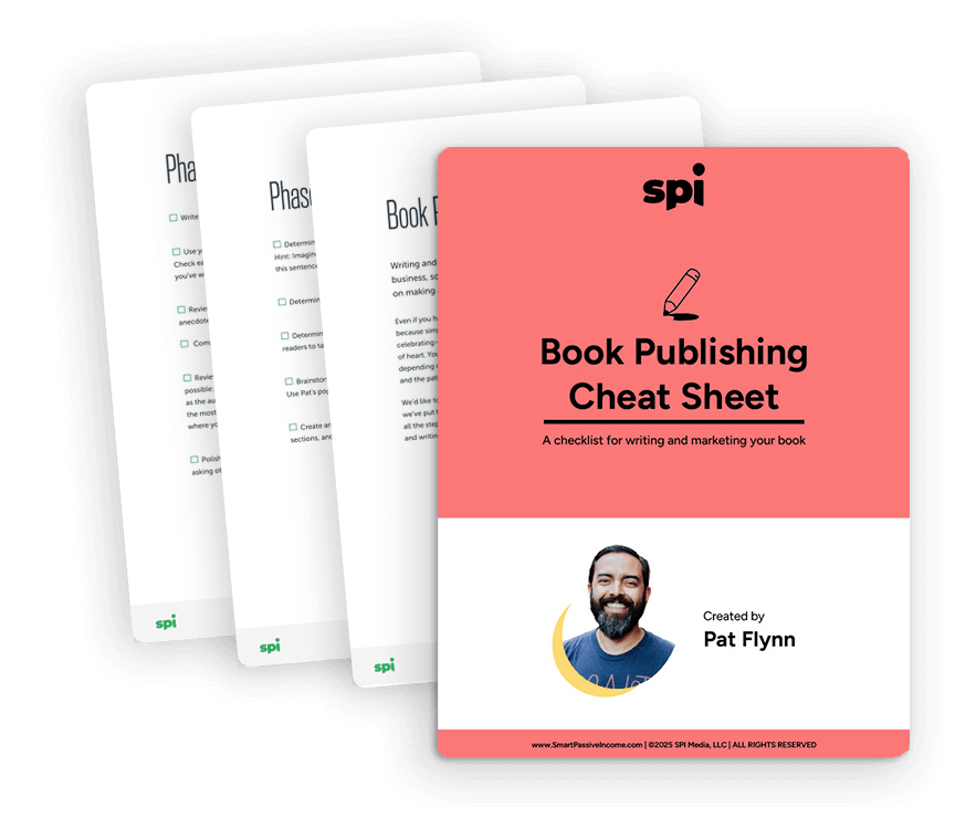
Get your free Book Publishing Cheat Sheet.
Learn the step-by-step publishing process guidance and get a high-level overview of the 5 stages of publishing. Our cheat cheat sheet covers steps for both ebook and print.
How to Start Writing Your Book for Publishing
So you have a book idea. Now it’s time to actually starting writing your book, which can be quite an undertaking—especially if you’ve never done it before. Here’s Pat with that important question to get us started on how to actually write the book.
Why publish a book in the first place?
You should never publish a book just because you can, because publishing a book is not an easy task. You should have a clear purpose in mind, not only for the topic of the book, but also for its reason to exist in relation to your brand and your overall goals.
The best way to figure out the purpose of your book is to visualize what it might look like within your brand. Imagine that it’s already published. What would it help you do? Is the book meant for generating leads? Building authority in a niche? Are you publishing it just to make money?
There are a lot of reasons to write and publish a book, but if you’re not clear on what those reasons are for you, you’re going to lose your excitement for it, especially when you get to the tough parts of the writing and the publishing.
If you need help discovering your reasons for writing a book, ask yourself these three questions:
- What is my book about?
- Who is it for?
- What do I want readers to feel or do when they finish my book?
For me, Will It Fly? was not published primarily to make money. For the most part, authors don’t make money directly from their books, although that’s not impossible as Nathan Barry shared in Session 75 of the SPI Podcast.
I wrote and published Will It Fly? for two equally important reasons:
- More exposure
- More control
Let me explain…
More Exposure
If generating the most immediate income from this work was the goal, I would have either sold the book directly on my own site and charged a lot more (à la Nathan Barry), or created an online course instead.
Getting the book in the hands of people who have not yet been exposed to me or the SPI brand was more important to me, and self-publishing a book to use Amazon’s algorithms is the mechanism for doing just that. This is a long-term game plan, and I’m hoping Will It Fly? becomes a great first impression—a pleasant start to a life-long relationship I have with new readers, subscribers, and customers.
More Control
Additionally, since starting SPI, I’d been generating most of my income from affiliate marketing and redirecting people to other people’s stuff. In order to make the most impact, and also keep people interacting with my brand, I had to start creating my own stuff, and it all started with this book. Will It Fly? lead to courses and other SPI branded material, and with that I’m able control the conversation I have with my audience, and the experience they have throughout their business journey.
Control is also part of the reason I wanted to self-publish the book, instead of going with a traditional publisher, despite traditional publishers reaching out and wanting to work with me. As I mentioned in the introduction for this guide, although there are a lot of pros that come with working with a traditional publisher (i.e. an advance and distribution in physical book stores), I would also give up some control over things like creative direction and content. Since most authors end up doing a lot of their own marketing anyway, I knew that self-publishing was the right choice—at least this time around.
With that choice, however, that means it’s more work for me to get everything done and executed properly on my own. But it’s great because I now know how it all works, and I can share what I’ve learned with you.
How to Know What to Write About?
Obviously, the topic of the book you choose to write is an important one. First, you want to write about something that will serve your target audience, of course. Combine that with the knowledge you have and the research you will do, and you’ve got a potential topic for a book.
But an idea alone isn’t enough. Is there a way to validate a book topic before writing it?
Absolutely!
Since Will It Fly? was all about idea validation, I knew I could (in a very meta way) validate the idea of my book before writing it. The idea first came after hearing the same question coming directly from my target audience over and over again. Through emails and voicemails coming from AskPat.com, the number one question people asked was:
“How do I know if the idea I have is one that will pay off?”
After you all planted this seed in my head and I started to research this topic, I conducted a survey that confirmed this once again. For those answers from people who had yet to start a business, the number one struggle they faced was figuring out what niche to get into, and the fear of something not working out:
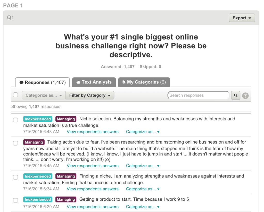
Even those who have started a business shared that they struggle with some of the same thoughts around their business idea:
![Answers to survey question, "What's your #1 single biggest online business challenge right now?"
Answer #1: "Sticking with one idea and going at it full throttle."
Answer #2: "Lack of focus and execution."
Answer #3: "Monetizing traffic."
Answer #4: "Driving traffic to my website. Finding where I can go to get traffic. Everyone says do it this way or that way."
Answer #5: "Getting users to click on links and convert visitors into readers into customers, for personal and affiliate sales."
Answer #6: "Getting going. It's possibly having the confident [sic] to put what I've read and heard to use. Will my efforts actually produce anything? Do I have the patience and fortitude to keep with it?"](https://www.smartpassiveincome.com/wp-content/uploads/2023/12/SPI-business-validation-audience-survey-2-1024x935.png)
After this, it was time to make sure that this was indeed a topic of interest for people, one that they would pay to learn more about.
I reached out to thirty people on my email list, at random, got on a Skype call with them, pitched the idea for the book (being honest that the book wasn’t even finished yet), and I asked them to pay $10 to my PayPal account if they would buy it.
Of the thirty people I reached out to, I was able to speak to about twenty of them, and out of those twenty, ten people paid me money. That’s how I knew the book idea was going to work.
There are other ways to validate a book idea. I haven’t done these myself, but I have seen other authors do these two things with great results:
- Write a guest post about the book topic on another site and gauge the reaction. This is a great approach, especially if you don’t have an audience of your own yet.
- Write a mini-version of the book and give it away for free, potentially turning it into a lead magnet for your email list. See what the reaction is like from there, and then turn it into a published book if people want more. This is what Michael Hyatt did for his book launch for Living Forward, which went on to become a bestseller.
Publishing a book is a big task, so it’s best to spend a little bit of time upfront to make sure it’s something your audience wants to read first.
Time To Write
Now that you have identified your why for writing and publishing a book, and a topic that your audience will want to read, you can’t do anything else until you of course have . . . a book. Book writing is something that used to be a constant struggle for me. Read on to learn about the process I used to write over 36,000 words in the first two weeks of 2015—and that I’ve been using ever since with great success. I’m also going to give you one tool that is saving me so much time and helping me achieve up to 180 words per minute.
A book is such a huge undertaking. It’s really funny, because I can write a blog post—3,000 or 4,000 words—in just a few hours, but when it comes to writing a book, I struggle a lot. That’s why I have a couple unwritten books just sitting on my computer, in Scrivener, which is the tool I use to help write books. It’s a great tool—the reason those books weren’t finished is that because I just couldn’t do it.
I remember sitting for hours. I would block out four or five hours of time during the day, just sit in front of my computer and come out of that with an extra 300 words for four hours of work. It was completely defeating—and I know a lot of you can relate to this. I know a lot of you also, like me, feel you have a book in you—maybe even many books in you. So I’m going to show you a book-writing technique that has changed my life in terms of productivity. I used it to write my book Will It Fly?, and within the first couple of weeks of 2015, I cranked out 36,000 words.
Using Post-It Notes to “Brain-Dump” Your Book’s Topics
I’ve adopted this technique from a lot of other people’s strategies and tips for writing books, and it’s involving something that a lot of other people have used before: Post-it Notes. I love Post-it Notes, because you can write on them and move them around. They’re small, but not so small that you have to squint to see them. So they’re perfect. I’m going to show you how to mind-map your next book using Post-it Notes, and how you can achieve incredible words per minute in terms of the rate at which you write your book.
The first step is to get some Post-it Notes. Make sure to get a bunch of different colors. I like the smaller ones, because you’re just going to write one or two words on them. Then you want to pick a color—and just start writing. Start with anything that comes to mind involving your book, put it down, one idea per Post-it, and stick it to the surface that you’re working on, whether it’s a desk or a whiteboard.

To demonstrate this, I’ll use a sample topic. Something I always talk about on the blog is fly fishing, and it’s something I know a little bit about. Using the example of fly fishing, I’ll show you how I can start to put together my hypothetical book and once you start to put all your ideas onto the board that you’re working on with Post-it Notes, you can move things around. Then the chapters and subchapters start to form, which help to create what becomes your outline.
So, fly fishing. I pick a color and place it in the middle to label my central idea, so I pick a pink note and write “fly fishing” on it. With this process, you write anything that comes to mind; there are no rules here. You can always throw things out, but you don’t want to stop yourself. This is the creative process. You don’t want to edit in your head. You just want to put things out there, and later on you can edit.
I’ve got “fly fishing.” Next, what is involved with fly fishing? I’m brainstorming anything and everything I can think of related to fly fishing and writing each one down on a separate Post-It. Things like:
- Fish
- Flies
- Rods
- Casting techniques
- Reels
Again, write down anything that comes to mind. You want to put the stuff that’s in your brain down on paper, because then you won’t have to think about it anymore. You can focus on organizing later, but we’re not there yet. So what else for fly fishing?
- Lake fishing or lake fly fishing
- Rivers
- Streams
- Oceans
- Tying flies
- Tournaments
Keep asking yourself, what else comes to mind? And usually one topic will spark another.
- How to dry things off after you’re done
- Equipment
- Clothing
- Trout fishing
- Bass fishing
- Fly fishing for kids
- Destination areas
- Where in the water
- Boots
- Safety
- License
- Net
- Catch and release
- Etiquette
- Snacks
- Fish finders
- Wading boots
- Boats
- Floats
- Jackets
I know a little about fly fishing, but I’m not a fly fisherman. You’ll obviously know a little bit more about the topic you’re working on, so you should be able to fill up your work surface pretty easily. When I was writing my last book, the table was completely filled with notes.
You can see the idea here is that there’s no particular order to how the sub-topics emerge, and nothing is off-limits. You just want to get down as much as you can so that you have plenty of ideas to work with. The order and organizing comes next.

Start to Create Some Order
At this point, you should have a whole board or desk full of Post-it Notes. Next, you want to start looking at all of them so you can start to tie them together. Pull them off and start moving them to different places, organizing them in groups that make sense to you. You’ll see that your brain will just start to organize them. Again, it’s nice that it’s all here for you because then it’s much easier to move things around.
For example, I can put “jackets” and “wading boots” together. “Equipment” and “clothing” are the top-level categories. Then I have “reels” and “rods” and “flies” with equipment. Then I have behavioral topics like “etiquette” and maybe “casting techniques” together. I have “oceans,” “lakes,” and “streams” grouped. “Snacks,” which is something to bring, so maybe that’s grouped with equipment.
“Safety”—I can put that with behavior. “Destinations”—that can go with “oceans,” “lakes,” and “streams.” “Fish finders”—that’s another piece of equipment. “Casting techniques”—now I see that’s its own thing, because there’s probably a whole array of different kinds of casting techniques.
“Kids.” You can take them with you on these destinations, so maybe we’ll have one for “kid-friendly.” Now I can clearly see four different sections, maybe five, because of “casting techniques.” Then I start to create a hierarchy, so I can see: “equipment,” “clothing,” and then stuff to “bring with you” when you go, and a separate section for “fishing-related equipment” that you’ll need before you go out. Already, I can see a chapters and subchapters coming together.
You keep going, and as you keep organizing other chapter topics might emerge. Like, if If I knew a little bit more about fly fishing, I would probably know that there were different flies that I could tie. And that becomes its own chapter to keep filling out. I also know that there are two different kinds of flies, so I’m going to create one for “dry”—those are flies that float—and then “wet.” “Wet” flies—those are the ones that sink. Then within that, I’m going to use a different color to create another level, and put “when to use.” So you can just go deeper and deeper. Then maybe “what to use” based on the type of fish or season.
And you just keep going until you’ve completely exhausted everything you know about your book topic. If you want to watch me going through this process with the fly fishing example, it’s something I cover in this video:
Start the Writing Process
I begin to structure everything, starting at the very top-level. I group things together, and then I start to break things out as it makes sense. This helps me decide what my chapters are, what order everything should be in, what my subchapters are, and my subsections. Then, what I typically do when I start to create this order and start to organize them in a sequential pattern, is start from the top. I pull a group of Post-it Notes and move them over to my computer.
That’s when I start writing about that specific topic. Everything else that’s here over with the Post-It brainstorming project is still there, but I’m not focusing on it, because I’m just writing that one, small section. That’s something I struggle with when writing books. I was envisioning the whole thing, and thinking about every other part of the book and how it was going to relate.
Instead, you’ve got to focus only on that next section. When you do that, it becomes so much more manageable, because as you complete one section at a time and move it aside, then move on to the next, and the next—little by little, you’re chipping away at it. You’re adding more words every single day, and by the end of it, you will have gotten rid of all your Post-it Notes. You start to make progress, and it’s completely motivating.
There’s one more little secret I want to share with you that goes along with this technique, and I’ll talk about that next.
The Technique that Will Dramatically Upgrade Your WPM
You’ve created your Post-it Notes, and you’ve started to see what’s happening in your book in terms of the outline and the chapters, the subchapters, and the subsections within each of those parts. Now it’s time to start writing. Like I said earlier, you’re going to pull out one small section at a time. I might, for example, pull out the sections on how to get involved with “fishing tournaments,” and there’s probably some more hierarchy involved with that topic. I think there are different types of tournaments, so those would go in there as well. Now that you know this is what you’re focusing on—tournaments—you can start writing about it, and your mind is just focused on this topic. Everything else is still there on the table, but you’re only focused on just this one.
Now, for me, writing and actually typing all that out would still be a struggle at this point. Narrowing the topic down into smaller chunks helps me to be a little more focused than I was, but my mind still gets into editing mode whenever I get in front of a computer. It works for blog posts, but when I am writing a book, it just becomes much harder for me mentally. Even though I can try to treat each of these things as a single blog post, I still want to edit along the way, as if I’m crafting it like a blog post that’s going to be published tomorrow.
Now, the very best strategy I know of if you want to upgrade your writing efficiency is to “puke” what’s in your head onto the screen. Basically, you just want to put everything in your brain about your topic onto the page. I know some people who actually take the “delete” button off their keyboard, because they don’t want to let themselves edit, even accidentally. They are just in creative mode. You can edit and move things around later, and you’re probably not going to be using a lot of what you write down, but what comes out when your brain is in creative mode is going to be extremely good for your book.
The problem is that when I’m in editing mode, I’m not letting myself think creatively. I end up stopping myself, because I have to edit this thing and move things around. It’s not what you want to do at this stage. So the big trick I use to overcome this barrier and achieve extremely high word counts per minute is actually an app called Rev. With Rev, I’m not technically writing, as in I’m not typing—I’m dictating my book.
Rev is an app for iPhone and Android. It’s basically an audio recorder, but the cool thing about it is that you can take your audio recording and send it to the people over at Rev, and they will transcribe it for you at $1 per minute. You can even transcribe it yourself or have someone on your team transcribe it for you, but Rev does a really great job. The quality is good, and when it comes back to you a few hours later, it’s all the words you dictated.
So that’s the trick I use to get up to 180 words per minute. It’s how I’ve been able to complete the first brain dump of each of my books. You can’t even really call them drafts, because they’re just everything in my brain about these particular topics, on these Post-it Notes, all dictated. Then I go through the book a second time with a little bit of editing mode in mind, and I can then shape and move things around and craft the stories in a way that makes sense for a book. It’s not going to make sense for a book when it comes from your voice, but you can get so many amazing stories and pieces of your book out through your voice.
So, record it on Rev, transcribe it, and you’ll discover that you have a lot of material to work with. And your book’s going to be finished sooner than you know.
To recap:
- Figure out your WHY for writing a book.
- Determine a topic that you audience wants to learn about from you.
- Brain dump all of your ideas about your book onto Post-it Notes.
- Move them around, organize them, group them, and sequence them to a point where they come to look like a book in terms of chapters, subchapters, sections within those subchapters, and so on.
- Pull out individual pieces and record yourself talking about those each individual item on your Post-it Notes.
- Get the recording transcribed and begin editing.
- If you don’t want to go the audio recording route, that’s fine; you can write about the topics instead. But having that single Post-it note there to keep you focused is going to help quite a bit.
We’ve covered a lot in this first chapter. So what do you do once you have a draft? Next up, we’ll look at editing your book so that it’s closer to publish-ready.
How to Edit Your Book Before Publishing
Once you have a complete manuscript draft, congratulations are in order. It’s a big deal to finish the draft of a book project of any length and that is definitely cause for celebration. But! Don’t rest on the laurels of that accomplishment for too long, because finishing the manuscript is only the first step. As much as we hate to break it to you, we must be the bearer of the reality check that your work has only just begun.
Your next big step will be to hire and work with an editor to get the book publish-ready.
It’s all too common in the new world of publishing for writers, especially online content creators, to have one of two misconceptions about the editing process. They either 1) assume that their work is good enough as it is and doesn’t need editing, or 2) don’t fully understand what working with an experienced professional editor can do for their work. If your perspective on the editing process is some combination of these two misconceptions, read on.
That’s what this chapter is all about: helping you to understand the editing process, what working with an editor is like, and what an editor can really do for you. The first thing we’ll say is that all writers need editors. It doesn’t matter who they are or how good they are—the best and most popular writers all have editors. Editors are the first line of defense for writers. They are your earliest official reader, and they help you to ensure that your work is ready for a larger, more public audience.
Think of it this way: Every year the president of the United States gives the State of the Union address, and that speech is written and revised and critiqued and revised and rewritten some more before it’s in the final form that gets delivered to Congress. Now, granted, your book is probably not as seminal a work as the State of the Union (not yet anyway!), but the point is that if the president of the United States takes that much care in crafting his message, then don’t you think it’s a valuable component when communicating something that is important to you?
Communication is often tricky, especially when you are attempting to introduce readers to new or unfamiliar ideas, because you have to ensure that you lead your reader on a logical path so that they can follow along in your thinking. That means that the sequence of how you present information is incredibly important. The breakdown happens when the complex idea that you are attempting to communicate on the page appears clear to you because it makes sense in your head, but it may not make sense to an objective reader. Your reader is not a mind reader and not intimately involved with your logic or thinking—you are the only person who knows what’s going on inside your head—and that’s where an editor comes in. The editor helps you to sort out and organize your ideas so that they are clear to anyone who encounters them, and so that they do make sense to readers who are new to the concept.
You may recall that a lot of us here at Team SPI have background and experience as editors. In that experience working with authors we have encountered writers periodically who, when we gave them feedback, attempted to verbally explain what they meant. This is usually an indication that the author didn’t communicate clearly and didn’t sufficiently translate what was in their head onto the page. The problem is if it’s not on the page, readers will not have access to you, the author, to get clarification on a topic or a point when they are reading your book—all they’ll have is the book, which means you need to make sure it’s as solid as it can be to stand on its own and communicate effectively on your behalf.
Everyone says my book is great; why do I need an editor?
You may have already had friends and family read early drafts of your manuscript, and you may have already revised to incorporate their feedback. That’s a great strategy to get your draft ready for an editor. And, yes, unless your significant other or best friend is a professional editor, we do still advocate hiring a professional even after you’ve passed your manuscript around to your personal network. (For the record, Pat has worked with professional editors for all of his self-published books. He shares more about that experience for his book Will It Fly? In chapter 3.)
As much as your friends and family love you and want to support you, unless they have training, there are things that only a professional editor will be able to do for you. First and foremost a professional whom you pay to work on your manuscript is going to give you critical, strategic, and objective feedback that people who know you are likely not in a position to give. When you hire an editor, you’re entering a business service relationship, in which the editor has a professional responsibility to help you create the best book possible because your editor will be invested in delivering the best work possible to you, the client.
Objective feedback is essential. You parents or your spouse or your best friend or whoever you’ve asked to read your early draft are probably more concerned about whether or not they hurt your feelings than they are with giving you feedback that you can actually apply toward improving your book. Not so with an editor. Beyond objectivity, your editor will also provide you with critical and strategic feedback. By critical feedback, we mean that your editor will analyze your draft and identify its structure and order, making suggestions to rearrange material if necessary. Your editor will also identify material that might get off track and make suggestions of where to cut, and where to expand if the material is lacking and needs further development.
Editors also think critically about your target audience, which may be something you haven’t given much thought in your writing process. That’s okay because 1) when you’re writing you need to just get the material on the page, and 2) that’s part of the revision process that an editor can help you with. This is the stage where you refine the manuscript to include references and examples that are relevant to your audience, and maybe take out the obscure Back to the Future reference unless, of course you are Pat Flynn, and you know your niche audience will get it.
More than anything else, hiring an editor means bringing on a teammate. With an editor you’re no longer a team of one, you’re a team of two. Your editor becomes your coach, your cheerleader, and your partner. If you find a good editor, someone who understands you and your book and who works well with you, then that person will be just as invested in the book as you are—and that’s what you want. You want someone who cares about your message as you do so that together you can produce the best possible manuscript. We’ll talk more about how you find that person, but first let’s talk about the different types of editing.
How do I know what kind of editing I need?
You may not know what kind of editing you need without first consulting an editor. That may seem a bit counterintuitive if you’re wondering how you hire someone if you don’t even know what type of service to look for. Don’t worry—most editors and content service providers will offer an entry-level service such as a manuscript evaluation, which would help you to identify the type of editing you might need.
Here at SPI we take our books through three levels of editing and define them as follows:
- Developmental editing is all about structure, flow, and story design.
- Line editing focuses on your manuscript line by line to improve language, word choice, tone, sentence structure, etc.
- Copyediting concentrates on bullet-proofing your manuscript, looking to correct errors in the areas of grammar, spelling, punctuation, etc.
Typically the first and best place to start is with a round of developmental editing. Unless you’re an experienced writer with more than one book under your belt, chances are that you’ll need to do some restructuring, reordering, and rewriting on the manuscript before it’s ready for the next stage. This is where you get the structure and order, what’s often called the narrative arc of the book, finalized. If the draft is super rough, then this phase is all about simply determining the focus of the book, eliminating anything that doesn’t support that focus, and identifying what new material needs to still be written to make the focus work. You don’t want to do a lot of the nit-picky corrections that happen in the copyediting stage before getting the structure nailed down, because you’re often writing new material, moving material around, and introducing all kinds of new errors in the process.
Once you are done with developmental editing, you can move on to line editing and copyediting, which is beginning to fine tune and polish up the manuscript. Whereas developmental editing works at a higher, holistic level, line editing works at the lower, sentence level. This phase of editing ensures that sentences flow from one to the next, that there are appropriate transitions between sections, that there’s a solid finish to each chapter, and that your word choice throughout is consistent with the tone you’re using to speak to your audience—for example, line editing would eliminate the introduction of profanity mid-way through your manuscript, because it would be jarring to readers if it is not part of the tone you’ve set with them from the outset.
In addition to correcting grammar errors, copyediting also ensures that your manuscript is consistent throughout with style choices like, for example, whether to use SmartPassiveIncome.com vs. Smart Passive Income vs. SPI. Copyediting is often combined with a final round of proofreading to catch any straggling errors, but in traditional publishing houses you’ll find that copyediting and proofreading are two separate roles and proofreading is the last step after a manuscript is laid out and before it goes to press. Every manuscript needs a minimum of copyediting and proofreading. Whether you also need line editing depends on how messy your manuscript is to begin with.
What is it like to work with an editor?
A good editor is like a business partner: You both have defined roles and responsibilities on the project and you both are working toward the same goal of making the best possible book. Your editor will challenge you and probably give you feedback that you don’t like or is a little uncomfortable to hear at times. But it’s all with the intention of bringing out the best writer in you. Your editor will also be your biggest cheerleader, identifying the strengths of your work often by asking for more of the same. And, if you think you will write more than one book, you may find that you continue working with the same editor for years because you’ve built a relationship with someone who not only knows your work but knows how you work.
One of the most important things to know about developmental editing is that it does not mean that the editor is doing the work of rearranging and rewriting. A standard deliverable for a developmental edit is a written critique, evaluating the following elements of the manuscript and making recommendations for each:
- Structure
- Opening/introduction
- Conflict
- Setting/context
- Show vs. tell
- Language
- Point of view
- Ending/conclusion
- Formatting
- Grammar/spelling
A developmental critique means you end up with a list of homework assignments from your editor and you go to work revising based on the editor’s recommendations. The editor is often available by email or phone to answer questions as you work on the revisions and then to review your manuscript one more time when you have a revised draft ready. You can expect more back-and-forth and a longer-term relationship with developmental editors, who are spending more time with you and with the manuscript, helping to inform the shape of the book and helping you to make decisions. There are even some developmental editors who will sub-contract for line and copyediting, and in that case you may not have contact with the next level editors.
With line and copyediting, you can expect an editor to make corrections directly in the document. The deliverable at this stage typically includes two files: one marked up file with the changes tracked, and one clean file with all changes accepted. Copyeditors will likely ask for a style guide that dictates treatment of words and punctuation specifically for your book. If you don’t have one, then they can also help you create one; it’s usually one page or less listing book-specific style choices that supplements the designated style guide you’re following such as The Chicago Manual of Style or The Associated Press Style Guide.
Keep in mind that editors often prefer and specialize in one type of editing. Developmental editors in particular may even specify that they will not copyedit a manuscript after they’ve done the developmental edit, and vice versa. Line editors almost never also copyedit. And copyeditors never proofread. The reason is that once you get to the next level of editing, you want a set of fresh eyes on the manuscript. The more familiar you are with the work, the more likely you are to miss something. Not to worry, most editors have a network of professionals in the field and can refer you to someone for any type of editing that they don’t do themselves.
How long will editing my book take?
That’s a hard question to answer because it depends so much on each individual book manuscript and, really, the author. There are so many variables, like how long the manuscript is, how much development it needs, how strong of a writer you are, how quickly you write, and, perhaps most importantly, how dedicated you are to the revision process.
The short answer to the question is, it depends on you and how much time you give it. If you get a developmental critique and you’re able to implement the recommendations within a week or two, you’re that much closer to having a finished manuscript. But if you are able to dedicate only a few hours on the weekends, it could take you several weeks or months to finish. So, bottom line is, it’s largely up to you how long it will take.
How do I find an editor?
Finding a good editor who you click with and want to work with long-term can be a bit tricky. It’s not like looking at a beautiful website, knowing you love it so much that you want to work with whoever designed it. The work of a good editor is hidden behind the scenes and unnoticeable—and that’s the point. An editor’s job is to make the author look good. When you love a book you think it’s well written, not well edited. So if you can’t see the editor’s work, how do you even know where to start?
Of course there’s always the good ol’ Google search, although you never quite know what you’re going to get there. Some of the trusted resources for authors online include sites like Jane Friedman and Joanna Penn’s blogs, where you’ll find resources listed for help with your book including editors. But in our opinion, the best way to find an editor is word of mouth. Ask your author friends who they have worked with in the past, and what their experience was like. If you don’t know anyone who has written a book and worked with an editor, there are professional organizations that provide directories for their members and some, like the Editorial Freelancers Association, have a job board where you can post a listing for your project and request proposals or quotes from interested members. You could also use a site like Upwork to find a freelancer for any type of project, including editing.
My book has been edited, now what?
You’re on your way! And you still have a lot of work ahead of you, including some important decisions about how you want to proceed. Do you intend to self-publish, or try to get a traditional book deal? Keep reading; we’ve got a chapter to give you an idea of what to expect from each avenue that will help you to make an informed decision. But first we need to cover how to get your manuscript ready for publishing, and we’ll get to that in chapter 3.
Get your free Book Publishing Cheat Sheet.
Learn the step-by-step publishing process guidance and get a high-level overview of the 5 stages of publishing. Our cheat cheat sheet covers steps for both ebook and print.
How to Get Your Book Manuscript Ready for Publishing
Deciding to write a book means a long term commitment to get it written, published, and ready for distribution. It’s not an overnight thing by any means, and it will test your limits. It did for me, but seriously, it feels really good once it all comes together.
This chapter is super-detailed sharing everything that involved in getting my book Will It Fly? ready for liftoff. We’ll cover a wide range of topics, from how I validated the idea for the book and how I wrote it, to how I found people to help edit it and how it was finally released into the wild with the goal of producing optimal results. In other words, all of the behind-the-scenes stuff that went into getting the book ready to publish.
I’m going into so much detail because I hope this will help you plan your own book, course, or product launch. Will It Fly? was written to help you get started building the business of your dreams, and I want this guide to be one more tool to help you get that business off the ground.
Getting the Book Ready to Publish
Writing Will It Fly? was a major challenge for me. Quite honestly, it was one of the hardest things I’ve ever done. I could have had the book ghostwritten, and I did have several offers to ghostwrite the book, but I chose to do it on my own. I really wanted to write the book on my own for personal reasons—so that I could be truthful when I say I wrote this book—but I also because I wanted others to see my example struggling through the process, conquering the fear, and putting in the hours in to get it done.
Now that it’s out there and in people’s hands, it feels good knowing I did it all on my own. That’s not to say I didn’t have help with content development and copyeditors, which we’ll get to later in this chapter, but to have put fingers to keyboard on my own book feels really good.
That’s not to say, however, that hiring a ghostwriter is bad. In many cases, it’s the right decision, but for me and for this book, I needed to do it on my own. Here’s an overview of the process for getting this book ready to publish. I’ve broken it down into these six stages:
- Stage 1: Outlining and Writing a Quick First Draft
- Stage 2: Revising a First Draft into a Second Draft
- Stage 3: Another Pass at the Second Draft (This Time with a Different Tool)
- Stage 4: Working with a Developmental Editor
- Stage 5: Designing the Book Cover & Interior
- Stage 6: Uploading the Book for Pre-Orders Through Amazon with CreateSpace
Stage 1: Outlining and Writing a Quick First Draft
The purpose of a first draft is to brainstorm. Shannon Hale, an award-winning author who has written more than twenty books, said it best: “I’m writing a first draft and reminding myself that I’m simply shoveling sand into a box so that later I can build castles.”
The trick is finding the best method for shoveling all that sand. For me, it was the method I shared in Episode 1 of SPI TV and in detail in chapter 1 of this guide:
After only two weeks, my first draft ended up totaling more than sixty-five thousand words, but ended up keeping less than 10 percent of that first draft moving forward. That 10 percent, however, was key. In the end, I hardly used any of the exact text that I dictated (and then transcribed) in the final manuscript, but that brainstorming session was definitely necessary for me to think about ideas and come up with material that wouldn’t have come out otherwise.
Stage 2: Revising a First Draft into a Second Draft
The next phase was to take what I had dictated and transcribed in my first draft, pull out all of the best parts, and then transform all of that into something cohesive that I could dive much deeper into. This started with creating a detailed outline of the book to nail down all of the parts that I wanted to include. You can see the start of what this looked like here on the left hand column:
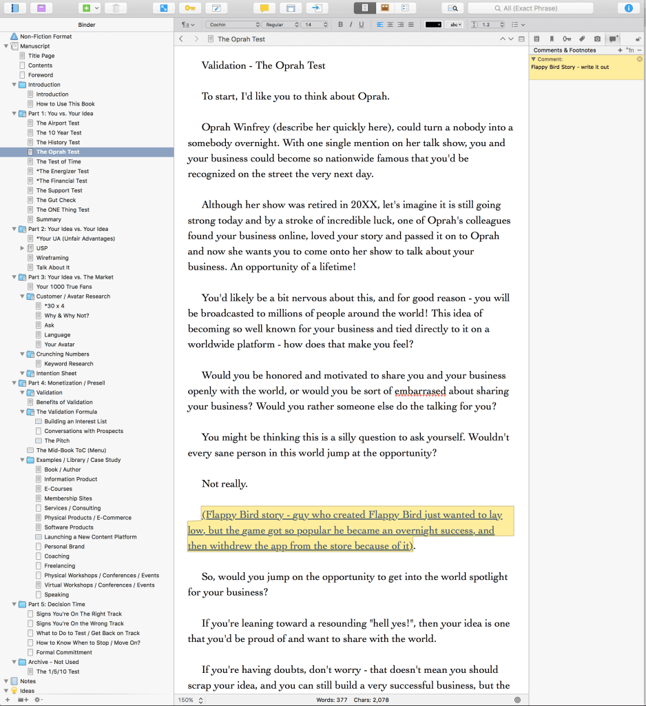
This is a screenshot of a tool for authors called Scrivener, and it’s the one that many authors of both fiction and nonfiction use to write their books. I used it to write my first book, Let Go, so I figured it would be easy to pick up again.
It was not.
Let Go was a much shorter book with a smaller and less intimidating outline. When I entered the outline for Will It Fly? here (which, by the way, was not titled Will It Fly? yet—it was simply called Validation Book as a placeholder) it became super intimidating and as I began to get into the chapters of the manuscript, I started to see just how long this journey would take.
I actually stopped writing for about two months at this point, because it was hard. I made excuses and although I did put writing into my to-do list for the day, I’d always prioritize something above it, and so it never got worked on.
It wasn’t until May of 2015 when I made the decision to get the manuscript done by the end of the year that I got serious and hired a coach, Azul Terronez, to help me through the process.
Getting a Coach
I needed help.
I don’t say that like I was in trouble, but I say that meaning that whenever I finally make the decision to really go for something, I need the help. I need help because I know there are people out there who are better than I am at certain things, who I can learn from to get better results. So when it came to writing this book and knowing I was letting myself down, I found a coach for authors who I knew would be able to help me through the process and hold me accountable.
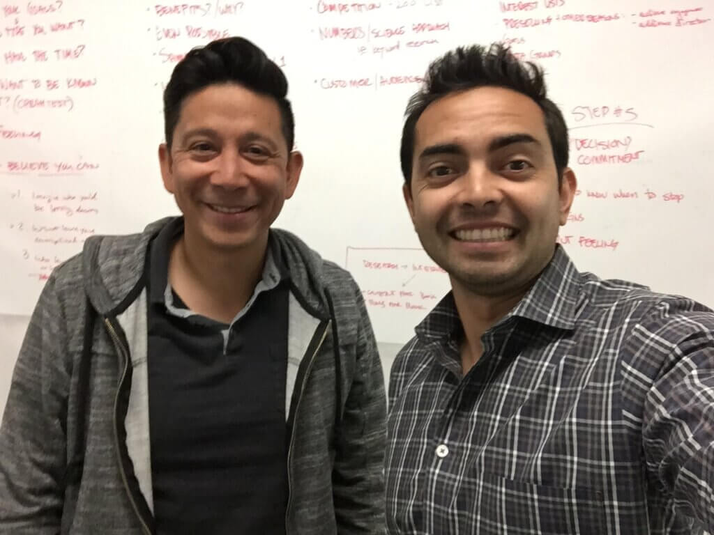
Azul was actually a student at one of Chris Ducker’s and my 1-Day Business Breakthrough Live Events. After keeping in close contact with him, when he learned that writing this book was a big goal of mine, he offered to help, and I gladly accepted. Since he was in San Diego at the time, we met in person to discuss and brainstorm next steps.
He was quick to address the mental roadblocks that I was facing, and he gave me specific deadlines for finishing certain parts of the book, which was helpful. That added pressure was key for me to get the motivation to sit down to write each day.
Here’s a photo from one of our sessions together at a coworking space in downtown San Diego:
Two other things Azul was super helpful with:
First, it was with encouragement. I told him that I work best when I know someone is rooting for me on the other end, so he would send me texts and emails randomly every so often rooting me on while I work toward the next deadline.
Second, he helped me realize just how much each section of the book was like a blog post. I knew this in the back of my mind, but his instruction to intentionally treat them as such helped out tremendously. Instead of writing in Scrivener, which is what I thought I was supposed to do, he suggested that instead I write the book using whatever tool I used to write my blog posts, which happened to be Google Docs.
Stage 3: Another Pass at the Second Draft (This Time Using a Different Tool)
When I shifted to a different writing platform, everything flowed so much easier.
Why?
Because it was a comfortable, non-intimidating environment I was used to! Writing in Google Docs took away the overwhelming outline that I could always see in Scrivener, and it kept my focus on the chapter I was working on, and that chapter only.
By the time August came around that year and I was back from vacation with my family, I was in full writing mode, and the book was going to be my ONE Thing (a concept I learned from the book The One Thing by Gary Keller and Jay Papasan) until it was complete. [Full Disclosure: As an affiliate, I receive compensation if you purchase through this link.]
I got into the habit of writing every morning between 6 and 7:30 a.m., because it was the only time I could fit it in. As soon as my kids woke up, my writing time was over for the day unless I could squeeze in any more uninterrupted time, which was unlikely. Soon enough, the parts of the book started to fill out, and I was excited to see the light at the end of the tunnel.
A Note About Structure
A good nonfiction book needs structure. Without it, you’ll end up with a mess of a manuscript that needs untangling before it’s ready for your readers. You might be tempted to rush through the outline stage, but let me tell you: don’t do it! It’s super helpful to get your chapters organized and ordered, because then you can approach writing and revising your book in chunks.
Beyond chapters, there are other elements of a book structure to help you organize and present your material in a logical organization that helps readers navigate the book. Think of the structure as a map for the book, and it eventually gets turned into the table of contents. The structure can also include
- Parts: a collection of chapters organized around a theme or timeline
- Chapters: main segments and building blocks of any book
- Subchapters or sections: smaller segments that organize ideas or topics inside chapters
Once you have your chapters you then have to figure out the best way to order them. For nonfiction books sometimes a chronological time-based ordering makes sense but I think mostly commonly you’ll see a step-by-step order leading the reader through a sequence of steps designed to help them achieve a specific outcome.
The step-by-step structure is what I did with Will It Fly?, because it’s all about helping people validate their business idea, and I ended up with nineteen chapters segmented into five parts (not including front and back matter, which we’ll get to later in this chapter). It’s a structure that developed throughout the editing and revision process.
Deadlines—EEK!
Azul’s deadlines were extremely helpful for keeping me on track, but as soon as I saw that the end of the first pass of the manuscript was in sight, I realized just how much more work beyond the manuscript itself was needed, and therefore how much more I had to think about, especially related to the timing of everything.
Team SPI (Matt and Janna, primarily) and I worked together on creating various schedules based on when I might be able to get the book done. Here’s what those look like. They work backwards from various publication dates, and include all of the timelines for all of the other things involved:
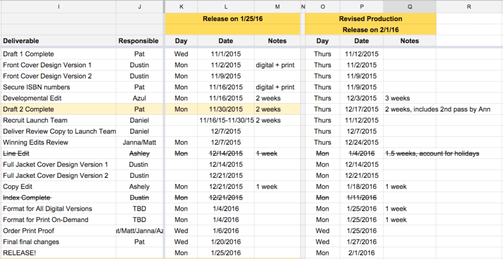
As you can see, we were exploring a 1/25/16 launch date initially, but we decided to have it come out a week later to give us an additional week for production purposes, which we later found out was completely necessary.
My biggest concern was having the manuscript finished in time to give the developmental editor, Ann Maynard from CommandZContent.com, so that she had enough time to review it and get it back to me before Thanksgiving break.
The deadline was November 1, but it got pushed back to November 12 because I got sick and was unable to get it done in time. This made me nervous, because we were supposed to launch on February 1, less than three months away at that point. The clock was ticking, and we still had copyediting to do too! Luckily, I had Azul and Ann in my corner. Here’s a good example of one of those encouraging emails:
Stage 4: Working with a Developmental Editor
Spelling and grammar are important, and it’s one of those things that no matter how much you try yourself, you’re going to need separate sets of eyes to catch those last minute mistakes.
However, even before working with a copyeditor, there’s the developmental editor, which isn’t so much about spelling and grammar, but rather the flow, order, and structure of the content within the book.
Before working on this book I didn’t know developmental editors existed, and I found out just how great it was to work with one. A few weeks after handing my first manuscript over to my developmental editor, Ann, I received some invaluable feedback. I didn’t have to rewrite the entire manuscript (thankfully!), but I did add some additional components and re-order a few things that took the book to higher levels.
I recorded a conversation that I had with Ann and Azul after getting back the first round of editorial notes. This is a very in-depth conversation, and I did receive permission from Ann to share this with you. This isn’t available on the podcast, only here as a bonus for those of you who care to listen.
It’s over one hour long (at normal speed), but it gets into a lot of what was wrong with the first pass, and what I could do to make the second pass even better:
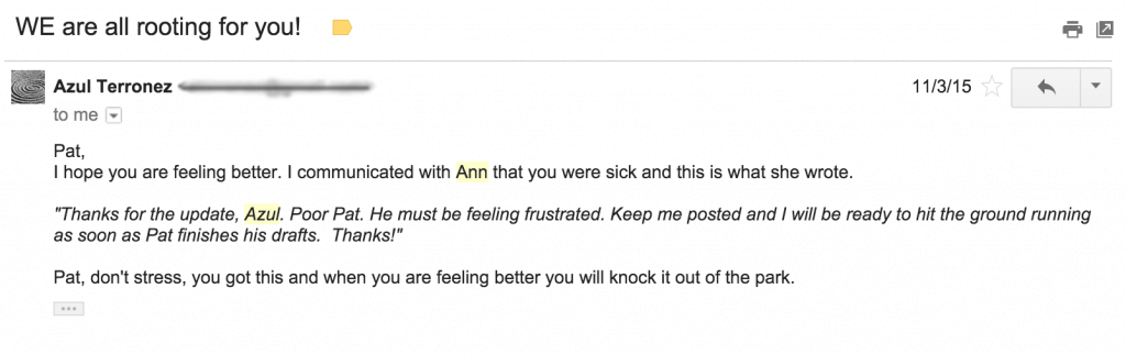
The most encouraging note, however, came from Ann via Azul over email. After she read it over the first time, this is what she said:
![The email from Azul reads:
"Hey Pat, I have been in communication with Ann, she has some questions about some content that I need to make sure she has so she can pass off the first polish to us. I am working on that now.
"Here's a note from here [sic] to you:
"'It's a rare thing for me to mutter, 'clever,' as I'm reading the closing sentences of a first-pass manuscript. Yet, that's exactly what I did with Will It Fly. (My dog heard me and thought it sounded close enough to 'breakfast' that it warranted begging around his food bowl, haha.) There's great content here. It's engaging and accessible without sacrificing actual value. None of the exercises included in your manuscript feel tacked on, and each one's purpose is very intuitive. And that's a VERY good (and surprisingly uncommon) thing. Even better, there are a few opportunities that have been laid at our feet to take the existing text even further. I'm very excited to talk through next steps!'
"I will shoot you a text soon once I get her what she needs.
"So exciting Pat"](https://www.smartpassiveincome.com/wp-content/uploads/2023/12/Email-from-Azul-and-developmental-editor-Ann-1024x841.png)
Wow, I mean—I couldn’t have felt any better after reading that! I knew there would be changes, and because I was so amped (and under a ton of pressure with the upcoming deadline), I was ready to make changes and submit to Ann a second go-around. I was able to knock that out in just two days. That’s unusually fast for a revision, however I spent every waking hour during those two days making it happen. Furthermore, how long it takes you to turn around a revision depends on the number of edits to make within that manuscript and a whole number of other factors. Luckily for me, the direction was clear, I just needed the time to do it, and I took all the time I had.
After the manuscript had Ann’s blessing, it was then ready to be passed on to the copyeditor, which was someone on my own team who has experience with copyediting various content for me.
And finally, if you get a chance, even though you might hire an editor of your own, make sure you spend some time reading through your manuscript . . . out loud. Hearing yourself say the words in your book will help you find even more mistakes that often get skipped over when just reading the text in our heads. (Be sure to revisit chapter 2 for more on editing and working with an editor.)
Let’s Not Forget the Front and Back Matter
What are the front and back matter parts of a book? Well, a book—a real, actual published book—is more than just the words you write from Chapter 1 to Chapter Done. There are a few more pieces that need to come together before your book is fully fledged and ready to fly off shelves.
These elements are known as a book’s front and back matter, the smaller sections that appear at the beginning and end of a book. They help set the stage and context about the book for your reader, provide them with additional information and resources if they want to learn more, and help them stay connected to you as an author. Here’s a quick rundown of these other pages you might forget about, but are a part of the book’s structure:
Front Matter:
- Copyright page: includes copyright information, ISBN, edition notice, date of publication, number of printings, disclaimers, warranties, and safety notices, publisher’s address.
- Full title page: includes the full title, subtitle, author’s name, publisher’s name and city.
- Half title page: includes only the title of the book, usually immediately following the full title page
- Praise: A collection of quotes and endorsements from advance readers.
- Table of contents: An ordered listing of the contents of the book that details the chapters and (possibly) subchapters.
- Dedication: A short section written by the author that mentions the person or people for whom the book was written.
- Epigraph: A quote that may be inspired by but not directly related to the topic of the book.
- Foreword: A brief essay written by someone other than the author but who is well-acquainted with the author or the book.
- Preface: The author’s introduction to the book as a book, with an explanation of why and how they wrote the book.
- Introduction: The author’s introduction to the content of the book, which lays out the purpose and goals of the book as well as sets up the first chapter.
- Prologue: The opening of the book, used to explain important information that doesn’t follow the chronological flow of the rest of the book.
Back Matter:
- Appendix (or Appendices): A supplement to the book that usually includes referenced documents cited in the text, or books and resources on related topics that may be of interest to your reader.
- Glossary: An alphabetical list of terms and concepts found in the book, with explanations.
- Index: An alphabetical list of terms and concepts found in the book that allows a reader to locate mentions of those terms in the book.
- Bibliography: This is where you add citations for all the reference materials used in your research: other books, websites, journals, etc.
- Afterword: The afterword can be an alternative to a preface. It can also be written by someone else. In updated editions of books, the author may include an afterword reflecting on the reception of the previous edition and what he or she has learned since then.
- Acknowledgments: The author’s thank-yous to people and organizations that assisted in the writing of the book.
- About the Author: A brief biography of the author.
- Other bonus material we’ll talk about in a minute.
For Will It Fly? I included the following front matter:
- Title Page
- Praise Page
- Copyright Page
- Course Promo Page
- Dedication
- Table of Contents
- Foreword
And back matter:
- Resource Page
- Let Go Page (promoting my other book)
- Acknowledgements
- About Smart Passive Income
- About the Author
And that’s the thing, when you’re self-publishing your book, you have the freedom to include anything you want in the front and back parts of the book. Don’t let these pages fool you, although they are just one to a few pages in length, they do take some time to complete, and your manuscript will not be ready for interior design until they’re complete.
Back to the Deadline Real Quick
At this point, you might be wondering why we were still going through edits so close to the launch of the book.
To be honest, it was a combination of a lot of things:
- Being over ambitious with the timeline.
- Not giving ourselves a ton of flexibility and lead-time, especially when it came to developmental and copyediting.
- Me getting sick.
- The holidays, and wanting to respect people’s time with family.
To launch a book in February means a ton of work needs to be done around November and December, and with Thanksgiving and Christmas, it takes away a lot of the time you might think you have to get everything done. (We talk more about this in chapter 10 on publishing mistakes.)
The plus side, however, is that because most people tend to slow down during these months, if you can speed things up you’ll have a slight advantage. This was definitely something I felt because when the book launched, it wasn’t up against anything else in launching the same category. Most other books, at least in the business category, seemed to come out in early January, or were scheduled to come out in March. It was the perfect window for Will It Fly?, and so I was excited to see what the results were, which are coming later in this guide.
But back to production stuff, because there’s a lot more to a book than just the manuscript. There’s the design of the book, too, both the outside and the inside.
Stage 5: Designing the Book Cover & Interior
The cover of a book is extremely important, especially if you’re going to be publishing it on Amazon. (More about how to think about the design for your book coming in chapter 4.)
The cover is the first impression people have of your book, even before they read it. A good cover helps your book to either stand out or blend in, and it can set the tone of the content for your reader.
Will It Fly? opens with a story of my son and his first experience folding a paper airplane (spoiler: it doesn’t go so well), and so I thought a paper airplane on the cover would make a nice visual for the cover. Plus, paper is what we write ideas on sometimes, and the purpose of the book is to see if those ideas can fly.
So, I drew a little sketch and had Dustin on my team come up with some early concepts:
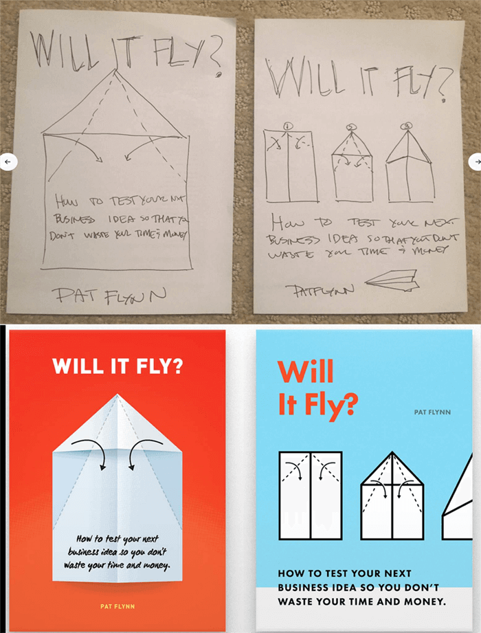
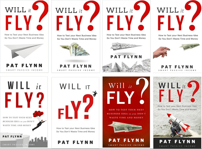
At first, I was happy with what I saw, but after the initial excitement died down, I knew that there could be room for improvement, and I wanted to see more iterations before making a final decision. I had also expressed the idea of sharing a single image of a folded paper airplane beneath the title, and so here was the next batch of design concepts from Dustin:
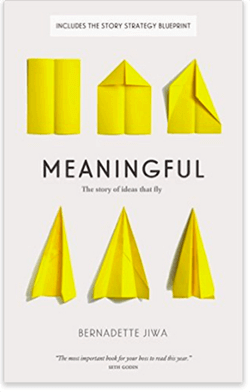
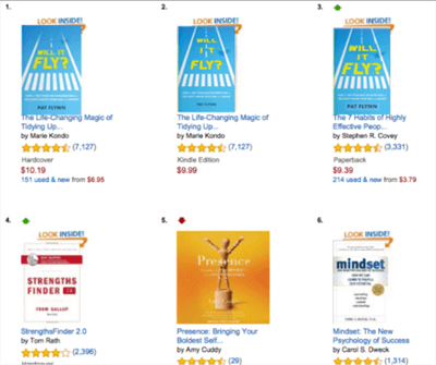
We were getting there, but I had yet to feel that “hell yeah” that I wanted when looking at the cover. I started to share these concepts on social media and with the book’s launch group to get a first reaction, and it was mixed. Also, a number of people found books with similar covers on Amazon, including this one, that was great:
After about two weeks and still struggling to find a design that worked, Azul and I ended up reaching out to another designer to see what it would look like coming from another person’s perspective. Having read only the introduction, another designer came up with the following iterations:
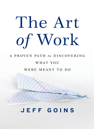
There were parts of this I liked, for example the font treatment, which made the title stand out much more, but the images seemed a little too stock for my liking. Plus, then another member of the launch group found this image from Jeff Goins’ book The Art of Work:
This was all happening while I was finishing up the manuscript, and after sharing with the team that I wasn’t happy with any of the submissions yet, Dustin took one final crack at it from a totally different viewpoint, and here’s what he came up with:
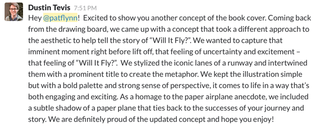
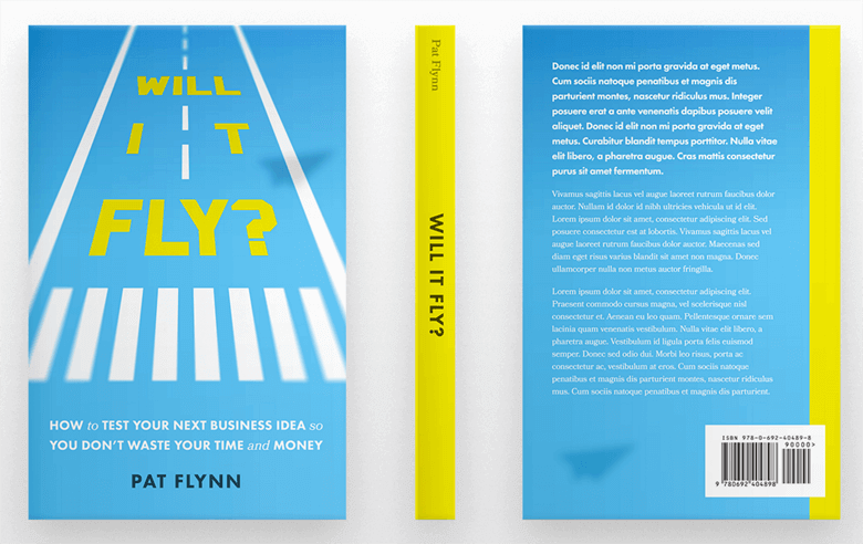
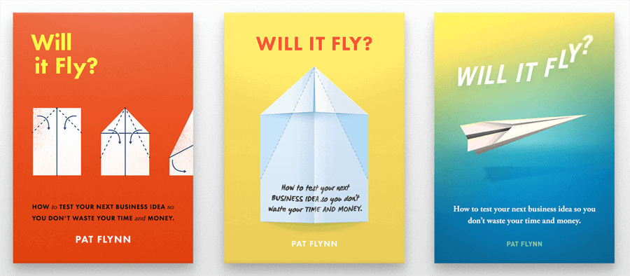
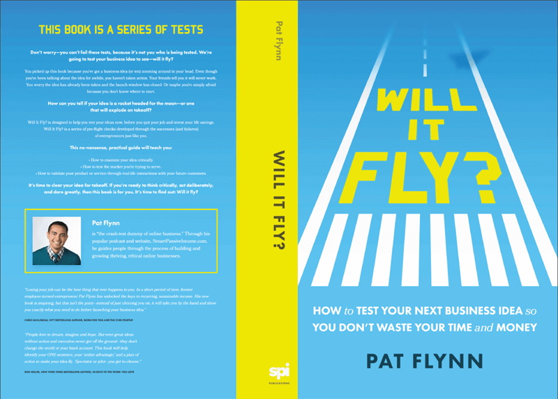
This was the “hell yeah” I was looking for! It still needed a couple of tweaks though (the spacing of the word “it” was really bothersome), but after playing around with it a little and darkening the blue to make the title stand out, we had our final version.
Photoshopping various thumbnails into Amazon at the smallest size:
The final front cover design before going live:
Since this was a paperback book, the back cover and the spine also had to be designed. To help us with the right specifications, since this book was being printed through Amazon’s print-on-demand service, CreateSpace (now part of Amazon’s Kindle Direct Publishing), Dustin referenced this document here.
The interesting thing is that he couldn’t determine the size of the spine until the book interior design was complete, because it’s the interior design that determined how many pages the book would to be, and obviously the more pages there are, the thicker the spine.
The back cover was a lot of fun to play around with, because it’s where you can add any blurbs and copy about the book that you want, and we also decided to add in a picture of me.
Unfortunately, what you see in a PDF file isn’t always what you get in your hands once it’s printed. Again, likely due to time constraints, we realized after going live that the back cover font was far too small. We immediately updated it to get it to the right size, but a handful of initial buyers have what I like to call the super rare early edition misprint.
Here’s a before (left) and after (right) comparison:
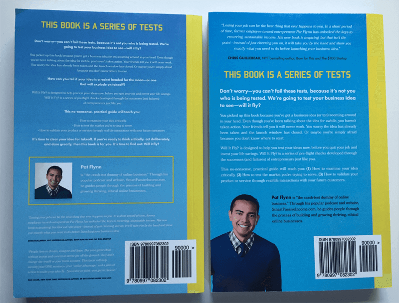
I’m very happy with how it turned out in the end, and coming from a print-on-demand service I was a little skeptical at what the quality would look like, but I was pleasantly surprised when I received my first copies in the mail:
Designing the Book Interior
The interior design of a book is just as important as the text itself, because a poor design or layout can make even the best of content hard to digest and tough on the eyes.
For a print book, interior design includes everything that you see when you flip through the pages: spacing, font size, drop caps, page numbers, headers, page breaks, chapter titles, images, bullet points, callouts, and featured sections.
For a Kindle ebook, it’s all of that, plus clickable links, and making sure the file is compatible to various device types and sizes.
This part of the process, by far, is one where I wouldn’t even know where to start if I had to do it on my own, so with the help of Azul, I found two people to help convert the manuscript into the final files that I would be uploading for approval and distribution.
Each format design took about a week to get the job done, and that is a quick turnaround. We were lucky to find people available to work fast on our deadline to meet our launch date, but usually these professionals need anywhere between two to four weeks to complete book design, layout, and corrections. Although the design was an upfront cost, I knew this was an extremely important part of the process and I didn’t want to skimp on it, but (as with editors), you may be able to find great work on sites like Upwork as well.
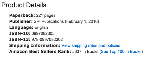
ISBN
Before getting your book up for sale on any platform that’s not your own site, you’re going to need an International Standard Book Number (ISBN), which is a thirteen-digit identifier for your particular book. The ISBN is used within the publishing industry to keep track and facilitate activities related to your work, like sales and distribution.
If you’re publishing on Kindle, you do not need an ISBN. Amazon will hook you up with a unique Amazon Standard Identification Number (ASIN) if you’re publishing through Kindle Direct Publishing.
If you’re publishing a print-book, you’ll need an ISBN. To get your ISBN, head on over to www.MyIdentifiers.com, where you can purchase your ISBN and barcode from Bowker’s Identifier Services.
Information About Your Book
When you register each version of your book, you’ll need to enter a few pieces of information that are always good to have on hand. You’ll need these anyway when you enter information into Amazon and any other platform where you choose to sell your book, so let’s define what they are. Here’s what you’ll need:
- Title
- Subtitle
- Description
- Author / Contributors
You’ll also need this info when you create your book listing on Amazon or any distribution platform. So let’s look at that next: getting Will It Fly? listed, officially published, and ready to sell!
Stage 6: Uploading the Book Pre-Orders Through Amazon with CreateSpace
As you know, Will It Fly? is self-published and printed on-demand through CreateSpace, a division of Amazon for print-on-demand books. If there’s a self-published paperback book for sale on Amazon, it’s likely due to CreateSpace.
The challenge was that I wanted to collect pre-orders as I see many authors do this on Amazon, but it’s not something that seemed possible when self-publishing and printing on demand with CreateSpace (now KDP). That is, until Azul, my accountability coach for this project, found out that it was possible by going through a completely wonky process that involved adding another arm of the Amazon branch, Amazon Advantage.
Amazon Advantage is a “self-service consignment program” that enables you to promote and sell media products directly on Amazon. It’s for publishers, music labels, studios, and authors. It gives you the tools you need to take advantage of the Amazon marketplace and help you with distribution and order fulfillment.
To share with you how wonky this process is, here’s the basic breakdown:
- Sign up with Amazon Advantage.
- Create a new item for your book and set the release date to your future publication date.
- Upload the cover image for your book. By now, you’ll have an Amazon page with the product displaying the future publication date. Pre-orders can now be placed.
- You’ll begin to get invoices for your book from Amazon. They’ll begin ordering copies from you and ask you to ship them in bulk to specific locations. Since you’re publishing through CreateSpace (now KDP) on-demand, you don’t have books to send anywhere, so you simply mark the items as backordered until that specific launch date.
- Meanwhile, you create your book on CreateSpace (now KDP) and fill in all of the necessary details (title, description, ISBN, categories, etc.) and upload the necessary files (book cover and manuscript). Don’t release it to the wild just yet though. Here’s where it gets weird.
- The evening before your launch, contact Amazon Advantage’s customer service team and tell them specifically to remove the item and transfer all of the pre-orders that came to CreateSpace (now KDP). They will then fulfill the orders that came in during the pre-sale.
- And then, magically on the backend, the Amazon page for your book switches from Amazon Advantage to CreateSpace (now KDP) fulfillment, and your book is live for customers to buy.
Here’s a link to a more detailed, step-by-step blog post where Azul and I first learned about the process. Eric, the main guy who shared this information with the community, also has a handy video that walks you through the entire process.
It’s wonky but it worked. By following all of the steps, we were able to pre-sell 3,110 copies of Will It Fly?, and those sales all dropped on February 1.
Why would you want to pre-sell your book?
Pre-sales for books are beneficial for a number of reasons:
- They help you build buzz before the book comes out.
- Leading up to the release date is a great time to offer bonuses for a limited time that help drive sales.
- It allows you to collect sales early for social proof.
- If done correctly, books will be reported as sold on launch day, which provides a massive bump in any potential bestseller list rankings.
The tricky part is the coordination of all of the moving pieces, especially when you’re self-publishing. When you work with a traditional publisher, they have relationships with the right people to make this all happen in a painless manner, and you likely won’t have to lift a finger to get it all set up.
The other cool thing about the pre-sale process in Amazon is that you can climb the rankings of your book category during this time. Will It Fly? was released on February 1, but was available for pre-sales after putting it up on Amazon Advantage on January 23, and within a day after a few shares on social media and sharing it in the launch group, it jumped to number 637 overall.
On January 26, it shot up to number 163, and on January 27 it cracked the top 100 list, which was amazing. Also, because of its velocity, it was featured on the “Movers and Shakers” list, all before it even went live.
Was this important? Absolutely. Each milestone became another moment of excitement for me to share, which exposed the book even more. As people began to see it climb, more people began to purchase it.
Now, you maybe asking, what about the Kindle book?
Ah, the Kindle book. That’s a whole different story.
For now I’ll just say that we moved forward without the pre-sale for the Kindle book, and got it uploaded and ready for launch day on February 1 (more about this process in chapter 10 on book publishing mistakes because, well, if I could go back and do things differently, I definitely would have made sure we had more time to get the book ready for publishing).
Once the Kindle book was up and live it felt like a huge accomplishment and a relief, too, because it was such a long journey of hard work to get there. But that was only the beginning. There was still a lot more work to be done to promote and market the book and get it in the hands of the readers who it’s intended to help. We get into all of that in chapter 7 on how to market your book and chapter 8 on tips for marketing your book.
But first there are a few more things to consider, like what other options are there for getting a book published? And if you do choose the self-publishing path like I did, what does that mean for you, your book, your brand, and what all do you need to know? That’s coming up in the next chapter on how to start thinking about publishing your book.
How to Get Your Book Design Ready for Publishing
It’s design time! This is where you get to turn your book idea into a piece of art, one that will hopefully be marveled at by hundreds, thousands, or perhaps even millions of people! But how do you go from just a pile of text to a finished product? There’s a lot to know and digest when it comes to your book’s cover and interior design, so put on your seatbelt.
Designing a book is a holistic exercise in balancing multiple requirements, all of which affect one another; paper weight affects book size affects printing costs affects spine width affects cover design . . . you get the picture. As a result, it pays to brush up on what to expect before you dive in.
Your first step before proceeding any further is to find a designer! Do not DIY your book’s cover, unless you are yourself a skilled designer. And even if you are a skilled designer, your book cover design may be best handed over to another professional. As the author, you probably already have your hands full with the content production end of things. Plus, it can be helpful to outsource this portion of the book project to someone who’s not as close to the book as you are—fresh eyes and all that.
If you already have a designer who’s worked with you on other projects, like perhaps your website, then have a chat to see if they have experience designing books. Some designers are “cross-canvas” competent, but many aren’t, so be sure to verify before signing up to work with someone. If you end up working with your current designer or someone new, be sure to ask them to send you copies of books they’ve designed, so you can review them and determine if their style is up your alley and if they have the chops to pull it off.
Your Book’s Cover: First Impressions Still Come first
We start on the outside, with your book’s cover. This is the very face of your hard work, the visual distillation of your book’s essence, and the collective criteria by which people will judge whether your book is worth that one-click purchase or a trip to the cash register to part with their lunch money. For a print book, you have two pages and a spine to make the sale, and for a digital book you have even less real estate. So give your cover design the attention it deserves.
Learn What You Like: Front Cover Edition
When it comes to your book’s design, you’re going to want to focus on the front cover first. And there’s a great reason for this: It’s arguably your book’s most important design aspect, since it’s the most prominent element of your book. It’s what people see first, and it’s what people are going to use to form their initial judgment about your book. And in a sea of competition, you need to make it great, something that’ll catch people’s attention in the right way, the first time.
Maybe you’re coming into this step of the process with a clean idea of what you want your book to look like. Or maybe design is just not your thing, and when you try to picture the front cover of your book, the only thing that comes up in your mind is a big question mark. Just as you can learn from other books so you don’t have to start from scratch in determining how to structure your book, in the same way, you don’t have to reinvent the wheel when it comes to designing the interior and exterior of your book.
Here are two exercises to get you started, by understanding what you like and don’t like and what works and doesn’t when it comes to front cover design.
First, grab a stack of (ideally nonfiction) books from your shelf—at least twenty or so. One by one, grab a book and examine the front and back covers. Don’t take more than a few seconds to decide: do I like this cover? Does it grab me, make me want to open the book and see what it’s about?
If you say “yes!” then place the book to the side and start a “yes” pile. If you say “no!” then start another pile—yes, this is your “no” pile. Go through each book this way, putting it in the appropriate stack based on your first impression. Try not to overanalyze it. Go with your gut. Which ones do you like, and which ones fall flat in your estimation? Once you’ve made it through all of the books, grab a notepad or open a word processing doc on your computer and keep it at the ready.
Now you’re going to go through each pile again, but this time with a bit more of an analytical mind. For each book, take a minute or so to try to understand what it is that made you say “yes” or “no” to it. Maybe it’s something specific, like the font, or the humorous juxtaposition of the title with the cover image. Maybe it’s something you can’t put your finger on—in that case, focus on how the cover made you feel—happy, safe, excited? Take notes on each book cover in your notepad or on your computer.
The next exercise works best at a real, live bookstore, but you can do it at home if you need to. It can help to have some sort of note-taking device for this one, too. As you walk into the bookstore, look left and right to scan the shelves from afar. As you do this, notice which books grab your attention. Take notes on which books grab you, and why they stand out.
The magic of these two exercises is that you’re using directed attention to tap into your innate preferences, so you can better understand why you have those preferences, and start to break down the elements that make a book cover appealing or not.
It’s great if you can also have a friend or two or three perform these same exercises with you, to enrich the data you collect from this experiment. Different people are going to have varying responses to a single design, and may be able to help you articulate why a particular design works or doesn’t.
Lastly, keep in mind you’re not going through these exercises to find the one cover design to rule them all. That will come later. Right now, it’s all about getting a better sense of what works and what doesn’t, so you’re better informed about what goes into your cover design concepts.
Next we’ll talk about the back cover of your book, and why you need to think about your entire cover design in a holistic way.
Don’t Belittle Your Back Cover
For print books, the back cover should not be an afterthought. The back cover might seem less important because it’s, well, on the back of your book. But it plays a powerful role in winning over potential readers, so don’t overlook the importance of getting this part right, too.
Why is the back cover so important? One way to think about it: the front cover is where you grab the reader, and the back cover is where you start to tell your story. The front cover is the enticement; the attraction. The back is where you begin to show the book’s true character—what’s, literally, underneath the surface. The back cover is where you close the sale.
Even though it’s not as visible as the front cover, creating cohesion between the back cover and front cover will demonstrate to a potential reader that you’ve thought things through. If you have a beautifully designed front cover, rich with colorful imagery and smartly laid-out graphical elements—and a black-and-white back cover with a few hastily penned paragraphs, what message does that send to your would-be reader? I didn’t think this whole book thing through, is what.
Hitting a homerun with your back cover is important in ebook land as well as the bookstore because sites like Amazon let would-be buyers preview books using their “Look Inside” feature. Often, this feature will let the user view the back cover as well, so it pays to imbue the back with some thought and quality.
So how do you create a great back cover? First, when it comes to design, it’s important to unify the back cover with the front cover into a full experience. The design of your back cover should flow from the design of the front cover. That doesn’t mean they have to look identical, but there should be some cohesion, some connection, some complementarity, between the two. A simple option is to use one of the main colors from the front cover on the back cover for color cohesion. You can blend the color directly from the left side of the front cover across the spine and onto the back cover. You can create this cohesion in other ways too—by borrowing graphical motifs and typeface choices from the front cover.
Since the back cover is where you start to tell the book’s story, the back cover may incorporate small, tasteful graphical elements, but here, text is your best friend. This is where you put a description of the book, along with testimonials from admiring readers (the more famous, the better).
Because back covers tend to be text-heavy, readability is especially important. Aim for a font size no smaller than 8 and no larger than 12; big enough to read at arm’s length but not so large that it looks clunky and unprofessional. The key here is to get a physical proof before you send your book to print, so you can truly judge the effectiveness of the text size. We’ll cover that later in this chapter, so stick around.
Learn What You Like: Back Cover Edition
Now’s the time to do a similar version of the first exercise you did for your front cover design. Grab a stack of books—it can be the same stack you used earlier!—and examine each of the back covers. What information does each one include? Which ones appeal to you the most? Why? Use your notepad to record your observations.
Again, with the back cover, we’re less interested in pizzazz—that’s front cover territory—and more in presentation and cohesion with the rest of the cover. Like the front cover, have your designer mock up a handful of options to choose from.
Logistical Considerations for Your Back Cover
There are also some logistical considerations for your back cover—not as fun as designing it, but important nonetheless. The first one is making sure you get a barcode. Pop a look at the back cover of any physical book, and you’ll see a little barcode there. Basically, if you want to distribute your book in physical form—including via print on-demand services like Amazon’s CreateSpace platform—you’re going to need a barcode.
A barcode is like an ISBN—it’s a unique identifier for your book that makes it easy for retailers to enter the code into their databases, so that the book can be scanned properly when someone purchases it. The information embedded in the barcode is associated with your book’s entry in the retailer’s database, making it easier for merchants to track inventory and check prices.
The back cover is also a good spot to add an attribution for your cover design. Give your designer (and illustrator, if applicable) a little love. Other items you may wish to include are an author bio, website, and publisher information. It’s also a great idea to include an author headshot on the back, especially if the front doesn’t feature one. Help the reader put a face to your name!
Coming Up with Cover Concepts
Now that you’ve gone through the exercises and have a better sense of what you like in a cover design, it’s time to come up with some front cover concepts. Sit down with your designer and go through the notes you took during your exercises. You can also show them some of the covers you like the most, and talk about why you like them. The designer will be able to bring their design expertise to bear to help you figure out which design approaches and elements might work well for your book and your brand. If you already have an established brand, then your book cover may benefit from inheriting some of those established brand styles—including colors, fonts, use of white/negative space, and other similar attributes and considerations. Be sure to share links to resources that will help your designer stay on brand with their cover concepts, such as your website and other printed or digital materials that demonstrate your brand’s visual identity.
The next step is to send your designer back into the wilderness to create a handful of design concepts for you to review. That’s right—you’re going to want to create more concepts than you think you need. In the exercise you did earlier in the chapter, you probably came away with some ideas of elements you’d like to include in your cover—fonts you like, whether you want an image on your cover along with some image possibilities, and perhaps even some rough cover concepts. You may have a strong sense about the overall feeling you want to convey with your cover, even if you don’t have a handle on the specific design elements you’d use to create that effect. All of these concepts, preferences, thoughts—go ahead and share them with your designer.
You might have a specific idea in mind for your cover, but here’s where you need to let your designer unleash their skills and come up with a few options. Your favorite cover concept may be one you hadn’t even considered, so don’t get wedded to just one or two ideas.
Stay on Brand
It’s crucial to ensure that whatever cover design you choose is consistent with your brand and author identity. If the designer is someone who’s worked with you before and knows you and your brand, then all the better, but if not, make sure to set aside time at the outset of the project to acquaint the designer with your brand identity. A good designer will seek out this information automatically, but it doesn’t hurt to make sure that they’re starting from the right place.
As a final note, be sensitive to how your cover looks as a thumbnail image. Your cover is going to (hopefully) appear all over the internet, including in thumbnail versions on sales pages of websites like Amazon.com and Borders.com. There are a few specific things to keep in mind when it comes to your thumbnail. First, it’s a good idea to avoid all white backgrounds, as this will cause your thumbnail to blend into the background of the page it’s on. Second, be sure to use a large font face for the title, for readability at thumbnail size. Next, consider using a large headshot or some kind of singular symbol as a metaphor for the book as the centerpiece of your thumbnail. Make it bold, memorable, and visible—even in minute form.
Understanding the Entire Cover Design Process
At this point, you may be wondering how the cover design process typically unfolds. Processes vary from one designer to another or from one service agency to another, as the case may be. To give you a sense of how these concepts fit together into a stepwise system that’ll help you feel confident about executing your own cover design process, here’s a distilled version of the process we’ve been through when working with a designer on a book cover (full jacket) cover design.
- Author (in our case, Pat) completes a creative discovery questionnaire to source the critical inputs needed to begin contemplating concepts. This is where you get a chance to share important details like your book’s value proposition, its “personality” or attitude, and what problems it solves for the reader—as well as your preferences about cover colors, fonts, images, and concepts.
- The designer delivers two low-to-medium fidelity wireframes of the front cover only. This step narrows in on a particular concept, anchored via the front cover, to then be used later to extend the concept around to the back jacket.
- Author chooses one of the two wireframes in addition to providing feedback on such things as fonts, colors, and general layout bits.
- Designer produce a high-fidelity concept (not a wireframe) of the front cover only based on all of the creative inputs and feedback thus far.
- Designer produces a high-fidelity concept (not a wireframe) of the front cover only based on all of the creative inputs and feedback thus far.
- Author has a final chance to give feedback. Acceptable feedback is minor feedback within the constraints of the chosen concept. Unacceptable feedback would be any request to deviate from the chosen concept or otherwise radically change the design.
In our case there have been times that we’re going through several more iterations of steps 4 and 5, but this is the basic sequence. And the number of revisions or iterations of the concept will usually be specified in your contract, to ensure that you don’t end up in an endless cycle of feedback and updates never finalizing the cover. This is for your sake as much as it is for the designer’s sanity and time constraints.
Interior Design Matters More than You Know
Your exterior design deserves a lot of focus, but interior design shouldn’t be overlooked. We’ll caveat that by stating that it’s okay if the interior of your book isn’t the flashiest thing in the world, as long as it’s tasteful, on brand, and cohesive with the exterior design. Simple is fine—as long as it’s professional.
But if you do decide to create a custom interior design, know this: relative to your exterior cover, custom interior designs are a lot of effort. You have way more pages to deal with, and lots of options in terms of what you can do with the inside of your book. Essentially, custom interiors are like the entire front cover (or full jacket) experience all over again, whereby wireframes and/or concepts need to be created for different page types of a books interior such as chapter covers, section covers, main body text without image, main body text with image, and so forth.
Fonts
The first major choice you’ll make regarding interior design is the fonts you want to use. Fonts are the foundation of the reading experience. With fonts, you have two basic choices: serif and sans serif. A serif is simply a small, decorative line attached to the end of a stroke in a letter or symbol.
This is a serif font.
This is a sans serif font.
Generally speaking, each font type has a different set of characteristics or connotations. Serif fonts tend to suggest a warmer, traditional feel. Sans serif fonts present a clean, direct, modern feel. In the past, serif fonts were frowned upon in some quarters, on the basis that the curls and swoops made these typefaces less readable. But research has shown that serifs are actually easier to read, particularly in print, because the added lines make each character more distinctive and thus recognizable. However, with the emergence of higher-definition and retina displays, it’s become easier to read all fonts on screen.
The bottom line is, don’t get too concerned with whether a serif or sans serif font is best for your book. There’s a case for either type of type.
Tread Carefully with Visuals
The interior of a book provides a rich playground for design-based enrichment. If your book is of a technical nature, you may want to represent some of your ideas in visual format, for instance through charts, graphs, and images. If your book will have a print version, you’ll want to make sure to select the appropriate paper type so that these elements are as readable as possible (more on paper type below).
Interior chapter covers could be a nice touch—a designed page at the beginning of each chapter, perhaps with an illustration that’s relevant to the focus of that chapter. Don’t be afraid to bring some flair to typically mundane elements like page numbers. Just keep in mind that the fancier you want to get, the more time it’s going to take to design it and get it right.
A Final Word on Interior Design
If you’re in doubt about how elaborate you should get with your interior design, err on the side of simplifying things—especially if you know that the majority of your audience is going to opt for the digital reading experience. The more variable elements you add, the more complicated it’ll be to keep the book’s entire design experience cohesive. Focus on creating a tight experience, with everything legible and on-brand. Staying within these bounds will still give you a lot of room to play—but straying too far outside them could run you the risk of ending up with a clunky end result that just doesn’t click. As the saying goes, less is more.
By the way, the main reason for simplifying the interior design if your book is primarily going to be digital? Interior design options are far more abundant with physical books than with digital books. With digital, you can’t control much beyond basic fonts and insertion of key images (like your cover design image). Beyond that, you’re at the mercy of the ebook formats, which are designed to keep file sizes down and make sure your book renders consistently on every device and screen size.
Size and Materials Shouldn’t be Ignored (for Print Books)
If you plan to have a print version of your book, as you embark on your book’s design you can’t forget about size and materials. Both of these items have a direct relationship with the rest of your design choices, so don’t leave decisions about these factors to the end.
One important note before we talk about these factors, though. The publishing route you choose—whether self-publishing, traditional, or hybrid publishing, all of which we’ll discuss in chapter XX—will largely determine how many decisions you’ll need to make when it comes to size and materials. For instance, if you self-publish, you’ll have the most freedom (and burden!) to make decisions about the book’s physical characteristics. If you choose the print-on-demand (POD) option, you may be a little more constrained, for instance, by having a pre-set list of options for the book’s dimensions. And if you’re going with a traditional publisher, then you likely won’t have anything to do with your book’s design.
Size
First up, how big should your book be? You might think there are only one or two “standard” sizes for nonfiction books . . . right? Not so fast. For nonfiction books, there are a few conventions to keep in mind. Most nonfiction titles are roughly 6”x9”, or sometimes 7”x10”, which can provide some more room in the margins if that’s important to you. Both of these size ranges should allow your book to fit on a bookshelf, which is an important consideration. If you’re creating a manual or a workbook, or a book with a lot of images, you may want to opt for a slightly larger size, in the range of 8”x10” to 81/2”x11”. And if you’re going for more of a coffee table book, perhaps an art book or one with lots of photographs or illustrations that’s meant to lie flat on a table rather than lined up on a shelf, then size conventions don’t apply nearly as rigorously as they do for other nonfiction books.
Cover Choices: Hard or Soft
Next is the question of hardcover vs. paperback. Here things are a bit more straightforward. As you’ve surely noticed whenever you’ve shopped for books, hardcovers are more expensive to buy, which means they’re going to be more expensive to produce. It’s also important to remember that hardcovers typically include a dust jacket, which will need to be designed and sized so that it fits your book correctly.
You could consider doing a limited run of hardcover copies, and a larger general run of softcovers. Keep the hardcovers as a special edition for your inner circle or most favored readers, and leave the paperbacks to your still-loyal-but-not-quite-as-loyal fans.
Paper Choices: Coated vs. Uncoated
Next up is the question of paper type. Wait, you mean there isn’t just one kind of book paper? It’s true—you’ve got choices up the wazoo here, too.
The basic choice is between coated and uncoated paper. Coated paper has an added layer, usually of china clay, that gives the paper a glossier feel and provides separation between the ink and the paper itself. The amount of coating used will result in a finish ranging from a matte appearance to semi-matte, gloss, and UV gloss. As a result, coated paper is often used for publications like art books and magazines that use a lot of images—because the ink stays in the surface layer and doesn’t bleed into the paper fibers, you’ll get crisper lines with coated paper. If your book has lots of photographs or intricate illustrations, you may want to use coated paper.
The downside of coated paper is it tends to be expensive. The premium paper feel will cost you a premium. Uncoated paper, on the other hand, is a lower-cost option that may involve some tradeoffs in image quality and paper feel. But just because coated paper offers a fancier feel, doesn’t mean you need to splurge on it. It’s also typically reserved for more specialty type books, as previously mentioned. If you do feel that coated paper would be a nice addition for images or photos you want to include, another may be to use coated paper for certain pages, and uncoated paper for the rest of the book.
Paper Choices: Weight and Thickness
There are a few other variables you’ll need to decide about when it comes to paper choices. Next up is paper weight and thickness.
Paper weight is also known as paper density, and it’s expressed as basis weight, which is the weight in pounds of 500 sheets of the paper at a standard sheet size. For uncoated book paper, 50lb., 55lb., and 60lb. are common basis weights, while coated book paper tends to run in basis weights of 70lb., 80lb., and 100lb.
Paper thickness is also known as caliper, and it’s measured in pages per inch (PPI); thinner paper will result in more PPI. A thicker page will obviously lead to a thicker book, so if your book is already 500 pages, you may want to opt for a thinner paper stock so that the printed book isn’t unwieldy due to its spine width. Along those lines, it’s important to know the PPI of the paper used in your book as you’re designing the book’s exterior. The PPI will affect the width of the spine, which will affect—you guessed it, your design parameters for the spine and rest of the cover.
Thicker papers also tend to be more opaque, which is a good thing because it helps readability. More opacity means less light will filter through the paper, making it easier to make out text and images.
Then there’s paper color. Most text-based books use paper with a natural shade—somewhere between off-white and cream. This softer spectrum can make it easier to read for extended periods, compared to a pure white. White uncoated stock is more commonly used for books with illustrations and photographs, as the white generally provides a better contrast against the images.
Get a proof. Always.
You’ve put it all together: the cover and interior designs, all laid out with your book’s content in a tidy electronic file, ready to send off to the printers. You’re so excited, and ready to decide how many copies you’re going to order! 1,000? 500? 100?
How about one?
That’s right—before you even think about plugging a three- or four-digit number into the “number of copies” field on your publisher’s order form, you need to do the smart thing and order a proof copy. This is the last, absolutely crucial step you must complete before opening the floodgates on your first print run.
Why is a proof copy necessary? Because there are things that just won’t become clear until you’re holding the book in your hands. Your looks different in real life. Colors may render differently in printing compared to what they look like on the screen. Fonts may look too small or too large on paper, even if they looked fine when you were reviewing the digital proof. There’s also an advantage to proofing your book’s text using a paper copy as well as on a screen. There’s considerable research suggesting that reading on paper is less tiring on the eyes than reading on a digital screen. As a result, you may find it easier to catch those last few typos by proofreading your book in print form. And in a holistic way, it’s also just difficult to approximate the experience of holding and reading a physical book via your computer screen. What might seem amazing on screen might fall flat in real life.
Out Into the World
We’ve covered a lot of ground so far in our lineup of book publishing stages—writing, editing, design—but we’ve yet to come to the heart of the order. Stick with us as we take you into the world of publishing and show you what it takes to bring your book to the masses. In the next chapter we take an indepth look at your options for publishing your book.
How to Start Publishing Your Book
When it comes to publishing your book, there are several options that you may already be aware of. Most people know of traditional publishing, where you get a book deal and a publishing house is the one to publish your book, and self-publishing, where you take matters into your own hands and publish your own book. But there is a third option called hybrid publishing which we will also look at in this chapter.
The most important thing to know about publishing your book when it’s ready is that it takes time. Yes, you could probably upload a file on Amazon and have your book available within a few days, but we are writing this guide to ensure that you know everything that goes into the process so that you can proceed with intention and avoid making hasty or uninformed decisions. So let’s look at the three options for publishing your book: self-publishing, traditional publishing, and hybrid publishing. We’ll review each in that order and also cover where there might be some overlap between them.
Stick with us because we’ve got a lot to cover in this chapter!
Self-Publishing
Self-publishing is just what it sounds like: you publish your own book. If that sounds like a lot of work, well . . . it is. That’s because as a self-publisher you are taking on everything that goes into making a book after it’s written. With a traditional book deal (which we will cover in detail), you, the author, write the book and then hand it over to a publisher who takes care of everything else: the front and back matter, the editing, the formatting, the layout, the proofreading, the cover design, the printing, the distribution, the marketing.
Whew! That’s a long list!
If you’re feeling overwhelmed, that’s normal, and we’re here to help as much as we can. The good news is that with digital technology available in our modern age, things are easier than ever. It’s true: there are a lot of elements to consider and figure out. But if you have come this far, you’ve already done the hardest part of actually writing a book. And we have already covered front and back matter, editing, formatting, and cover design. So really all that’s left is the printing, distribution, and marketing. Let’s dig in, shall we?
How do I know if I should self-publish or not?
Deciding to self-publish is really a personal choice and it comes down to one big question: what is your main objective for publishing a book? For some authors, their main objective is simply to get a book deal. But if that isn’t you, and your main objective is to put the word author in your bio on your website well, then, self-publishing is probably your best option. Self-publishing is also best for folks who want to use their book as a calling card, to build authority and legitimacy in their niche, or to establish another revenue stream for their business. Self-published books are also a great way to generate potential leads for entrepreneurs and business leaders. If a potential client is hesitant to make a huge dollar investment in your products or services, but you have a book they can buy first then it’s a low-cost barrier for people go to get introduced to you and what you have to offer.
We know authors, including Pat, who have been offered a traditional book deal and turned it down, opting to self-publish instead. Why would someone in their right mind want to do that, you might ask. The reason is: control. When you self-publish, you make all the decisions on what the title will be, how the cover will look, what the price will be. And, you keep more of the revenue. With a traditional book deal, which we cover in the next section, the publisher owns the book, not you, and therefore has final say on all of those decisions. And, you have to share the revenue with them.
So to reiterate, self-publishing vs. traditional publishing really comes down to what you hope to accomplish with publishing a book. If you are still trying to figure that out, we recommend taking sometime to answer the question WHY? Why do you want to publish a book? Your answer should help you decide whether self-publishing is the path for you. Also be sure to read chapter 9 and chapter 11, where we look specifically at two of Pat’s self-published books, Will It Fly? and Superfans.
What are the options for self-publishing?
If you’re browsing books on Amazon you’ll probably notice that most are available as a paperback or Kindle version. So, yes, it’s standard practice to publish both a digital and print version. However, many authors do publish ebooks only. Again, since you’re self publishing, the choice is up to you. The questions to ask yourself right off the bat are:
- What format will I publish? Ebook? Print? Both?
- What platforms will I use for distribution? Amazon? iBooks? Barnes & Noble? Others?
Answering these questions will determine the type of format you’ll need for your book, because ebooks require a different format from print, and Amazon requires a different ebook file format than other distribution platforms. If you also want to publish a print version, you’ll need to determine if you’ll use print-on-demand or handle printing on your own. Deciding on the format of your book will impact how you distribute and market your book, and each format type has a number of different variables.
Ebook
Ebooks are a go-to choice for many self-publishers because it can be as easy as creating a pdf and standing up a payment gateway on your own site. This is especially effective for authors with an established audience or experienced content creators who get a lot of unique traffic to their site on a regular basis. This option usually satisfies the goal of establishing a source of passive revenue, and one that allows you as the author to keep 100 percent of the revenue. However, many authors opt to publish ebooks on Amazon because they feel that, even as a self-publisher, it brings a level of legitimacy to their book and to themselves as an author.
Even if you want to publish a paperback version of your book, most people expect to see the ebook version as an option on Amazon. Ebooks are usually priced lower than paperbacks because there is no cost to produce a unit since it is a digital file, and it’s an easy way to make a lower price-point available. It’s also a little bit easier to produce, because you don’t need to have the book’s interior designed and laid out for print. There is some design involved in selecting fonts, setting heading styles, and you’ll still need a cover, but most of that can be done easily enough in a Word document rather than a specialized software program like Adobe’s InDesign.
The main thing to know with ebooks is that for publishing on Amazon you need a .mobi file format and for every other platform (iBooks, Barnes & Noble, etc.) you need a .epub file. Amazon will do the file conversion if you upload a Word file or a PDF, but we do recommend doing it yourself or hiring someone who has done it before to ensure that there is no funky formatting that happens in the conversion. If you don’t have any other option than to use Amazon, we recommend as much QA and testing of the file as you can manage on your own and with anyone else who you can solicit to help. Amazon has simulators that allow you to test the file. You can also simply add the file to your own Kindle or e-reader app before uploading it for publishing.
Print-on-Demand
If you also want to publish a paperback version, then you need to have the interior designed and laid out, and you also need a full-jacket cover (both of which we cover in chapter 4 on design). That means in addition to the front cover, your book will also need a spine and a back cover. You’ll also need to decide how you’ll get the book printed. Amazon’s print-on-demand (POD) service CreateSpace lets you upload your book file and make it available for purchase in print on Amazon. When a book is ordered, CreateSpace prints and ships it to the buyer. Hence POD: a book is printed only when it’s purchased.
POD is convenient for many reasons and sometimes inconvenient for others. It’s convenient because basically all you have to do is upload your file and then the printer does the rest. They process orders, payment, fulfillment, and send your cut of the revenue on a predetermined frequency. It could be considered inconvenient because of things like set dimensions, meaning your file has to meet their required measurements for size. Or because there’s a fixed unit cost to produce a paperback, which also determines your minimum price.
Traditional Print Run
You could use traditional printing, ordering a certain number of books in bulk from a printer you find on your own. In that case, you are the one storing the books (however many you order) and fulfilling orders when a purchase is made. This option involves more legwork on your end because you have to research and find the printer you want to use. It does allow some flexibility with cost, depending on production value and often where the printer is located, and can then result in more control over determining your price. You also have more flexibility with the file dimensions, which may be important to you if you’re set on a non-standard size book.
We don’t typically recommend this option for authors, because with a traditional print run all you’re getting is the printing. Most authors want to make the process as easy as possible, and packaging, labeling, and mailing a single book every time an order is placed is not exactly keeping things simple. You also have the up-front cost of getting the books printed.
Let’s recap. Here’s a quick breakdown comparing the three different options for self-publishing:
| Ebook | Print-on-Demand | Print Run |
| ✓.pdf file for self-hosted sales ✓.mobi file for Amazon ✓.epub file for other platforms ✓front cover required ✓minimal design required ✓file conversion required ✓zero cost; lower price-point | ✓ interior design required ✓ full-jacket cover required ✓ pdf file required ✓ dimensions set by platform ✓ fulfillment included ✓ unit cost; higher price-point | ✓ interior design required ✓ full-jacket cover required ✓ pdf file required ✓ dimensions flexible ✓ storage & fulfillment required ✓ unit cost; higher price-point |
My book is formatted; how do I make it available for sale?
The most popular distribution platform, as you might have guessed, is Amazon.com. It’s the most popular for distribution because it’s also the most popular for shopping. It’s a sad but true tale for those of us diehard independent bookstore supporters, but Amazon has definitely cornered the market for online shopping, especially for buying books. So if you are trying to sell a book, the best advice we can give you is to get it where the buyers are and that is, at a minimum, Amazon.com. As mentioned in the section above, you can distribute both an ebook and print version of your book on Amazon. You’ll need an account with Kindle Direct Publishing (KDP) to publish your ebook on Amazon. You can also use Amazon’s own POD service CreateSpace if that is the route you choose.
For other ebook distribution channels such as iBooks for Apple devices, Barnes & Noble for Nook devices, Kobo for Kobo devices, and other less mainstream e-readers here’s the catch: each has its own marketplace with its own platform management. That means if you want to be on these other platforms, you’re managing an administration account for each. You have to upload the file to each platform individually, enter your metadata like title, keywords, price, categories, description, etc. on each platform, and anytime you want to make changes you have to do it on each platform.
There are independent online services, like the outlier Smashwords, where you can upload your book file and enter your data once, and it acts as a distributor to the other platforms on your behalf. Update your book file and reupload it or change your pirce all on Smashwords, and it pushes the updates to the other sites. It’s a helpful service if you are dead set on being on other platforms in addition to Amazon. Most of the authors, however, see the majority of their sales come from Amazon and so don’t feel it’s worth spending time and energy on the others.
The same logic usually gets applied to the POD vs. traditional print run question. With POD, especially if you use CreateSpace, your paperback book is sold right alongside the ebook. Buyers can choose the version they want and it either gets delivered right to their device or shipped directly to them. You don’t have to do anything beyond making it available on the site.
But, again, this is where the decision depends on your goals. Maybe you have a large enough audience who would buy books directly from you on your own website. And maybe you have support staff who can process orders as they come in. Or maybe all you want to do is have books available for people to buy directly from you when you speak at conferences. All of those hypothetical situations could be very good reasons to go with a print run so that you have books on hand for when you need them.
We’ve mentioned several different options in this section. Let’s recap.
| Amazon.com | iBooks, B&N, Kobo, other | Smashwords |
| ✓KDP account required for ebooks ✓CreateSpace account required for POD ✓automatically connects ebook & print version of same title | ✓individual account required per platform ✓ebook distribution only | ✓account required ✓multi-platform distribution ✓ebook distribution only |
My book is available for purchase. Now what?
Congratulations on making it this far! Now the fun can begin. Well, it depends on your perspective. If you’re a nerd like most of us here at Team SPI, then everything leading up to this point has been fun. Others still think that the hardest part is yet to come: marketing. Yes, it’s a lot of work, but it’s also often the most fun part for many authors because of one reason: they get to talk about the book!
If you’re settled on self-publishing then you can skip or skim the rest of this chapter on hybrid and traditional publishing, and jump right to chapter 7 on marketing and selling. Now that your book is available, the next thing to do is: let people know about it!
Traditional Publishing
If you’re like every other writer on the face of the planet, you probably have a secret (or not-so-secret) dream: to be discovered by an agent, publisher, or editor who instantly recognizes your talent and brilliance and who offers you a three-book publishing deal complete with a six-figure advance.
This does happen from time to time. A writer we know was earning her MFA in creative writing, and one of her teachers told her that the novel she was working on was good—so good, in fact, that she should shop it around to literary agents. In just a few months, she had a book deal with a SEVEN-figure advance (yes, that’s a million-something and change) and her book ended up on the New York Times best seller list.
She’s living the dream, right?
But the problem is that stories like this are few and far between. Up-and-coming novelists, or well-known entrepreneurs, politicians, and celebrities may be courted by a publisher and get a big advance, but that doesn’t happen often. And that’s the great thing about the publishing landscape these days—you don’t have to wait to get discovered by the publishing gatekeepers. You can self-publish your work, as we discussed in the previous section, sell a lot of books, make money, and build credibility as an author and entrepreneur. The options authors have these days give you more power. That’s good news!
But what if you still have that dream of getting your book published by a traditional publisher? And what if you don’t want to deal with editing, formatting, designing, printing and distributing the book yourself? Then traditional publishing may be the route to go. You may not get a dramatic discovery or a big advance, but there are many, many authors who find a literary agent, get an advance, and experience the thrill of seeing their book on a book store shelf with a well-known publisher’s imprint on the spine.
Besides fulfilling a dream, traditional publishers offer many services and advantages that self-publishing does not. We’ve already talked about self-publishing, so now let’s talk about traditional publishing.
The Pros of Traditional Publishing
Credibility
First, you will have the advantage of being affiliated and represented by a publisher. When a reader sees your book on the bookstore shelf, they may ask: “Why should I read this book? Is this author credible? Can I trust them?” If you’re an unknown author, readers may be more likely to see your book as credible if it has been vetted and produced by a traditional publisher. While this attitude is changing rapidly, as self-published books are more common-place and there’s less stigma attached to self-publishing, some readers still want to recognize the publisher’s imprint on the spine of a book.
An advance
When your book proposal is accepted (we’ll talk about proposals in a bit), and you sign a contract with the publisher, typically you will receive an advance. This is up-front money a publisher gives you before any books are sold. Basically, the publisher is paying you advance royalties on what your book will eventually (and hopefully) earn. The amount will be based on how much the publisher believes they can make from selling your book vs. the cost of publishing it. The advance could be any amount from a few thousand dollars to millions, but will likely be somewhere in-between. Typically you receive half of the advance when you sign the contract, and half when the publisher receives your complete manuscript.
Professional editing and proofreading
Once your book proposal is accepted, the contract signed, and the full manuscript submitted, a publisher will assign you an editor. Your editor will give you feedback on any issues you need to address in your manuscript. He or she will help you polish your book and take it to the next level. A good author-editor relationship is invaluable, and your editor will help you grow as a writer. Your book may go through a few rounds of editing, and be sent back to you for rewrites and changes. Once it’s done, a proofreader will take over and make sure the manuscript is error free.
Book cover design
A traditional publisher will know market trends, what types of book covers sell well, and will help position your book in the marketplace. They typically have in-house designers who will provide you with a professionally-designed cover. Depending on your contract, you will be able to offer suggestions for the cover design, but the publisher usually has the final say since they are investing money in your book and they know best what cover design will help your book sell.
Exposure
If you long to have your book reviewed in the New York Times Book Review, then traditional publishing is the way to go. Publishers have sources and contacts throughout the publishing industry, and know where and to whom to send your book for review. Publishers also have relationships with bookstores, and have sales people who will pitch your book to bookstores in an attempt to get the bookstore to place it on their shelves. Industry knowledge about how to get your book out there and into the world, whether it’s by selling it in bookstores, garnering book reviews, or getting award nominations, is invaluable.
Promotion and marketing
Publishers know how to sell books. They know industry trends, what types of books are hot, how to create a marketing strategy, and how to position your book in a crowded marketplace. In the good old days of publishing, the publishing house would do all of the marketing and promoting for you. However, as the publishing industry has changed in the past two decades, publishers are relying more and more on authors to do their own marketing and promoting. We will cover how to do this in chapter 7. But even if you are required to do a lot of the marketing yourself, your publisher will offer some support.
The Cons of Traditional Publishing
While there are many advantages to traditional publishing, of course there are also downsides. Nothing’s perfect, right? All of the services traditional publishers offer, there’s also a price, including:
Longer timeline
Self-published authors can write and publish their book fairly quickly. But with traditional publishing the timeline is much longer. The process of editing, proofreading, designing the cover, printing, and developing a marketing campaign can take awhile. In addition, a publisher may strategically release your book during a certain season they think will garner the most sales (i.e. they may want to release a light-hearted novel in the summer, or a business book in the fall, etc.). From signing the contract until your book shows up on bookstore shelves, the process can take at least a year, and usually more.
Lack of control
While a traditional publisher offers many services, the trade-off is that you lose control. The publisher will make the final decisions about the title, cover design, and core marketing messages, among other things. They are taking a risk on your book, so they get to decide what will help it to sell the best. While you may have written what you think is a killer title, the publisher may decide that it’s too similar to another book out there, or that it doesn’t position the book correctly in the marketplace. Or you may hate the cover design the publisher develops, but ultimately the publisher will have the final say.
Shared earnings
Typically, for a first-time author, hardcover royalties range from 10 to 15 percent of the retail price; trade paperback royalties range from 6.5 to 7.5 percent of the retail price; and mass market paperback (usually lower quality printing/paper than trade paperback) royalties range from 7.5 to 10 percent of retail. And before you can start earning royalties, you need to earn your advance. For instance, if you received a $15,000 advance, that means you were paid $15,000 of your royalties in advance. If your book is priced at $25, and you receive a 10 percent royalty, your book needs to sell 6,000 copies to earn your advance, and that’s before you start receiving any royalties (10 percent of $25 = $2.50. $2.50 x 6,000 = $15,000).
How to Get a Book Deal
So if you’re still convinced you want to go the traditional publishing route, how do you go about it? Most authors will need to write a book proposal and shop it around to agents, or publishers, or both.
For non-fiction books, you need a well-written book proposal and at least three solid chapters of your book completed in order to pitch it to agents. The three chapters will show agents that you have the chops to write a good book.
The proposal is a thorough document that will show agents you have a solid vision and an idea that is marketable, that you have ideas for promoting it, and that you have the credentials to write it. It needs to show agents and publishers that your book is worth the risk.
What to include in a book proposal
- Overview: A summary of your book, similar to a book introduction, that will give agents/publishers a quick idea of what your book is about. This summary needs to be well-written and compelling. It needs to catch the eye of an agent who probably looks at several proposals a day. What makes your book unique and worth publishing?
- Author bio: Why are you qualified to write this book? What are your credentials? You need to convince an agent/publisher that you have the knowledge and experience to write on the topic.
- Target audience: Who are you writing this book for? Do you know the audience well and is the audience big enough to sell a lot of books? Publishers will want to know if there are readers out there who will want your book.
- Competitive title analysis: Are there other books that have been published on this topic? If so, how is yours different? Why do readers need another book on this topic?
- Table of contents/outline: A table of contents, along with a summary of each chapter of the book, will give the agent/publisher additional insight into what the book is about and what you plan to include.
- Marketing plan: How will you help the publisher promote the book? How big is your social media following or existing audience? Do you have well-known people who can give you endorsements? Are you willing to give readings, radio interviews, and even schedule your own book tour? You need to show the publisher that you will hustle to sell your book.
- Sample chapters: You need to complete three top-notch book chapters to show publishers you are a good writer.
When you are finished with your proposal, it’s time to find an agent. Let’s talk next about whether or not you need an agent, and how to find one.
Do I really need an agent?
If you want to publish your book with a small press, you probably will not need an agent. Small presses are like small businesses that often focus on certain genres or topics and publish fewer books in smaller quantities than larger publishing houses. Many small presses work directly with authors and don’t require them to work through an agent. Maybe you have a niche book and you want to target a smaller publisher that specializes in your niche. In that case, you can reach out directly to an editor at that press and ask them if you can send a proposal.
However, most bigger publishing houses, such as HarperCollins or Penguin Random House, only consider book proposals that are sent to them by literary agents.
So what does an agent do?
When you send your query to an agent, he or she will determine whether or not they want to represent you. Is your book idea marketable? Are you a good writer? Do they think they can successfully pitch your idea to a publisher?
If they accept you as a client, the agent will then critique your book and offer feedback. Maybe they see potential in your idea, but it’s not quite there yet and you will need to make some revisions. Maybe your sample chapters need to be revised or rewritten. An agent knows the book market and understands what publishers want. They will help you to best position your proposal to make it attractive to publishers.
Once your proposal is polished and ready to go, the agent will send it to various publishers to see if any are interested. Agents have a deep understanding of the book market, and of which publishers may be interested your book. They have connections and in-roads that you may not have. They know the industry.
If a publisher is interested in offering you a contract, the agent will then negotiate your contract with the publisher and basically be your advocate throughout the whole process. You’ll want to discuss, in depth, contractual stipulations like how audio versions of the book get handled, and if you’re willing to sign over international publication rights. While the agent will take a cut of your advance (typically 15 percent), it’s worth it to have an agent do all of the legwork for you.
How do I find an agent?
To find the right agent, you will need to do some research. Start by asking other published authors you know to recommend an agent. Compile a list of names from publications and websites. Find other books that are similar to yours, books that you admire and like, and see if the author lists his or her agent in the acknowledgments.
Once you have a list of agents, determine which ones represent books similar to yours. Some agents only deal with fiction, and others only nonfiction. Some specialize in business books, and others in sports or cookbooks. All agents have a specialty, so you need to find ones that will be a good fit for you.
Once you have narrowed down your list, start reaching out to them to see if they will take a look at your proposal. Another good way to contact agents is by attending writers conferences. Many agents attend writers conferences and will set up one-on-one meetings with potential authors. Or maybe you know of another author who will introduce you to their agent.
It takes a bit of legwork, but it’s worth it to find a good agents who will be your advocate. Chemistry is vital!
When do I get to go on my book tour?
Hopefully the day will come when your book is published and on bookstore shelves. Exciting! So when do you get to go on a book tour? Maybe you have dreams of being interviewed by Oprah, or the Today Show, or interviewed on your favorite podcast. You publisher may set that up for you. But . . . maybe not.
Sadly, with all of the changes in publishing in the past decade, publishers have less money to spend on promoting mid-list authors (basically any author who isn’t a super-star). So they may or may not put lots of effort into marketing and promoting your book. Congratulations if they set up a book tour, but if not, don’t worry. In chapter 7 we will cover how to market your own book. If you’ve already decided that you want to self-publish your book or go the traditional route, you can skip to chapter 7. Otherwise, be sure to read the next section to learn about a third way to publish your book: hybrid publishing.
Hybrid Publishing
The world of publishing has evolved more in the past twenty years than it ever has. A myriad of options greet the author with a publication-ready manuscript, and questions about the process can be stressful. As we’ve already discussed, most writers find themselves choosing between either traditional publishing or self-publishing, but even this binary can be eschewed in favor of a third, somewhat rarer option: hybrid publishing.
Hybrid publishing strikes a middle ground between a traditional book deal and self-publishing. It’s difficult to define exactly what hybrid publishing is, because it can vary substantially depending on the iteration you encounter. There are four basic types of hybrid publishing, and we’ll go over all of them which we’ll get into in a bit. But regardless of what variety you end up pursuing, one element remains the same: The onus of publishing will be shared between you and your publisher. It’s also likely that you’ll be ponying up your own cash right off the bat, which might sounds overwhelming, but can actually be a great reason to hybrid publish.
The main benefit? You won’t be walking alone. You’ll have a publisher, which can be validating in and of itself. Just having a logo and a team of professionals on your side can make all the difference, and (depending on your unique situation, of course) can be well worth the money spent to hire them.
Before we get into pro and cons, and some nitty gritty, let’s contextualize all of this. We find that sometimes, writers have misconceptions about what a traditional publisher will do for you, or what exactly goes into self-publishing, so it’s difficult for them to understand what hybrid publishing is, exactly. We covered self-publishing and traditional publishing in the previous chapters, but here are some key takeaways in case you skipped right here:
Why hybrid publish?
For someone who has had difficulty getting a book published in the traditional model—maybe they’ve been rejected countless times—the hybrid model can be appealing. It’s more than just a stab in the dark; hybrid publishing includes the benefit of a support structure that you wouldn’t get with self-publishing. If you want a little more hand-holding, and the advice and support of real professionals, hybrid publishing could be the way to go. You’ll have a team on your side who likely knows more about publishing than you, and that experience may prove to be irreplaceable.
Hybrid publishing is a dynamic form of publishing in that it’s so varied; this is, again, what makes it somewhat difficult to define. There are a huge pool of publishing houses out there that offer hybrid publishing services; just search “self publishing company” on Google. And when you’re courting hybrid publication companies, you’re not just searching for a publishing house that can publish your book, you’re searching for a company with the kind of arrangement you want to engage with as well. You, the author, are empowered to pick and choose the kinds of deals you want to make, and what rights you even want to put on the table. You could reserve the world English rights for your book. You could opt to sell the film rights and keep everything else independent. You reserve the final say.
For authors, the pros of working with a hybrid publisher include the support of the community (instant feedback), working with a publisher who believes in your work, transparency in process, not as challenging or seemingly insurmountable as would be to publish through traditional means.
Why not hybrid publish?
Still, hybrid publishing is certainly not for everyone, which is why this chapter presents all of the options available and not just one. But the biggest reason to not hybrid publish is validation. A lot of authors seek the prestige and validation that comes with a traditional book deal, and just can’t be pleased with any other arrangement. And we respect that—go for it! Other authors prefer the complete control they get with self-publication, and we gladly flash the rock n’ roll horns to them as well.
Hybrid publishing is as much of a gamble as any other form of publishing—certainly less so than self-publishing, but not by much. You still retain a lot of the responsibility for the success of your book, and will likely be putting a lot of your time into marketing efforts for it. But there’s zero guarantee that your book will even sell one copy, you’re paying to have your book put into print in the first place, and the company that’s printing it hasn’t given you any advance. So there’s significant risk involved, potentially more risk than if you were to flat-out self-publish.
You should also be wary of the bait and switch tactics some hybrid publishers employ. Because they operate similarly to a traditional publishing house, hybrid publishers can get listed in directories alongside those publishing houses. You might send them a query and be surprised when they try to get you to pay for their publishing services instead.
And just because a publisher is willing to publish you for money doesn’t mean you should give them a penny. While there are solid hybrid publishing operations available that are absolutely worthwhile, there are some thorns floating around the ground out there that you don’t want to step in. Some of these hybrid publishers will do little more than popping your book up for sale on their store as an ebook and will do very little to actually help you sell copies. Be sure to do your research and look into the hybrid publishers we’ve recommended below, but also make sure you do your research when it comes to any new publisher. We wouldn’t want to see you hurt from a bad deal.
Types of Hybrid Publishing
There are four general types of hybrid publishing that you’ll find out there in the market. Each have their pros and cons, so you should take your time and make sure you pick the one (if any) that’s right for your unique author journey. These four types of hybrid publishing include:
Curated Publishers
A curated publisher is one that is more selective about the types of authors and books that they want to bring into their publishing space. They don’t bring in everyone that walks through their door. As an author, you would pay for the costs of editing and publishing, but since the publisher is more curatorial about their titles, you will usually benefit from better and more in-depth marketing and distribution.
The major players that generally follow the curated publisher model include: She Writes Press, Greenleaf Book Group, Evolved Publishing, and Ever After.
Under the umbrella of hybrid publishing there’s a thing called partnership publishing. Authors who publish through partnership publishers, such as She Writes Press, pay for that service. Also, the authors keep a high percentage of the royalties, so inherent most of the risk.
The value for authors to go with partnership publishers like a She Writes Press is that they receive traditional distribution, and other traditional publication benefits, including the ability to set your book up for preorder and access to traditional review channels like Kirkus Reviews, Publishers Weekly, and Booklist.
Crowdfunded Publishers
A model like She Writes Press is a bit different from services such as InkShares and Publishizer who use crowdfunding to publish. Once a project gets enough interest in the form of pre-orders, the book can be sold.
A crowdfunded publisher is one that requires the author to raise money for their book, before they are granted a deal. The onus is on you as the author to build your readership to the point at which you can generate enough in a crowdfunding campaign on Kickstarter, IndieGogo, or GoFundMe. After that crowdfunding goal is reached—and this number could vary between publishers—the rest of the process more closely resembles a traditional publishing model.
The major players in the crowdfunding publisher model include: InkShares, Publishizer, and Unbound.
Assisted Publishers
An assisted publisher is really just self-publishing but with some guidance that varies in scope among the companies. Authors pay to publish in this model, and it’s unclear if there are any prerequisites for authors to work with these types of assisted publishers. To some, assisted publishers are described as “vanity publishers,” speaking to the idea that some authors are more focused on seeing their name on the cover of a book (and willing to pay for that) than with the validation of quality that comes from a traditional book deal. The same could be said of self-publishing, but it’s especially prickly in the paid publishing model because anyone could potentially have a book published.
If you decide to go down this route, make sure to do your research to find out if they offer any of the value of a hybrid publisher (i.e., editorial guidance, distribution, marketing, etc.).
Traditional with Self-Publishing Arms
Some traditional publishers, usually smaller, lesser known ones, have been known to broker deals that are similar to hybrid publishing arrangements, where the author pays a little up front. It’s self-publishing, but with some guidance from a small press publisher. This approach we don’t recommend, frankly.
But there are some similar approaches to this model that may hold some more merit, such as agencies like Andrea Brown Literary Agency, Curtis Brown (UK), Dystel & Goderich Literary Management, and April Eberhardt Literary. Each of these agencies help authors self-publish digitally.
In most cases, authors retain the rights to their book, but may be asked for a set term of agreement (sometimes six months to a year).
Similarly, there are even independent literary agents who can work with authors to help them get their work self-published. These agents are often former employees of traditional publishers, and have broken off to guide authors on a more one-to-one level.
Over at WritersDigest.com, Jane Friedman, the internet’s resident book publishing expert, says:
Several years ago, when agents began assisting clients with self-publishing, some offered a one-size-fits-all model, which usually meant a 15 percent commission on sales, with the author paying freelance costs, such as copyediting, cover design and e-book formatting.
Today, some have moved to tiers of service or customizable arrangements, to take into account the unique needs of each client. The agent may earn a higher commission for providing hands-on marketing support, which can involve advertising placements, blog tours, advance galleys, Goodreads campaigns and more—if the author wants.
How to Choose a Hybrid Publisher
Each hybrid publisher varies in the level of support they provide. Some provide more editorial support, marketing services, and strategy, where some might just focus on the strategy without offering editorial services such as copyediting. It’s up to you what makes sense for your author journey.
But we can provide some guidance on how to choose a hybrid publisher. Here are some things to consider:
Curation
Usually, a reputable hybrid publisher will have guidelines around for curating their titles (i.e., picking what books they want to publish). It behooves them for you to succeed, so if they’re picky, that’s a good sign. If they look as though they take any submission that comes their way, you’ll likely find more value elsewhere.
Distribution
The best hybrid publishers will offer print distribution to retail establishments and, ideally, brick-and-mortar bookstores. She Writes Press, for example, offers traditional distribution through a partner, Ingram Publisher Services. EverAfter, a romance publisher, offers distribution plus additional services like warehouse storage for your books and sales team support.
Overall, distribution for hybrid publishers varies, depending on the capacity of each publisher and the relationships that each has built with distributors. It’s also rare that hybrid publishers will sell and distribute physical copies of your book to bookstores. Most focus on digital distribution. But a few who can distribute print copies of your book include She Writes Press, InkShares, Matador, and Greenleaf Book Group.
Some firms do digital distribution only, so it’s important for authors to weigh their options, and assess the pros and cons of having print distribution, etc.
Marketing and Promotion
If you want to get your book into the hands of readers, make sure to research what the publisher does for marketing and promotion. Efforts like sending your book out for reviews, writing press releases to announce your book, and sending the book to print and online media outlets for coverage are examples of some ways hybrid publishers can help with marketing and promotion. For example, InkShares, indicates that they do reach out to their own community as well as pitching for reviews, features, and interiviews.
Editing
If you come across a hybrid publisher that doesn’t offer editing and proofreading, we recommend pivoting toward one that offers editorial services. Again, we’re going to highlight She Writes Press here because they provide a great example of the types of editorial services they offer authors, broken down into specific tracks. If a publisher offers proofreading, copyediting, and developmental editing, you’re on the right track.
Hybrid Publishers We Recommend
- NEWTYPE Publishing
- She Writes Press
- Unbound
- Greenleaf Book Group
- Inkshares
- BQB Publishing
- Evolved Publishing
- Publishizer
When assessing the right hybrid publisher for your needs, if you take into consideration all of these things—curation, distribution, marketing and promotion, and editing—you’ll have the tools to make the best decision for your author needs.
With any choice you make, always do your due diligence and determine for yourself what is right. Hybrid publishing, as you can probably tell, isn’t so cut-and-dry. It’s still a relatively new form of publishing, and with that comes uncertainty.
If we can leave you with one thing, remember to check in with your goals as an author. Make sure your goals are clear at the start of your publishing path. Take your time. Be patient with the process and determine the publishing option that works best for your desired outcome. You’re an entrepreneur and soon-to-be author, you’re a creative person pursuing big dreams.
In the next chapter, we dig deeper into self-publishing with a closer look at why and how that option has worked so well with Pat’s own titles. To date he’s self-published three books: Let Go, Will It Fly? and Superfans.
14 Tips for Writing & Self-Publishing Your Book
Books have been top-of-mind for me and Team SPI this year. With the release of Superfans in July 2019, I’ve now successfully self-published three books—two of which are Amazon bestsellers and one even hit the Wall Street Journal bestseller list.
All of that to say, I have a lot of experience about self-publishing books to share and it’s all right here for you in this chapter covering the top publishing tips that have been helpful to me in writing and publishing multiple books in the past decade. These are my favorite high-level tips that will be helpful to anyone who’s writing a book or thinking about writing one in 2020. So let’s dig in!
Tip #1: Have a reason—a purpose—to write a book.
A lot of people want to write a book because . . . they want to write a book. But if you don’t have a great purpose for writing it, your book is going to fall short. Your purpose can be business-related, in terms of how you want to serve your audience, or it can be more personal. But, either way, you have to have a clear purpose for writing your book, and you have to be committed to that purpose.
For Will It Fly?, my purpose was to serve the beginners in my audience. These are the people who ask a lot of questions about how to start a business, who are unsure about where to start or what niche to get into—hence the subtitle, “How to Test Your Next Business Idea So You Don’t Waste Your Time and Money.”
I felt strongly about this purpose because these people represented the largest segment of my audience. I wanted to create an awesome resource to share with beginner entrepreneurs encountering my brand for the first time.
With Superfans, my purpose had less to do with what my audience was already asking me, and was more about what I know they and other entrepreneurs need in order to succeed. With social media changing and technology evolving, the number one thing that’s helped me stay afloat and continue to thrive no matter what, even without the best marketing skills in the world, has been my superfans. And Superfans is my how-to guide for building those fans.
There’s nothing out there so far about this topic in the way I tackle it in this book. That’s why Superfans is my flag in the ground about how businesses can grow and succeed. I see so many people focusing on traffic, search engine optimization, digital ads, and other tactical moves. Although those things are important, what’s most important is what happens when people come across your website or your brand. How do you treat them? What experiences are you giving them? And when you build your superfans, your brand will grow because of them.
So, you need to have a purpose, and not just write a book for the sake of writing a book.
Tip #2: Nail the big idea.
Beyond your purpose, you also need to have a big idea. Your big idea is the central message of your book, the thing that’s going to connect with the people in your target audience. It’s the thing that will make them want to, you know, read it, and love it when they’re done with it.
If you just pick a topic and go with it, without a real big idea, well, your book is likely to get lost in the sea of other books out there. So if you don’t have your big idea nailed down, you need to do that first, before you start writing.
The big idea with Will It Fly? was that you’ll greatly improve your chances of success, and save time and money, by spending a little time doing market research and idea validation up front. With Superfans, the big idea is that your business should focus on the experiences you give people who come across your brand.
Your big idea is the thing that makes your book easy to talk about and easy to share. If you create a book that’s just like everything else out there, well, then why does this book need to exist in the first place?
When you have the big idea nailed, you’ll benefit hugely in terms of marketing because you’ll know exactly how to talk about your book, what it’s about, and who it’s for.
Tip #3: Brainstorm the content.
After you nail down your big idea, you can start brainstorming the content that’ll go in your book.
You need a method to get all the ideas out of your head and collected in a place where you can start to organize them and create your book’s outline.
Like I shared in chapter 1, I love using Post-it Notes for this because it’s a quick and simple system for getting all your ideas out of your head. You can write one idea per note, and then group them together by topic until you start to see an organization and your book outline begins to emerge. The beauty of this approach is it gets all those ideas out of your brain and into a place where they can be organized. Your brain does a good job of coming up with ideas, but a terrible job of organizing them on the fly.
I suggest devoting a half-day to going all-in with your topic and just dumping everything out of your head and onto Post-it Notes so that you can begin to organize it. (Revisit chapter 1 for an in-depth review of what that process looks like.)
You’ll find as you go through this process that not all those things in your head may be worth including in the book. This exercise will also reveal gaps you may need to fill, and you’ll be surprised by some of the new ideas that emerge. It’s kind of like magic, how it happens. Each Post-It Note essentially becomes a part of each chapter, and each chapter become part of the larger whole. You’ll start to see what a person’s experience might be like as they read through your book.
Tip #4: Validate the book idea.
This isn’t something a lot of authors do, but it’s something I definitely recommend, and that is validating the book’s big idea with your target readers or customers.
If you have an audience, maybe even some superfans, or friends, family, or anyone in your network who understand the topic you want to write about, ask them if you can share your big idea and book outline with them to get their feedback.
Doing this will help you get the all-important gut reaction from those people. It’ll encourage you to move forward and start making crucial changes now, before you get too far down the path of writing. It may just be as simple as talking about your topic in a more detail on a podcast episode, on a blog post, or in an interview with somebody who’s an expert on that topic.
There are other ways to validate your idea too. Michael Hyatt validated his book Living Forward through a lead magnet. When it became his most popular lead magnet, he turned it into a book that became a best-seller. And Superfans actually began its life as a stage presentation, all about converting your casual audience into raving fans. It became one of my most popular presentations, which helped to validate my big idea.
Tip #5: Create a consistent writing schedule.
When it comes to writing your book, you need a schedule. With Will It Fly?, writing was initially a huge struggle. I scrapped a bunch of versions, and it wasn’t until I connected with my writing coach, Coach Azul, who helped me grasp a number of the mental components related to writing, that things started getting easier. One of the huge things Azul helped me understand was the importance of consistency in the writing process—doing a little bit every day.
With Will It Fly?, I got into a rhythm of writing at the same time every morning, and it made all the difference. I did something similar with Superfans. Although it wasn’t in the morning, I wrote every day, for thirty days, during National Novel Writing Month (NaNoWriMo). That was great for me because it held me accountable to the challenge of writing every day, and momentum started to pick up.
I even had people help hold me accountable through social media, when I was posting my daily word count.
If you need some help from a writing coach, I definitely recommend getting in touch with Coach Azul. He also has a great podcast called Born to Write. I also talk with Azul in episode 379 of my podcast on how books increase our authority and leadership.
Tip #6: Follow your writing schedule.
The next step after creating a schedule is to actually honor that schedule. Just because you create a schedule doesn’t mean you’re going to follow it. You have to commit.
It’s easy to say, “Oh, I’m going to do it tomorrow,” or, “I’ll get through it eventually.” Even if it’s a couple sentences at a time, you have to go in there every day, hunker down, and get it done.
Actually doing the writing, on schedule, can be tough, especially because a lot of the stuff leading up to this part—coming up with your purpose and big idea, and brainstorming the book outline—is often more fun. As a result, the writing phase is where a lot of people procrastinate or give up.
But just like with anything related to productivity, if it’s in your calendar, you need to honor it and get it done. So be ready to make a commitment to your writing schedule.
Tip #7: Take it one piece at a time (and go out of order if you like).
As I was getting ready to start writing Will It Fly?, I was really daunted. How was I going to write this whole book?
Another huge lesson I learned from Azul was to take the writing one piece at a time. He got me to approach writing each chapter as if it were just a blog post—something I had a lot of experience doing already. So I’d go into Google Docs and pretend each chapter was another blog entry. It made the whole thing much less scary.
As the “posts” started adding up, I could see the picture of the whole book coming together. The connections and transitions from chapter to chapter came later on, although some of them happened naturally.
The other key to this approach was not necessarily writing each chapter or “post” in sequential order. The intro and the first few chapters in Will It Fly?, for example, were some of the last sections I wrote, once I started to get more energized by having most of the book written. It was the same with Superfans: I didn’t write the first chapter first. I started with the chapter I knew the most about, the one I was most excited to write.
So, take it one piece at a time, and write in the order that makes sense to you.
Tip #8: Get through the first draft.
The next most important thing is to get through the first draft as quickly as possible. Getting through that first draft helps you stay motivated to move forward because you’ll have created an actual, tangible thing. You’ll be on your way.
And then, once you have that draft, it becomes a question of how to improve it instead of worrying if you’ll ever get it done.
Now, the first draft shouldn’t be perfect. There’s no way that it can be, and in my experience, with each of the three books that I’ve written, I’ve kept maybe 50 to 60 percent of my original material at most.
That’s why you need to make sure, as you’re writing, that you don’t edit too much—or at all. You want to get everything out there. It’s not going to be perfect, and you need to be okay with that. Once you’ve got your story written down, then you can begin to start pruning, fine-tuning, and making it great.
You see, your brain’s editing mode is different from its creative and writing mode. If you try to do both at the same time, you’re going to get nothing done. I’ve even heard of some writers who “delete” the delete key from their computer because they don’t want to have to worry about editing themselves while they’re writing.
As Anne Lamott wrote in Bird by Bird, your first draft is like gathering all the sand for the sand castle you’re going to build. Or in another sense, it’s just like throwing up on a page. It’s going to be gross and nasty, but it’s what you need to do before you can start cleaning it up and making it great.
There’s a number of different ways to help the process along. One great way is to use a transcription service to get through it, as a way to “write” your book as you’re driving home from work.
Tip #9: Ask people to read your manuscript.
After the first or second draft, have several people read it and get their feedback. Think of each draft as the prototype of a physical product. If you were to keep that product a secret until revealing it, it may not be to the liking of your target audience, and it’s the same thing with a book.
Are there people you know who you can ask for a favor or do something pro bono for them in exchange for a first read? Maybe you have fans in your audience who would want to get your book in their hands early, and you could offer them an advance copy in exchange for their feedback.
Receiving early feedback helps you know what you need to focus on in later drafts. It can also give you extra motivation in the early stages of writing your book, when you may be struggling or feeling overwhelmed. Getting that initial feedback, especially if it’s positive, can help you keep going when times get tough.
When you’re ready, you can also combine this tip with creating a launch team that helps with marketing the book before it comes out.
Tip #10: Hire a developmental editor.
If possible, make sure that you hire, a developmental editor. (This is different from a copy editor, which I’ll talk about next.) A developmental editor is someone who helps shape the book to ensure that it makes sense, that everything’s in the right order, that all the stories are filled out, and that there are no open loops that need to be closed.
Your developmental editor is the person who’ll tell you things like, “You need to add a story here to support this point,” or, “This point over here conflicts with this point over here, so you might want to resolve that or choose one over the other.”
Working with a developmental editor is important because it’s someone with an objective perspective, who has experience with the book writing process. This is a professional who’s not “in” your book like you are. Because you’re so deep into it, you might make assumptions or connections your readers won’t, which can reduce the quality and accessibility of the book.
When you’re so involved with something, it’s hard to see what it’s like from the outside, so a developmental editor can be of great use in making sure everything makes sense and all the gaps are filled in.
Tip #11: Hire a copy editor.
When you’re ready to publish your book, you definitely want to make sure your grammar and spelling is correct, and that’s where a copy editor comes in. A copy editor will read through the final manuscript to tighten up the language and catch any errors. Sometimes a copy editor will also fact check, but they may not automatically include that in their services, so you should ask.
I also recommend reading the final manuscript yourself, and have others read it too. I’ve had my books read by ten different people, and they’ve all discovered different mistakes. But a copy editor is crucial, because they know what to look for. (Revisit chapter 2 for an in-depth look at the editing process.)
Tip #12: Get the cover designed.
While this is all happening, you can get the book cover designed.
You need to get an idea of the book size you want, so visit some bookstores or take a look at your own bookshelf to understand what works for you. Pick up several books, see how they feel in your hands, and imagine each one is your book. What feels right to you?
With that in mind, you’ll be able to give your book cover designer a better starting point.
There are a lot of places you can get book covers done, from 99Designs to Fiverr, to hiring a professional designer. It’s really up to you and your budget, but there are options for all budgets. You can even do it yourself.
However, I highly recommend working with someone who has book experience. Your cover design not only helps a person understand what that book may be about, and how it might help and serve them, but it’s also a key part of your marketing. It’s often the first thing a person sees, and we all know what they say about first impressions.
A good exercise is to go into the book categories on Amazon that match (or almost match) your book’s topic, to quickly see what other covers are out there and which ones stand out to you. See how you might be able to either adapt something others have used that you like or create something completely different that really stands out.
Tip #13: Get the interior designed.
If you’re doing a print book, there are a lot of services out there to help you create your book, from Lulu.com to (the service formerly known as) CreateSpace, which was bought by Amazon and became part of Amazon KDP.
These are some of the DIY options out there, which is exciting, but even if this is the route you want to take, you still need to get the book’s interior designed. But book interior design presents special challenges, so it’s important to work with someone who has experience with this kind of design. You’ll be presented with many questions like, Where do the page numbers go? How big should the line spacing be? Where do the page breaks happen? What do the chapter titles look like?
All those are things you didn’t have to think about in the beginning, but at this point, you definitely do. So you need to find someone who’s done it before and done it well.
A cool aspect of interior design is the opportunity to add fun touches to your book. An Easter egg we added to Will It Fly? was a little paper airplane at the bottom of each page. If you flipped through pages (like a flipbook), you’d see the airplane fly across the page. Little things like this help put the reading experience over the top, especially in print book format.
Tip #14: Get the ebook designed and formatted.
Like having someone help design the print book interior, you also need to hire someone to design and convert an ebook version, if that’s a format you’ll be using.
Creating an ebook might seem like a simple operation, but it’s actually complex, and it definitely isn’t something I know how to do. It takes some knowledge of coding and the intricacies of the different ebook formats—the main ones being MOBI (for Amazon Kindle) and EPUB (for other readers)—as well as all the different device types and screen sizes that need to be accounted for.
Thankfully, there are people out there who you can hire to help you format your ebook versions properly.
Bonus Tip: Where to Learn More
I wish I’d known all these things when I was writing my first book, and so I hope you find these tips helpful (and saving you time and frustration) as you’re getting started with your new book idea.
You should check out a couple of older-but-still-very-useful podcast episodes from the SPI archives, including one with Jeff Goins about book marketing and promotion, and another with Daniel Decker about creating a launch team for your book.
In the next chapter, we explore the marketing and selling of your book, including where to market your book, what types of content to include on your website, best practices for social media, and more. When it comes to promoting your book, you don’t need to feel overwhelmed. Read on to discover your book marketing and selling solutions.
How to Start Marketing Your Book
There is one key thing about writing and publishing a book that many authors neglect or simply don’t think about: Publishing is a business and therefore needs to sell its product, which of course happens to be books. That said, getting the book written, getting the book published, that’s only half the battle. Now you have to sell the book. And the way you do that?
Marketing.
Marketing is perhaps one of Pat’s favorite topics to discuss here at SPI. There are a lot of tricks and strategies that can move the needle in your business marketing efforts and, yes, there are even some very targeted approaches that work specifically for books.
You know that your platform and your marketing efforts go hand-in-hand, so we talk about both in this chapter. If you’re an entrepreneur with a successful business the chances are that you already have an established platform, which is an awesome place to start. But—does that platform also identify you as an author, letting your audience know that you have (or may soon have) a book for them? If not, well, that’s something you’ll have to address. So let’s dig in, shall we? We’ll start with that author platform.
Author Platform
An author platform is a must-have for book authors these days, especially if you want to get a traditional book deal. But even if you’re self-publishing your book, you need a platform from which you can launch a book into the world.
Publishing expert and founder of an award-winning blog for writers Jane Friedman defines an author platform as “an ability to sell books because of who you are or who you can reach.” In this context, your author platform is about status and engagement: How much influence do you have in your genre or niche? How big is your social media reach and community? As in, how many Twitter followers do you have and how large is your existing audience? Basically, how many potential readers already exist who will be interested in buying your book? Remember, publishing is the business of selling books.
There are many ways to have a platform. Celebrities, of course, are well-known with thousands if not millions of followers on Facebook, Instagram, and Twitter. If you ever wonder why celebrities get book deals―it’s because they have a built-in audience that gives them the ability to sell thousands of books. Publishers know that they will get a return on their investment.
Or, if you’re well-known in your field―say, an award-winning neurosurgeon who has been interviewed on NPR and featured in the New York Times―then you have a platform. Readers will recognize your name on the front cover of your book and be more likely to buy it.
If you have a personal blog that gets thousands of hits a day because your writing is just that hilarious or poignant, then you have a platform. Your blog readers will probably be more than willing to shell out $19.95 for your book because they already love the writing on your blog.
But for those of us who aren’t celebrities, aren’t well-known experts, and don’t have thousands of blog readers, don’t despair! It will take a bit of work to build your author platform. Keep in mind that building your platform isn’t just about the number of Twitter followers or Facebook page likes, it’s about being authentic, having a message, and truly wanting to connect with and help people. Let’s look at three ways to get started:
Build Authentic Connection
How do you connect with your audience, find common ground, share your story, and engage with them as authentically as you can muster?
There are many ways to connect with readers, but one must-have is a website. Your author platform starts there. It gives your readers a place to connect with you. It’s like your digital home base, a place you can direct your readers to learn everything they need to know about you.
Social media is also a must-have these days. Having a presence on at least two social media platforms, such as Facebook, Twitter, or Instagram give potential readers exposure to who you are and your message. But your website is the only place online where you have total control. Algorithms control what your followers see on Facebook, Twitter, and Instagram. But you control what you put on your website.
The most important thing to keep in mind is that you need to be authentic. This means you need to be passionate about your message and what you have to offer to the world. The best author platforms grow organically because people tend to flock to writers who have something important to say, who are passionate and vulnerable. If you’re just putting stuff on your website or on Instagram in order to grow your audience, your readers will sense your inauthenticity.
Gain Visibility
Building an author platform isn’t just connecting with your audience, it’s being visible in venues that get your message and writing noticed by a bigger audience and people in the publishing industry. Are people reading your writing? How is your writing shared? Where is it shared, and by whom? Are people responding to your writing, in blog post comments, on social media, in response to a monthly email newsletter you send?
Beyond your website, try to get articles and essays published in well-known publications, attend writers conferences and network with other writers, editors, and agents. Maybe you have an expertise and can land speaking gigs at conferences. Start a podcast, or a YouTube channel. You have many ways to gain visibility.
One author we know wrote an article for a small online publication. Her article, about how being the mother of biracial children was helping her to come to grips with her white privilege, hit a nerve and ended up going viral on social media and within a few days over 100,000 people had read the article. Bingo. Suddenly, she had gained visibility and she was able to use that to get an agent and a book contract.
It’s important that you show up. Think about where you can go to get your message out into the world.
Find and Grow Your Audience
An author platform is also about knowing and growing your target audience. Or, as best-selling author Jeff Goins, who wrote the books The Art of Work and Real Artists Don’t Starve calls it, “your tribe.” A tribe is a group of people who you identify with―it could be a group of friends, people who you attend church with, or who have the same hobby. It’s a group of people who care about the same things you care about.
Your target audience, your tribe, is composed of the people who will most likely benefit from your book; they are the people who want to read what you have to say, the people you want to read your book, the people you want to connect with and engage with.
Let’s say, for example, you wrote a book about DIY beekeeping. Obviously, your target audience is composed of people who are interested in starting their own beekeeping operation at home. You will need to find out where to connect with these people—is there a Facebook group you could join? A beekeeping magazine where you could pitch articles? A beekeeping conference where you could give a workshop? Knowing your target audience and how to reach them is critical, regardless of whether are self-publish or land a traditional book deal.
When you start writing about something you’re passionate about, you will probably, by default, start growing your tribe. Those are the people who will flock to your blog to learn more about whatever interest is bringing you together (whether it’s beekeeping, how to build an online business, parenting, etc.).
When you know who your tribe is, and how to connect with them, your platform will grow. It will also help you to focus on the topics and message on what your tribe will care about. And it will help you to be clear with a publisher exactly what target audience will be interested in your book.
Tools for Building Your Platform
If you’re an entrepreneur with an existing business, chances are that you already have a website and social media profiles to support that business. But if you’re starting out as an author without an existing business, where do you start to set up your author platform? Let’s look at the essentials.
Website
Your author website is your online home base. As early as the idea stage, you should be thinking through where people will land when you share the concept of your book. An author website is where you can share more about who you are, why you write, where people can buy your book (or books!), and how people can get in touch with you. Entrepreneurs with websites branded for their business or product should consider starting a site dedicated solely to this new aspect of your online presence: your author persona. We recently did this here at SPI and Pat now has a site that differentiates him and his books from the SPI business as a brand.
Finding the Right URL (and How to Snag It)
The first step in building an author website is finding the right website address or URL. If you’re not building your own website using platforms like Squarespace or WordPress, you’ll want to use a third-party domain host to secure your URL. Domain hosts such as Bluehost are user-friendly and offer fairly inexpensive services. Once you choose the domain hosting service you feel best suits your needs, it’s time to start searching!
When it comes to URLs, many authors use their full names, but it’s important to keep your options open as you start your search. Many URLs with the .com suffix are taken, but if YourName.com is taken, you can opt for a domain like YourName.co or YourName.is. Or consider adding your middle name or middle initial. If you use your middle initial on your book cover, it is completely appropriate to add it to your URL. The goal, here, is to find a URL that people will easily find when they search for your name.
Including the Right Content on Your Website
When it comes to considering the types of content you’ll want to include on your author website, we always try to reiterate the concept of it being your home base for your persona as an author. Remember, this is different from your primary business website. From your homepage to your contact form, you’ll have the opportunity to share your story as an author.
- Homepage: Set the tone for what your readers can expect as they move throughout the site. Add a little content about who you are and what people can expect from your work, along with some visual elements like photos or graphics.
- About: This page is your bio page, where you give readers more detail about who you are. Let readers know any relevant experience you’ve had in your area of expertise. Give them a glimpse into your life and why they should read your book.
- Book Landing Pages: Book landing pages are crucial when it comes to selling your book, so we recommend focusing a decent amount of time here. The goal of a landing page is to get the reader to click to pre-order or buy the book.
- Blog: Keep your readers informed of things like book news, tour dates, and scheduled events.Use your blog to allow readers to get a glimpse into your process. Share stories about how and why you do what you do.
- Press: Creating a relationship with media contacts is incredibly valuable for authors. Keep that relationship going long after the interview ends by linking to the story on your website.
- Contact: Be specific about how people can contact you. More importantly, let readers know why they the should (or shouldn’t) be contacting you.
What to Include On Your Book Landing Page
A book landing page lives on your website and can be fairly simple, but it is a crucial element in directing your audience to all of the places your book is sold. Thanks to Amazon, it is easy to think that book landing pages have become obsolete. However, we are here to tell you that simply isn’t the case!
Book landing pages are an opportunity to let the reader in on the story of the book. Readers who end up on your landing page want to know more about your book. You can share more about why you’ve written the book, include a video trailer, cover images, reader-generated social media photos of your book out there in the world, reviews, and—most importantly—links to everywhere your book is sold.
One important thing to consider is that every book deserves its own landing page—even if the books are part of a series or trilogy. You have written multiple books for a reason and each book should get treated as such! It is very likely that your readers are looking for information regarding a specific book and your best chance of selling them a book is by getting them directly to the information they need with as little friction as possible.
Social Media
Social media can be an amazing opportunity to interact with your community, but it can also be a huge time commitment. Here are a few things to consider before diving in and finding yourself overwhelmed:
It’s crucial to find the right platform(s) for you and your readers. You may feel as though you need to have a presence everywhere and that’s not necessarily the case. Finding one or two platforms that are likely places for your audience to hang out and interacting regularly in those spaces is your best bet. Not only will you avoid social media burnout (it’s a real thing—trust us!), but you’ll also be able to better nurture your community. Let’s take a look at the three most popular platforms and how they might be useful to you:
- X is great for having short conversations with your readers, fellow authors and others who might be interested in what you’re creating (like media outlets and personalities—we’ll get to that later in the chapter!).
- Instagram is perfect if you either have a visual story to tell or you have the ability to create visuals and relate them back to your brand. It’s also a great place to share photos of you and your life, giving readers another glimpse at who you are.
- Facebook is used by many authors to create public or private groups focused on their book topic or niche and, while those groups can take a great deal of time and energy to manage, they can be successful promotional tools and ways to connect with your ideal readers.
When it comes to building a social media presence, part of the challenge is managing that presence without spending every waking minute on social media, especially if you already have a presence for your business. So remember to employ your knowledge and skills from running your business to running your author identity: batch your work, use an automated scheduling tool, cross promote if you already have a successful brand, and limit your time for daily engagement.
Here are a few additional tips to define your author platform. No need to do everything, but start with a website and add things from there as you feel comfortable.
- Determine your message and what you’re passionate about
- Create a website that includes a blog
- Show up consistently, whether that’s on your blog, social media, or other outlet
- Pick two social media platforms to build your author following
- Start a podcast
- Write articles or essays for other publications
- Network with authors to learn as much as you can from them
- Get speaking engagements at conferences in your area of expertise
- Start sharing about your book to your email subscribers.
Ideally, it’s important to start building your platform long before you publish a book, and if you’re starting with a following from your business then you’re ahead of the game. By the time your book is published, you will need to start promoting it. And that’s what we’re going to talk about in the next section.
Promotion
Now that you know all about what it means to build an author platform, let’s talk about how you can leverage that platform when it’s time to market and sell your book. Your author platform, and promoting your book, go hand-in-hand.
Authors often find themselves either completely unsure of where to start or overwhelmed by the options available for book promotion. It’s easy to see why that might be the case. Authors, like yourself, have birthed a story of some sort. Perhaps you’ve created a fantastic work of fiction. Maybe you’re poised to put forth the book that will help others launch the next great business idea. Whatever the case may be, you’re proud of what you’ve created—protective of it, even. So protective that it’s hard to imagine putting it out into the world for others to read, review, and (gasp!) critique.
We know. You’ve worked hard to get this far. You’ve stayed up late into the night and woken before the sun and the rest of the world just to put pen to paper. That’s why it’s so important for you to get this right.
One caveat here is something you’ll want remember: we are all in control of our own story. Once your book is out there in the world, those words on the page are no longer just yours. Those words now also belong to the readers who purchase the book. However, the story you tell on your website, your social media accounts, through your launch activities, and via the media is all up to you.
The outreach you do for your book will be in the form of a pitch of some kind. You, as the author can do this work yourself, however, it can be time consuming. If you choose to hire a publicist to assist you with this part of your marketing plan, we highly recommend working with someone who understands book publicity and has done this type of work before.
Regardless of whether you will be hiring someone or doing the work yourself, it is important for you to understand the process.
Types of Media Outlets & How They Work
For the sake of simplification, we label any platform to which you might pitch your story as media. Gone are the days of media including only newspaper, magazine, television, and radio journalism. In today’s world, the media includes every type you could imagine, from glossy print magazines and local television news stations to bloggers and podcast hosts. Let’s break down how to find and work with each type of media to spread the word about your work.
Television News
Television news media outlets, both local and national, operate twenty-four hours a day due to the immediacy of information. As an author, you will likely be looking for news segments that either fit one or more themes found in your book or segments that allow you to position yourself as an expert. You will want to familiarize yourself with your local and national networks to get a better understanding of what segment opportunities you would like to pursue.
Print Publications
We often hear about how print is dying, but we are here to tell you—it is alive and well. As you pitch your story. It will be important for you to research each publication you want to approach as each newspaper or magazine will have their own publishing schedule. Newspapers are printed daily, alt-weekly publications are published weekly (and sometimes bi-weekly), and magazines can go to print monthly, every other month, quarterly, semi-annually and annually. You’ll want to get a good grasp on their lead times before pitching so that you don’t miss any print deadlines.
Online Publications & Blogs
Online publications and blogs tend to run the gamut—some operate similarly to print magazines with editorial calendars planned out months in advance while others write each post as it comes. The best bet for authors who are looking to be featured by these types of publications is to look for particular columns. Does the blog or publication run an interview series? Do they often tap people for their expertise on a certain topic? Do they regularly feature books in online book clubs or giveaways? One important thing to note is that these types of publications often run sponsored content alongside their other coverage, which is usually a pay-to-play scenario.
Podcasts
Many podcasts are weekly interview shows, like the SPI Podcast, and are broadcast across multiple platforms (web, mobile) and can be created in multiple mediums (video, audio). More often than not, podcasts are focused on a certain topic or industry and you’ll want to research exactly what the podcast host is looking for prior to pitching your story. We always recommend reading the description of a show (often on the show’s website and in iTunes) and listening to several episodes to get a feel for how the show operates.
Building Media Relationships Before You Need Them
Just as it is important to get an understanding of the media outlets you want to approach, it is equally as important to research those who actually produce the stories. Whether we are talking about on-air reporters, podcast hosts, blog editors, or freelance writers, digging a little deeper will enable you to reach out to the people who can help you share your story through their respective media outlets.
The most obvious way to learn about the types of stories each person produces is read, watch, or listen to their work! You would be amazed what you can learn, once you start paying attention to more than just the story itself. When it comes to finding the best way to contact someone, oftentimes a simple Google search will lead to more information, but you can also check social media sites like LinkedIn, Twitter, and Facebook to try to find email addresses where you can send a press release or pitch.
One of the best tips we can offer when considering your media outreach plan is to start early and build relationships through interaction with the media contact’s work. This is best accomplished through social media, but a brief email regarding one of their recent stories isn’t a bad idea. The goal is to genuinely express interest in the writer, podcaster or editor’s work long before you ever ask them to do something for you. Treating your interaction with the media as a healthy relationship—one based on give and take—is always the best approach.
Pitching Yourself, Your Book, and Your Story
When it comes to reaching out to the media, there are many important things to keep in mind, but there are a few simple tips that will help you hit the ground running as soon as you’re ready to pitch.
- It’s not about you. Ouch! We know—it can be tough to remember this one—but you always want to pitch a blogger, journalist, or host in a way that makes them feel as though you completely understand their audience. Think about how your story and your book will help their audience members in some way.
- Sometimes it’s not about the book. Wait—what? You just wrote this amazing book and you want to tell everyone about it! Truth be told, most of the time the product itself isn’t what interests journalists. What’s more interesting is your story and how it will help the audience. Why did you write the book? How did you find the time to write it? What challenges have you faced in life that made this book worth writing? Those stories are interesting.
- Editorial calendars matter. It can be so tempting to type up a pitch email and send it out to your whole media contact list all at once. The problem with sending mass emails is that print magazines have much longer lead times than blogs, which have longer lead times than daily newspapers, which have longer lead times than most local TV news journalists. You get the idea. Think about when each specific person or media outlet will need your story. Then pitch accordingly!
- Keep media relationships strong. Regardless of whether or not a media outlet covers your story or features your book, it’s crucial to remember that members of the press are human beings just like you. Their job isn’t their life (most of the time) and they want to feel both valued and validated. Be sure to start connecting with media outlets and journalists long before you ask them for something. If your story does get featured, share the you-know-what out of it on social media. Journalists these days are judged not only by the quality of their work, but by the reach of their stories. Be sure to keep in touch with the contacts you make by staying engaged on social media!
Putting It All Together
So now that you know many of the outlets and ways you can promote your book, how do you put it all together? How do you know where to start? It’s a good idea to create a launch strategy. Here’s an example of a basic launch strategy for a hypothetical author who is the CEO of a successful online business. Notice how the plan supports the author’s identified goals for writing and publishing the book.
Book Launch Strategy Example
Vision
This book will be a platform and a jumping-off point for Jane to start and continue an important conversation that she wants to have about her industry. She would like to do more public speaking, develop workshops and trainings, and attend and host events for the industry. She would like to get out of client service work so that she can focus on building her business and community.
Goals
Jane’s goals for publishing a book, in order of priority, are:
- To get paid more for speaking engagements so that 100 percent of her salary comes from speaking. The book will establish Jane as an authority and leader in the industry.
- To help as many people as possible. Jane doesn’t expect to make money from the book; she would rather give it away so that people can get to know her and invite her to speak at their events. She does not have a list to sell to, and so she understands that it may be a slow burn on making money.
- To publish the book by the end of the year. Her business gets a lot of inquiries at the beginning of a new year, and Jane would like to maximize the impetus that people have for seeking help.
Marketing/Promoting
The following strategies will help to bring awareness to Jane and her new book.
Author Website
Jane should set up a website for herself, which can be dedicated to promoting and selling the book as well as establishing herself as an author and speaker, and ultimately as a leader in her industry. Initial thoughts for a simple author website architecture:
- Home
- About
- Book
- Description
- Testimonials
- Buy buttons
- Speaking
- Description
- Testimonials
- Speaking reel
- Contact
- Contact
Company Website
Add a homepage treatment to promote the book, linking directly to Jane’s author website. Update the about page and Jane’s bio to include the book info, linking to author website and where to buy.
Existing Clients
Every existing client should get a copy of the book as a gift as soon as it is available. Send it with a personalized note, and ask them to leave a review on Amazon.
New Clients
When new clients are signed, send them a copy of the book with a personalized note (asking for the Amazon review) as part of a welcome package.
Personal Network
Send a copy of the book to Jane’s network, both personal and professional (including the company’s team), again with a personalized note asking for an Amazon review.
Podcast Tour
Conduct a podcast tour, in which Jane appears as a guest on as many podcast shows as possible. It is ideal if as many episodes on which Jess appears go live around the same time. Here’s an example ideal schedule:
- Month 1: Jane (or someone on her team) pitches podcast shows to secure guest appearances
- Month 2: Jane conducts as many interviews as possible
- Month 3: Book is published
- Month 4: Shows publish Jane episode
Webinar Tour
Select five to ten strategic partners in complementary industries with established audiences and invite them to host joint webinars. Choose one specific aspect from the book to present or teach that would be tailored to the audience and give them a quick win. Collaborate with each partner to give away prizes such as copies of the book, copies of webinar host’s book, a one-hour consultation with the author, etc. Make a list of ten potential webinar partners.
Blog Tour
Select five strategic blogs and write value-driven guest posts. Make a list of five potential guest posting opportunities.
Social Media
Social media promotion can get overwhelming with so many different outlets. We recommend choosing two or three main channels and focusing efforts there. Some suggestions include:
- X
- Update bio to include book title
- Update header image to include photo of book
- Establish a hashtag for the book
- Pre-write and schedule promotional tweets to align with podcast tour, webinar tour, blog tour, launch party
- Reply, like, and RT everything on the hashtag
- Instagram
- Update bio to include book title and book hashtag
- Update bio to also include author website url
- Use the same Twitter hashtag with every book post
- Plan and schedule promotional posts to align with podcast tour, webinar tour, blog tour, launch party
- Encourage followers to post pics of the book, using hashtag; comment and like everything on the hashtag. Reshare posts from the hashtag
- Goodreads
- As soon as book is available, add it to Goodreads and complete the book page
- Jane should then claim her author page by identifying herself as the book’s author via the book page
- Message your Goodreads friends ask them to add the book to their “to-read” shelf, and to write a review
- Follow groups in the book genre; befriend the moderator
Inquire about an Author Chat with group moderators
Events
Potential event opportunities include:
- Launch party
- Bring the company team together
- Bring clients together, if they are local and able to attend
- Announce and promote the book, with copies available to give away and to sell, if clients want more copies to give their colleagues and friends
- Create content for sharing later on with a video or livestream of event on IG, FB, or YouTube
- Future industry events, conferences, holiday parties, have book available to sell or give away
- Speaking engagements; inquire about a book table for speakers
Have Fun!
The final thing to keep in mind as you plan to promote your book is to get creative. Marketing and selling your book can be hard work, but it can also be a lot of fun! (Launch party, anyone?) To make it sustainable, try to put your efforts into outlets that you enjoy. If you don’t like public speaking, maybe put more of your energy into a blog tour or promoting your book on social media. If public speaking is one of your strengths, then by all means, try to schedule speaking events or start a podcast. While promoting you book may force you to go out of your comfort zone at times, you’ll find that you will be more successful if you focus more on the things you love doing and that you’re good at. Now go out there and let the world know about your book!
Next up, let’s take a closer look at marketing strategies for two of Pat’s books, Will It Fly? and Superfans.
9 Tips for Marketing a Self-Published Book
Everyone wants their book to be a bestseller—I certainly did. But not many authors understand what it takes to really make that happen. As we’ve talked about in other chapters of this guide, two of my self-published books are Amazon bestsellers, with Will It Fly? also making it to the Wall Street Journal bestseller list.
But how did that happen?
It certainly didn’t happen on its own, and that’s what we’re going to cover in this chapter: behind the scenes of the marketing and promotion that went into turning these two books into bestsellers.
Will It Fly?, what I call my first official business book, performed well from the beginning. In the month it was released in February 2016, it sold 15,674 copies, and generated a total of $45,083.14 in revenue. It climbed to the number one position on Amazon in the Entrepreneurship, Startup, and Motivational categories, and it shot up to number twenty-two overall in the entire Kindle store.
Now, three years on, we’re a little smarter and we have a bigger audience, so we took what we learned with the launch of Will It Fly? and applied it to my newest book, Superfans, which was released in August 2019 and it was a “hot new release” on Amazon during its pre-sale leading up to launch day. On the day after it was released, it was number one on Amazon in the Web Marketing, E-Commerce Professional, and Customer Relations categories. It didn’t hit a bestseller list like Will It Fly? But I still consider becoming an Amazon bestseller to be a huge win.
There’s a lot to talk about when it comes to marketing and promotion for a book, so let’s start at the beginning when the idea for Will It Fly? surfaced, because that’s actually when the marketing started too—even before I knew what the book was about or what the title would be.
Book Marketing Strategy #1: Start Sooner than You Think
Marketing shouldn’t begin when your book or product is available for sale, and it doesn’t start as soon as it’s finished either. It really starts the moment you begin talking about it, and my advice would be to build buzz and start talking about it as soon as possible.
Episode 138 of the SPI Podcast, which went live in December 2014, featured the first public mention of a new book that I wanted to write. It was clear that I didn’t know what it was going to be about, but I was brainstorming and getting people to be a part of that process already. After that initial public mention, I discussed the book over and over again in different ways.
Then in February 2015, I showed the start of my brainstorming process for Will It Fly? in SPI TV Episode 1, which was about how to write a quick first draft (also covered in chapter 1). This planted the seed, once again, that I was writing a book, and that I was serious about it. As the book topic became more defined, I mentioned it here and there on podcast episodes and on social media.
At the time I was using Periscope, which was particularly helpful in sharing the process and receiving direct feedback from my audience. In one Periscope session, I shared my word count and the tools I was using to write my draft. In another, I talked about writer’s block and how I was overcoming it. I also did this same type of sharing for Superfans, using Instagram.
Remember, Will It Fly? didn’t come out until February 2016, so all of this was happening more than a year in advance and before I had even started writing the book. It wasn’t until three months prior to the release that I started to nail down some book marketing ideas that would be used specifically to help launch with a bang.
Brainstorming Marketing Ideas
It’s important to conduct a marketing related brainstorming exercise before your launch date. After getting together with my team, here’s what we came up with:
- Podcast interviews and guest post tour (ideal publication is a week before or week of launch)
- Behind the scenes: book cover options, interviews with other team members involved
- Launch team to get early access to book, leave feedback, build excitement
- Launch with goals of sharing and reviews in mind
- Give book away for free
- Pat’s “Under My Wing” promotion: have a contest and take one person publicly under my wing through the exercises and strategies in the book
- Paid advertising (Facebook)
- Goodreads promotion
- BookBub
- Pre-sale and book bundle promotion
- Social media campaign
- Periscope
- Email list
- Launch day virtual party
- Teaser video
- Trailer video
Most of this is pretty standard stuff, except maybe for the “Under My Wing” promotion. Unfortunately, after diving further into the details (which would have included an application process, application review, and a flight out to someone’s house to help walk them through the validation process), it became apparent that we just didn’t have the time or resources to execute it the way we wanted.
The next step was to look at our list of marketing ideas and determine which items required work right away. At three months out from the February 1 launch date, these were the top three priorities:
- Reaching out for podcast interviews and guest post opportunities
- Figuring out if we could pre-sell the book on Amazon as a self-published author printing through Amazon’s CreateSpace
- The Book Launch team (which you can hear about in episode 198 of the SPI Podcast with Daniel Decker, the SPI Launch Team manager for Will It Fly?)
We’ll get to each of these in this chapter, because they were very important for both the Will It Fly? and Superfans marketing strategy.
Book Marketing Strategy #2: Make a Big Pre-Order Push
We had pre-orders available for the paperback edition of Will It Fly?, which we printed on demand through CreateSpace (now a part of Amazon’s Kindle Direct Publishing). But we put it all together kind of last-minute, which wasn’t ideal.
The goal with Superfans, on the other hand, was to have it available for pre-order as soon as possible. And it was actually available for pre-order in May (the book didn’t come out until August). We didn’t let anybody know until June once the pre-order bonus was figured out (which I’ll get to in just a second). But the idea was to have it available on Amazon for pre-order early on so that we could get as many sales as early as possible. We did that because those pre-orders purchases are considered “day one” purchases. And that really helps the book’s sales numbers. So we wanted to leave plenty of time for people to hear about the book and pre-purchase it.
So for Superfans, we used my podcast, email list, blog, and YouTube to tell people not only that the book was available, but also that we were offering a pre-order bonus for early buyers who purchased before the official release date of August 13.
And that brings us to book marketing strategy number 2.5 . . .
Book Marketing Strategy #2.5: Provide a Pre-Order Bonus!
In addition to opening up pre-orders of the physical book, we also offered a bonus incentive for acting early.
And the bonus this time was the audiobook of Superfans.
A lot of people have used an audiobook as a bonus for collecting email addresses after people purchase a book. But we wanted to use the audiobook as a pre-release incentive, for a few reasons. The first is that an audiobook can be a high-value item. For instance, an audiobook on Audible can be anywhere between $15 and $30 depending on the length. There’s more value compared to something like a worksheet download, and this can create more incentive to pre-order the physical book—because it’s the physical book that counts for the bestseller lists.
We opted for single pre-order bonus this time around after using a more complicated tiered bonus structure for Will It Fly?—I’m talking different bonus packages depending on how many books were pre-ordered. It was a good strategy and worked well for my first book, but it was also a lot of work for the team and we decided to streamline things the second time around.
The idea with the audiobook is that not only is it an incentive to pre-order the physical book, but it’s actually one of the preferred ways people like to consume my content. I already have a podcast that gets tens of thousands of downloads every single episode, and audio is how a lot of people are used to hearing from me. So an audiobook was a natural option.
Book Marketing Strategy #3: Give the Physical Book a Top-Notch Design
With the paperback edition of Will It Fly?, we used print on demand, which limited the customization we could do with the book’s design. But we wanted the print version of Superfans to really stand out. We wanted to create something people would be excited to share with others. Will It Fly? was a decent physical book, but it felt like the minimum we could have done design-wise.
The first and biggest difference is that Superfans is a hardcover book, and the cover itself is where our design focus first stands out. You’ll see right away that this book is not about readers or followers or subscribers or customers—it’s about superfans.
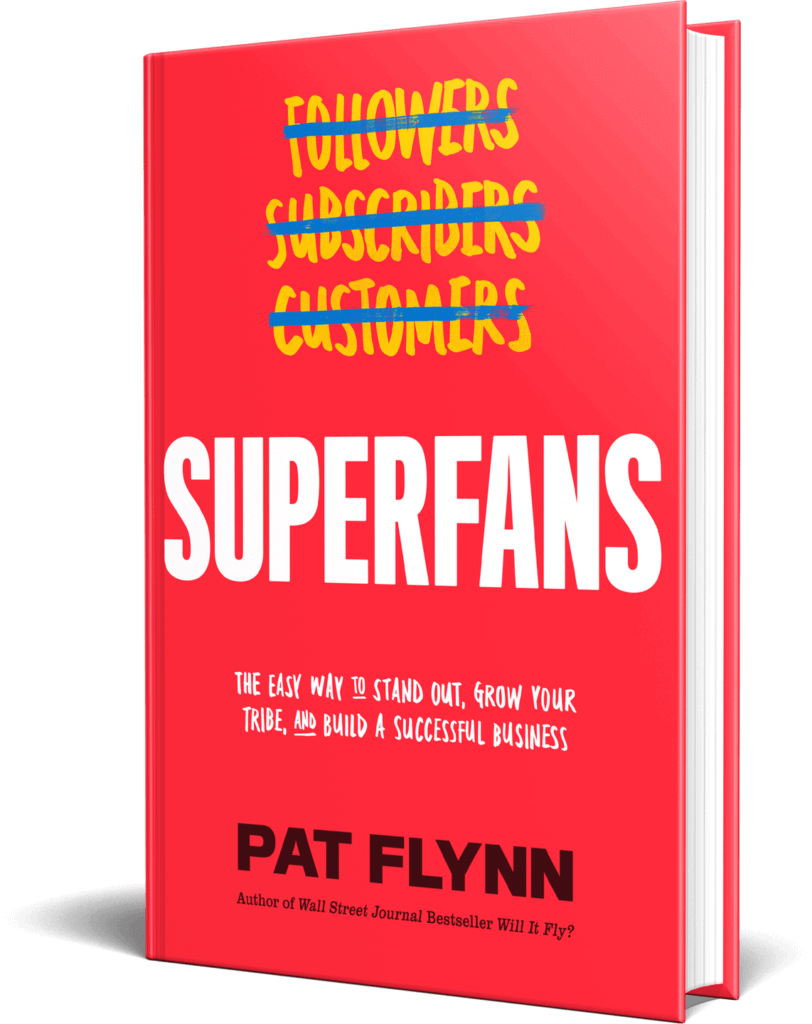
The interior of the book is gorgeous, too. Although we used black and white instead of color, the interior still features a lot of cool design elements that make it look great—and even a little easier to read.
Book Marketing Strategy #4: Host a Virtual Book Tour
The same year I released Superfans, I watched my friend Ramit Sethi pull off his own successful book tour with the launch of the second edition of his book I Will Teach You to Be Rich. He actually went on a physical book tour where he traveled to different bookstores, but I didn’t have the capacity to do a full physical book tour for either of my books.
That said, I did host a book launch party for Superfans at Podcast Movement on the day the book released, but the rest of my “book tour” for was virtual. That means I appeared on a lot of podcasts as a guest to talk about the book. It’s a strategy that worked really well for me when I released Will It Fly? and so we decided to do it again.
Here’s how we did it for Will It Fly?
The first step was to make a list of anyone who could potentially help promote the book. My team and I created a spreadsheet and filled it in with as many people as possible. We ended up with a list of about 100 people. It was a great list, but since I could only schedule podcast recordings for a couple of hours on Tuesdays and Thursdays leading up to the launch, we narrowed the list to about fifty.
We then expanded on these names in our spreadsheet, knowing it would become the tool we would use internally to keep track of our progress as we reached out to the hosts and blog authors. You can see that spreadsheet here:
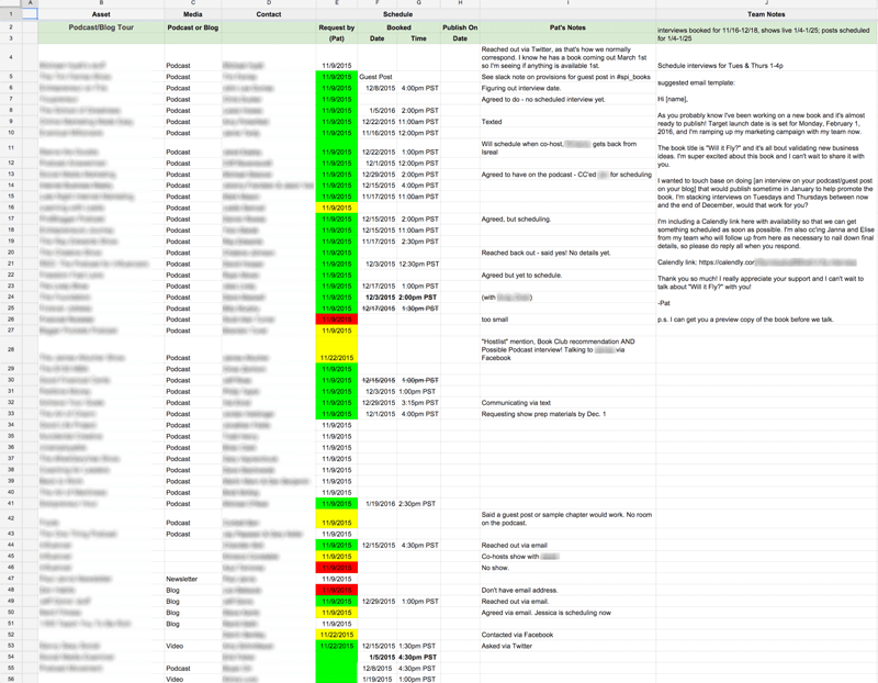
Note: I blurred out the names because this isn’t about who I reached out to, or who said yes or no. This spreadsheet was massively important. It helped us stay on the same page in regard to who had been contacted, who had yet to reply, and when those shows were scheduled to record and go live. You’ll see on the spreadsheet that there are green, yellow, and red highlights. The green means that they said yes, the yellow was a maybe, and the red was a no. Some I never heard back from. Don’t let the fear of hearing “no” keep you from reaching out.
I’m super thankful that a majority of the people I reached out to replied with an excited yes! Ninety percent of those I reached out to I had helped in some way over the years, and because of that I felt more comfortable asking for help in return. In fact, many of the names were drawn from a list that I’ve been keeping track of over time, which comprised of people who had once said to me, “If there’s anything I can do for you, please let me know.” I always keep a running list of people who have said that, because you never know when you might need the help. And I’m definitely thankful for being able to redeem some of those offers!
As more and more people heard about the book, I started to receive additional requests for interviews or guest blog posts, which is why you’ll see more than fifty entries on the spreadsheet. As it turns out, I decided to focus on podcast interviews as opposed to guest posts, because I didn’t have the time to write that many unique posts, and recording an interview was a more efficient way for me to connect with an audience.
To help with the scheduling, the best tool we used beyond this spreadsheet was Calendly. [Full Disclosure: As an affiliate, I receive compensation if you purchase through this link.]
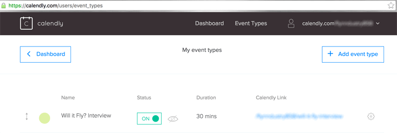
Calendly syncs with your calendar and makes it easy to schedule appointments by sharing a link. When someone wanted to set up an interview, we’d send them the Calendly link specifically for the Will It Fly? interviews on Tuesdays and Thursdays. As spots get filled in, those times become unavailable on the Calendly link, so it makes sure everything is organized and people, including myself, receive appointment reminders by email. It also asks for the Skype ID when people schedule a time. Seriously, Calendly is one of my top ten apps of all time.
Reaching Out With Video
One other thing I wanted to test was whether there was any difference in response time and promotion quality from those I reached out to via email, versus those I reached out to with a video. Video took a little longer than email so I wasn’t able to do a complete fifty-fifty split experiment, but I did notice that those I reached out to with video had a lot more energy for the promotion. I’m not sure if this is a direct correlation to the video, or to the fact that I sent videos to people I already had a strong connection with, so the experiment isn’t necessarily conclusive.
With that said, all but one person I reached out to with a video said yes, and I definitely feel like I got a stronger push from those people. The videos were not highly produced, just shot with my iPhone in my home office and uploaded as an unlisted video on YouTube. Here’s one sample that I sent to Jess Lively, someone I connected with earlier in 2015 and whose audience was perfect for Will It Fly?:
Book Marketing Strategy #5: Recruit a Book Launch Team
Something else that worked really well with Will It Fly? and that we did again for Superfans is having a launch team. In June 2019, we started working with Daniel Decker again, who managed our launch team for Will It Fly? and was kind enough to offer to help manage the Superfans launch team.
What exactly is a launch team? It’s essentially a group of people who help you promote the book at launch, and it doesn’t have to be very big. The Superfans launch team was about 500 people. They’re all superfans who got early access to the manuscript and can rally together to help support the book by writing reviews and getting people excited for the launch. In exchange, they’ll each get a complimentary copy of the book.
The big thing to be clear on here if you want to try this strategy yourself is that you cannot offer your book in exchange for a five-star review. You can offer the book and ask for an honest review, but you can’t force a person to review something in a way they don’t want to. With Will It Fly?, we didn’t ask everybody to leave a review, and some people did leave two- or three-star reviews—which is fine. But Will It Fly? did end up with mostly five-star reviews.
And with Superfans, I’m hopeful that because of the quality of the book and how helpful it’s going to be for a lot of people, most of the reviews will be five stars. I’m hugely passionate about the content in this book. It’s very tactical and very teachable—it’s a step-by-step guide on how to build your own superfans. And it’s something that’s never really been done before. I’m really excited because I tell a lot of great new stories in the book, too.
I’m very thankful for my launch team and all their help in making this book the success that I hope it will be. If you want to learn more, I interviewed Daniel in episode 198 of the SPI Podcast about the process of putting together the Will It Fly? launch team. There’s a lot of great stuff in there that will walk you through the process of building your own launch team.
Book Marketing Strategy #6: Experiment with Facebook Ads
The only paid advertising I experimented with for Will It Fly? was Facebook Ads. There are other opportunities, especially for authors, to pay for additional promotion such as on websites like Goodreads and BookBub, but I wasn’t quite ready to explore those options. With Facebook, I had the help of Mark Dawson. Mark has written several successful fiction books, which you can check out on Amazon.
He’s absolutely crushing it.
I was lucky to have started a conversation with him before my book came out to pick his brain on a number of self-publishing related tips and tricks, and he agreed to help me with my Facebook campaign.
Here’s an ad we ran related to the promotion:

I agreed to run a test for $1,000 over the course of three to four days to see what that could do. In the end, we spent a total of $1,150. Here’s how it broke down:
Expenditure
- Ads: $1,266
Income
- E-books sold through the ads: 465
- Print books: 27
- Royalties: $1,162
- Commissions: $223
- Total: $1,385
Return on Investment: 9%
That’s minimum, and doesn’t take into account purchases outside of twenty-four-hour cookie life, organic sales through boosted rank, and general increase in awareness through the ads.
Overall, Facebook advertising was worth it, but it definitely wasn’t a game-changer, at least as far as the numbers are concerned. One thing to consider, however, is that even though some people see these ads in their Facebook feed and they do not purchase directly from that ad itself, it’s another touchpoint that puts the book in their mind for a potential sell or share later on, which isn’t something that can be measured, but still incredibly important.
How did we keep track of conversions?
Well, we used an Amazon Associates affiliate link! We created a special tracking ID just for those who picked up the book through the ads on Facebook, so we could see exactly how they were converting. From there, we calculated the ROI based on units sold and royalties.
The trouble was that we didn’t know for sure what the numbers were until twenty-four hours after each day, because the Amazon Associates reporting system updates after the day is over, and that cookie is enabled for twenty-four hours. But the numbers that Mark reported above were the final Facebook campaign numbers.
Book Marketing Strategy #7: Ask Your Email Subscribers for Help
The number one thing that gave Will It Fly? the biggest boost in sales and rankings on Amazon was sending an email to my list. Here’s that email, word for word, which was sent on February 2, the day after the book was released:
Subject: Book Launch Results! (+Special Kindle Deal!)
Hi [FIRST NAME GOES HERE]!
Yesterday was launch day for my new book, Will It Fly?, and I was completely out of it! I had not slept a wink the night before since I was getting things ready for the launch. It was my first all-nighter since college!
There’s so much involved with the launch of a book—especially one that you self-publish – and I made sure to keep track of everything I did so I can report back to you on everything that happened in an upcoming blog post. That includes numbers, marketing strategies, how it was all put together, everything that went well, and everything that didn’t go according to plan.
Despite some hiccups (like the Kindle version going live much later than expected), the book launch did very well! We quickly flew to #1 Hot New Release for Entrepreneurship, #80 Overall Best Seller, and apparently overnight it hit #1 in Entrepreneurship, but I was sleeping so I didn’t catch a screenshot in time.
I just wanted to thank you for all of the incredible support. Yesterday was truly a dream come true, and to see everyone rush to get their hands on Will It Fly? made me super proud of the SPI community and how amazing you all are, and I know this book is going to help you in your entrepreneurial journey.
If you have the book and have read it already, please post a review on Amazon when you get a chance!
Special Kindle Deal! ($2.99 until Feb. 3rd)
For the next two days only (until the end of February 3rd), the Kindle version of Will It Fly? will be available for only $2.99 USD.
The price will at least double around midnight the morning of the 4th.
Additionally, I’ve enabled a setting called Kindle MatchBook, which means that if you purchase the physical book, you will be able to also get the Kindle version for a discounted price (and at the current sales price, that means for free).
Click the link below to grab your copy now before the price goes up:
Thanks so much once again, and I look forward to your thoughts and reviews!
Cheers!
Pat
—
Now, you may be thinking, “Pat, you sold the Kindle book for $2.99? Are you mad?!”
At $2.99, that’s a huge discount, especially considering the value that’s packed into this book, but the purpose of this book wasn’t to make a ton of money. It’s about getting the book into the hands of as many people as possible, who have not yet been exposed to me or the SPI brand, and that’s exactly what this promotion did.
With the price doubling in less than forty-eight hours, people were quick to get their hands on it. Here’s a graph of the Kindle book sales as a result of this promotion:
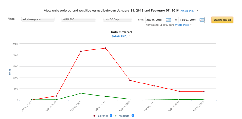
How crazy is that?
And remember, Will It Fly? became a Wall Street Journal bestseller because of the number of e-books sold within the first week, not because of how much it earned. All things considered, a WSJ standing is definitely worth giving up a few dollars upfront on each book sale.
At $2.99, the royalty isn’t all that much ($1.56 per unit), but to see thousands of people read it and glean value from it means the world to me. The WSJ standing was simply a cherry on top, and actually quite an unexpected one.
Now for some quick tips I learned while selling on Amazon.
First, Amazon encourages you to promote your book using your own affiliate link. On your website, you should absolutely give yourself extra commission by using your Amazon Associates affiliate link to promote your book. I did this on my website and podcast and earned an additional $2,500 during the month. And remember, it’s not just the one product you direct buyers to that will earn you a commission, it’s everything else included in their cart when they purchase. Check out some of these random items that I got paid a commission for:
Second, although the above is true, you’re not supposed to share your affiliate link in any email promotions. Not all people obey this rule, and yes, many get away with it, but you put yourself and your Amazon Associates account at risk by doing this. In the email I sent out, I just made sure that the link I included was not an affiliate link.
Book Marketing Strategy #8: Share the Process
A strategy I’ve used to help grow my business and pull off successful launches of many kinds is simply talking about the process. Often, some of the best marketing is simply showing how you do what you do, like with the podcast episodes and YouTube videos that I’ve mentioned. Even this guide alone is hopefully helpful in giving you an inside view of how we have launched my books and how you might pull off something similar. I have a good feeling many of you will find value in it. And if you do, the best thank you would be pre-ordering Superfans so you can get your free copy of audiobook as well!
Book Marketing Strategy #9: Work with a Publisher/Distribution
One more thing we did for Superfans that’s different from anything we’ve done before is although the book is self-published, we partnered with a company called NEWTYPE Publishing. NEWTYPE was recommended to us by a good friend, and this company helped with printing and distributing the book.
Why did we choose to work with NEWTYPE? Well, as NEWTYPE’s website says, “The problem is publishers don’t sell books, platforms do. NEWTYPE is writing a new chapter in publishing, one where authors win but aren’t alone.”
Essentially, NEWTYPE helped us with a significant part of the whole printing and distribution process, while we get to keep the rights to the book. And that’s awesome.
Instead of print on demand, we did a full print run, using estimates based on previous book sales and other data to determine how many books to order. Then NEWTYPE handles distribution to bookstores and Amazon.
They have a Manhattan-based sales team that helps push the book to all major national book retailers, chain accounts, and more than 5,000 independent accounts. So they’re fighting for the book’s placement, which is awesome. They also move very quickly: whereas traditional publishers might take twelve to twenty-four months, with NEWTYPE you can get your book printed and distributed in about six months. NEWTYPE also offers a lot of things that can help you even if you don’t have a production team like I do—things like developmental editing, copy editing, proofreading, and cover design.
At the same time, it’s still our book, so the royalties are great, and we still have control over the entire process. NEWTYPE is also very open and transparent about their costs.
It’s been a really great relationship so far, and Ryan at NEWTYPE has been fantastic at helping us understand how it all works. We’re even had the opportunity to do a promotion for getting Superfans into airports, which is something I didn’t even know was possible before with a self-published book. I’m really excited to see what happens as a result, and if you’re thinking of self-publishing your own book, definitely give NEWTYPE a look.
We’ve covered a lot of ground in this chapter and I know it can be overwhelming. Here’s the good news: everything I went over in this chapter is a combination of what my team and I did for two different book launches. That means you don’t have to do it all. In fact, you probably shouldn’t try to do all the strategies in this chapter, especially if it’s your first time launching a book.
Take another read through if you need to, and really think about what sounds like it might work best for you and your audience. Pick two or three things and start there. Remember: everything is an experiment and you don’t have to do it all. On that note, let’s continue on to the next chapter where we get into tools that will be most helpful for you on your book writing and publishing journey.
12 Tools for Writing & Publishing Your Book
We’ve covered a lot of ground in this guide, and you may be wondering at this point, What do I need to get my book written and published? And that’s exactly what we are going to cover in this chapter: the tools that you need to leverage in order to set yourself up for success with your book.
One last thing before we dig in: This is by no means an exhaustive list but it does include the tools and resources that Pat and the rest of us here at Team SPI have used and had the most success with. We also know that everyone works differently, especially with a hug project like writing and publishing a book. So review what we’re suggesting but always remember to experiment and figure out what works best for you and your process—don’t force yourself to use something just because we recommend it. If it’s not a good fit, move on and try something else.
Writing Tools
1. Scrivener (for managing your book project in one place)
Scrivener is the industry standard for writers working on books. It is a desktop application that creates files as projects inside which you can store your entire manuscript organized by parts, chapters, and subchapters, along with all of your reference notes, comments, research materials, and much more. When it’s time to compile a complete manuscript, Scrivener will export just about any type of file format you want from plain text to Word to a pdf. It also will automatically format your manuscript based on standard presets you select for the type of book you’re writing. If you’re writing a novel versus a nonfiction business book some of the page formatting with change according to standard formats for the different genres.
Scrivener has many features that makes it popular with writers, including a distraction-free writing mode, a split screen view that allows you to have different parts of the manuscript side-by-side, and the corkboard view. Corkboard view is exactly what it sounds like: a digital corkboard with index cards pinned to it—each card belongs to a section of the manuscript with title and summary. Rearranging the cards automatically rearranges the corresponding manuscript sections accordingly. It can make organizing and reordering a book so much easier than cutting-and-pasting in other word processing tools.
Now, Scrivener isn’t for everyone and if you go researching the application you may discover that just as many people hate it as love it. Fair warning: it is a robust application that does take some time to learn and get up to speed to get the most out of it. But many serious writers swear by it as the best way to organize and keep all of their book materials in one place.
2. Google Docs (for collaborating on your book and accessing it anywhere)
If you’re someone who might feel that Scrivener is a bit much for your needs then our next choice for managing your manuscript is Google Docs—and, yes, we do prefer it over Microsoft Word. Here’s why: does everything that Word can do, and it’s less bloated and more user-friendly. Not to mention that keeping your material online in the cloud allows you to access it from any device, which gives you more flexibility for when, where, and how to work on your book (as in, you don’t have to be at home working on your desktop all of the time).
Beyond those benefits, working in Google Docs allows for easy, straightforward, and streamlined collaboration. That means when you’re ready to get feedback on your book, whether that’s from a friend or you’re ready to hire an editor, you can share your files with them, set permissions in the doc to determine what kind of access they have (allow them to view only, comment, or edit), and now you are collecting all of your comments and feedback in one place instead of creating multiple versions and copies of your book that now exist all over the place.
If you don’t need or want the bells and whistles of an application like Scrivener, then using something as simple as Google Docs is your best best.
3. Post-It Notes (for organizing your book ideas)
Sometimes you need to spread out and see all of your ideas at once. Post-it Notes are a great tool for this (and if you skipped straight to this chapter, don’t miss chapter 1 where Pat goes into detail on his process for getting started on his book manuscript with Post-its).
Using Post-its to organize your ideas helps to give you a visual of the big picture, but it also engages just enough movement that can also help to trigger new ideas and different ways to think about your book topic. Imagine working on your book in front of your computer, sitting there typing away. It’s a single static environment—the page on your computer screen—with little movement required to type.
Now take a break from that picture to imagine sitting at your desk with a pen and a stack of Post-its. You write a single idea on one Post-it, peel the Post-it off, stick it on your desktop, and continue this movement until your desk is covered in Post-its. Before you know it, you’ve run out of room for all the Post-its so you start moving them from your desk to the whiteboard on your wall. You’re moving back and forth from your desk to your wall, sticking up Post-it Notes, and as you do this you begin to group the notes together in clusters that start to reveal a potential chapter structure.
This movement creates energy, you’re engaging your brain on the project in a different way, and before you know it the ideas are flooding so fast that you can’t even keep up with making new Post-it Notes for each one.
4. Rev.com (for dictating and transcribing your book)
Rev is a tool that records and transcribes audio, which you can use to dictate your book. There are several reasons why you might find dictating your book to be incredibly helpful in getting your material out of your head and down on paper. You might be someone who gets ideas out more easily if you’re talking. You may find that sections of your book that are harder to get out by sitting down to type. Or you may want to make the most of a long commute by multitasking with dictating sections of the book that you can then edit and arrange later on.
Regardless of the situation, dictating your book can be an excellent option for moving quickly through an early draft of your book. The question is once you have the audio, then what do you do? You need to have it transcribed. That’s where Rev comes in. Upload your audio online, order the transcript it’s delivered to you in twelve hours or less.
Even better is the Rev mobile voice recorder app. Record directly into the app, organize all your audio files, and select the ones you need transcribed. Once your transcript is returned you now have your book material in a written format that you can begin to work with, develop, rearrange, organize, and mold into what will eventually become your final manuscript.
Publishing Tools
5. Kindle Direct Publishing (KDP) (for publishing both print and ebooks)
If you have been in the writing and publishing space or following self-published authors who primarily use Amazon to publish and sell their books, you may know that getting a print book on Amazon used to require yet another vendor called CreateSpace. At the end of 2018, Amazon acquired CreateSpace and merged it with Kindle Direct Publishing, its publishing services for Kindle books. That means KDP now offers publishing for both Kindle and printed books.
Anywhere you read online about authors using CreateSpace is pre-2019. Publishing independently on Amazon is now all done through KDP, so you can have a single KDP account for managing both the Kindle and print versions of your book. As with CreateSpace previously, physical books published with KDP are print-on-demand (POD).
Regardless of whether you use KDP for your physical book, if you want your book on Amazon for Kindle the only way to do that is via KDP. This is an account that you or your publishing team will have to create and administer; it’s where you upload your ebook file; it’s where you manage your book listing information, royalty payments, and sales. And remember, like we talked about in chapter 5 on publishing options, KDP requires a .mobi file which is a separate format configuration from the .epub file used on other e-reader platforms.
6. Amazon Advantage (for setting up Amazon pre-orders for your physical book)
In the history of independent and self-publishing, one of the biggest mysteries and hurdles for independent authors to overcome is making their physical books available for pre-order in advance of their publish date on Amazon. It’s an option for Kindle books with KDP, but for some reason not for physical books.
The workaround for this has been to use a separate account with Amazon Advantage, which allows pre-sales on Amazon. It’s a bit of a convoluted process involving setting up the Amazon Advantage account and then submitting a support ticket request to transfer any orders from Amazon Advantage to fulfillment with KDP (formerly CreateSpace, before Amazon acquired it). Pat used this process for pre-orders with his book Will It Fly? When it came time to publish Superfans, we worked with a publishing partner who handled this process for us.
Although it’s cumbersome, it does work. And as of writing this chapter at the end of 2019 it’s currently the only way we know of for independent authors to set up pre-orders for physical books. There has been speculation that this may change now that Amazon has acquired CreateSpace, but that has yet to happen. Also as of this writing, enrollment in Amazon Advantage is currently paused. (More information on this process can be found here.)
7. NEWTYPE (for printing and distributing your book)
We don’t blame you if trying to figure out Amazon and all of its idiosyncrasies sounds nightmare-ish. If it’s something you’d rather avoid altogether, consider a hybrid publishing partner like we talked about in chapter 5.
For SPI and Pat’s most recent book, Superfans, this was our solution and we used a publishing partner called NEWTYPE Publishing. When we started working on production for Superfans, we knew a couple of things: 1. We’d need to do a print run to have copies to give away at FlynnCon1, 2. Pat wanted to do a hardcover book (instead of paperback), and 3. Pat also wanted to pursue distribution to bookstores, which would would also require going with a print run instead of POD.
Some of that could have been accomplished on our own—sure, we could have found a printer and ordered a couple thousand copies of the books. But then getting them into bookstores and on the shelf? Well, that’s a piece of the puzzle that requires a distributor, and that’s something that usually isn’t available for self-published authors.
That is why working with a publishing partner like was the perfect solution for us, because NewType handled the printing and the distribution. The NewType team has a relationship with a printer as well as retailers, and the staff to support managing the printing and selling titles to book buyers. It’s was the ideal arrangement for us: we handed over our completely edited manuscript and design template, and NewType literally handled the rest from layout of the print book and conversion of the ebook, to printing and distribution.
If you plan to self-publish your book but want the support of a publishing partner for the printing and distribution logistics, then this is the option for you. There are other hybrid publishing partners out there, as we talked about in chapter 5, but NewType is the one we can vouch for.
8. Literary Agent (for handling your international rights)
Regardless of whether you self-publish, you might want to consider a literary agent to handle international rights of your book if you’d like to see it translated and published in other countries. Even if you get a traditional book deal, your publisher will buy the rights to your book typically for a specific country or region. In the United States, for example, publishers buy North American rights, which gives them the right to distribute and sell the book in North America only.
But let’s say you have a global audience, like Pat does, and you’d also like to get your book published in Europe. That means you’d need the book translated into different languages, depending on the country—German, French, Spanish, Polish, etc. And that would require a publisher to do that translation, to print the book in that language, and distribute the book in appropriate stores.
This is where a literary agent would come into play, because these are people who specialize in representing authors in other markets. They have the contacts and relationships with international publishers. Not only that, but they also are trained to handle the legalities and the contract that would stipulate the terms you agree to in selling international rights. There are a lot of nuances to a business deal like this, and having a trained professional in your corner to make sure you’re not only getting the best deal but also covered legally is always your best option.
Marketing
9. Book Launch Team (to help spread the word about your book)
When you’re ready to release your book into the world, you want to create as much buzz as possible around the release date and one of the best ways to do that is with a dedicated book launch team. A book launch team is a group of volunteers that you recruit with an incentive, usually a fee advance copy of your book, to help promote the book during your launch week.
We’ve done this successfully for Pat’s two books Will It fly? and Superfans, and we have done it with the help of a book launch strategist, Daniel Decker. There’s a signup process and a private Facebook group for the launch team to interact with each other, and with you. The Facebook group is also where announcements can be made to the group as well as delivering assets, like graphics and messages for social sharing.
Although it’s been a help for our team to have someone like Daniel on board managing this process for us, but if you are a smaller operation then it’s definitely something you could manage on your own. You can recruit volunteers from your audience using your social platforms and email list, add them to a private Facebook group and you’re off to the races. The most important thing is to communicate with the book launch team on a regular basis, get them a copy of your book as soon as you can (this gives them something to talk about when they promote it), give them specific guidelines of what you’d like them to do, and provide them with assets they can use to post about your book.
10. Calendly (for scheduling interviews with you)
If you plan to do any interviews (podcast or otherwise) to promote your book (and of course we think that you should!), then make friends with Calendly. It’s a tool that will make scheduling so much easier and eliminate the back-and-forth of “that doesn’t work, how about this instead” emails. [Full Disclosure: As an affiliate SPI earns a commission if you purchase through this link.]
Calendly syncs with your Google calendar and allows you to set up events with preset windows of time for your availability. So let’s say you were going to be available for media interviews two days a week on Mondays and Wednesdays between 2-5 p.m., you create an event in Calendly with those parameters. It generates a link that you can send people where they will see your available times and book the appointment right online. An event gets created and added to your calendar, and that time is no longer available to others who look at your schedule via your Calendly link.
Calendly also integrates with platforms like Zoom if that’s where you plan to take your meetings, and will send the meeting details with an email confirming the appointment. The premium and pro plans allow for automated reminder and follow-up emails.
There are other scheduling tools available, so pick one and streamline your scheduling process (even beyond book launch marketing interviews). We just happen to use and love Calendly.
11. Social Media (to share about your process and let your audience know about your book)
It should go without saying that if you’re going to publish a book, you need an audience—an audience who will buy and read your book—and the most cost-effective way to do that is via social media. It’s also the best way to share your process and start talking about your book as soon as you start writing it, or even before you start writing it as Pat did with Will It Fly? (Revisit chapter 8 for more on that.)
The benefit of leveraging social media is that you don’t need to be invited on a podcast or TV show to have a platform for talking about your book. You can create a video and share it anywhere you want. You can go live on your platform of choice and host a Q&A about your book. You can do any number of things in your own feed that will help people get to know you and what your book is about. It doesn’t really matter if you are on one or all of the social media platforms. What matters is that you figure out where your audience is most active, go there, and engage with them.
12. Teachable (for creating a companion course for your book)
What happens when your book is published and people who have never heard of you buy it, read it, and love what you have to say? Awesome, right?
Yes, awesome! Except…how do you know who these people are? You don’t have a way to reach them, unless they google you and start following you. And even then, how do you know if your new followers are people who read your book?
That’s where a companion course comes in. You can use a platform like Teachable to create a free course for people who have read your book. [Full Disclosure: As an affiliate, SPI earns a commission if you purchase through this link.] You don’t promote it or share it beyond the pages of your book itself. You include the course url in the book with encouragement for people to join, like additional resources and material that compliment the book. It’s free to join, so why wouldn’t they? If you provide value in the book and promise even more in the free course, there is a good chance they will join. And then you have direct access to your readers.
Pat has done this for both of his books Will It Fly? and Superfans, and in chapter 11, you’ll read about how nearly 50 percent of people who have read Will It Fly? have joined the companion course.
Your course can be as simple or robust as you want it to be. Create a few videos where you share an extra story for each chapter. Or make worksheet downloads available. No matter what you do, give people a reason to take action beyond the book. All you have to do is make sure the course is ready to go on book launch day, that way as soon as the book is in the first person’s hands, the course is ready for them when they land on that course url.
One Final Tool: A Resource to Learn from Other Authors
The tools in this chapter are a handful of the top resources that Pat and the rest of us here at Team SPI recommend for getting the most success out of your book writing and publishing journey. But there is one thing we didn’t touch on in this chapter, which offers aspiring authors a more in-depth look at what a book can really do for you and your business. And that is learning from other experienced authors and book professionals for additional perspectives on how you can strategize and leverage your book as a true asset for your brand. We’ll dig in on our recommended resource for doing just that in chapter 12, but first we have two more chapters to cover: one on how to avoid some common book publishing mistakes and one on a final look at Pat’s book Will It Fly? as a case study of how it’s done since it was published in February 2016.
8 Book Publishing Mistakes
Most of what we’ve covered in this guide so far has focused on a lot of the positive aspects and big wins I have experienced (and that you can, too!) with the books I’ve written and published. While it’s true that my books have done well and I’ve had a lot of success with them, that’s not to say that I haven’t had my share of road blocks along the way. It’s definitely not all sunshine and rainbows, especially when it’s your first time entering the world of book publishing.
In this chapter we’re going to look at some of the things that didn’t go so well with the books I’ve published, specifically Will It Fly?. The reason I’m focusing on Will It Fly? here is that since it was my first business book, it was also the first time my team and I were doing things like offering pre-order bonuses, planing a big launch, and using CreateSpace. That means the chances of stuff going wrong or not working were higher and, thankfully, we were able to learn from that experience the second time around with Superfans, so I’ve got a few takeaways from that publishing experience to share with you as well.
So let’s get into it, shall we? We’ll start with the biggest hurdle from self-publishing Will It Fly?, and that was getting the Kindle ebook published and available on launch day.
Kindle Pre-Orders Through Amazon Kindle Direct Publishing
Kindle books are sold through Amazon’s Kindle Direct Publishing (KDP) program. It is definitely possible to set up a pre-order for your Kindle book (as stated here), but we were unable to do so for Will It Fly? because of one primary reason:
We didn’t have time.
Part of the requirement for putting a Kindle book up for pre-order is that you must upload the final manuscript file at least ten days before the launch of your book. The reason is that Amazon doesn’t want people to collect pre-orders for an e-book that doesn’t exist. With Will It Fly? publishing on February 1, this meant that we would have had to have it completed, edited, designed, and uploaded by January 21, which was impossible since the manuscript was still being designed at that time.
I personally wanted to make sure that the book looked and read nicely on any Kindle device or reader, and that was more important to me than an extra pre-sale. I figured it made sense despite having pre-order bonuses available for the paperback version, because the bonuses were for those who purchased bundles of books, and you can only purchase a single copy of a Kindle book.
Furthermore, as I learned through many conversations with authors leading up to the launch, pre-selling your Kindle book can actually hurt you more than it can help. You get all of the benefits of pre-selling a product, except for the one about all sales being reported as happening on launch day, specifically related to getting on the bestseller lists. With paperback books, pre-sold copies all report as being sold on the day that it’s published (again, specifically to the non-Amazon bestseller rankings). With Kindle, this is apparently not true. I tried to do some more research on this, but I couldn’t find any concrete information, but this is what I heard from more than one author who’d had this experience and so I took their word for it.
Turns out, I hopped over a potential roadblock to run smack into another one: the Kindle version of the book wasn’t even available on February 1 until later in the afternoon. I submitted the final files to Amazon KDP about twenty-four hours before I wanted it to go live. My goal was to have it ready by the virtual launch day party I was hosting at 9 a.m. Pacific on Friday, February 1.
I stayed up the entire night before finishing the content in the Will It Fly? Companion Course (a free course offered with the book that includes supplemental materials for an enhanced reading experience), and throughout the entire night and early morning, I constantly checked KDP to see if it had finally gone through.
By the time 9 a.m. rolled around, it still had not been approved, and I had not slept a wink. I was delirious, which you could definitely tell if you watched live on the Google Hangout and Periscope feeds. We had a good time though!
The big lesson is that I would have given myself more time for Amazon to approve the KDP file. All of the Amazon info says that they usually approve books within twenty-four hours, but it can sometimes take up to seventy-two hours. Most of the chatter in KDP communities online at the time said people were having their books approved sometimes within twelve hours, so I don’t really know what happened.
Because of this, I had to delay a book launch-related email I had ready to go out to my list because I wanted to make sure I gave people both options (Kindle or paperback) so they could purchase the book in the format they liked best.
Then, finally, at the tail end of the live stream, after refreshing KDP several times, the book was approved and the status switched from “under review” to “publishing”! It happened while I was hosting my virtual launch party live, in front of everyone and my reaction says it all!
The reaction is cued up in the video below, which is a replay of the launch party:
But there’s more. When the Kindle book was finally available on Amazon, I noticed that it was a completely separate page from the paperback book. Yes, that’s right—the paperback and the Kindle book were on two separate Amazon listings. This is not what I was expecting. But remember, I was a rookie at this, and after a panic text message to my writing coach Azul, and a search through a bunch of discussion forums, I gathered that after a certain amount of time the two listings will magically find each other and connect the pages. Phew!
Based on the titles, the author, and the description (which should be written the same for both versions of the book), Amazon eventually connects the two pages. I was also told that you can contact KDP customer service to ask them to make it happen sooner.
For me, the two Will It Fly? book pages for paperback and Kindle connected into one universal page about three hours later, and after 5 p.m. the book was finally the way I had imagined on Amazon. I was ready to shoot out the email to my list. But I decided to wait until February 2 to send it, and I included a little promo that helped the book skyrocket to the top. (I share the full email that I sent to my list in chapter 8 on book marketing strategies.)
I was super happy with the results of the Will It Fly? launch overall, and the process helped my team and me implement new things and improve on the process with my next book, Superfans. Although the launch for both books were completely successful, there are a few things I wish I had done differently with Will It Fly? and a few things I learned with Superfans that I’ll definitely do again in the future:
1. I would give myself (and my team) more time!
After setting a hard launch date of February 1, we were off to the races. It became our stake in the ground as we continued to make decisions and add new items into the mix. As a result, some things were rushed or never happened at all.
For example, all of the stuff with the Kindle launch wouldn’t have happened if we had given ourselves adequate time to get it done and uploaded. We were down to the last two days to receive final PDF files for the paperback, which was cutting it close. If there were any errors that had to be corrected, we wouldn’t have made our February 1 deadline.
Additionally, with all of the moving parts, including CreateSpace and Amazon Advantage, something could have broken or simply not worked, and it would have delayed the launch as well. Thankfully, everything seemed to work out.
With my most recent book, Superfans, I was able to learn from my mistakes with Will It Fly?. My team also had adequate time to prepare. Because we gave ourselves more time (about seven months) after the manuscript was finished until the launch date on August 13, we could focus on designing a better book, recording the audiobook ahead of time, and even booking more podcasts that I could appear on as a guest.
2. I would hire a coach sooner.
I hired a coach to help hold me accountable and really guide me through the process of getting my manuscript complete. But I ran into a few roadblocks. Looking back, there was a good three or four month period during the year I was working on the book that I feel were wasted because I wasn’t in the right mindset at the start to get the writing done—a lot of it was not believing in myself. I hear from so many readers that this kind of doubt is a big struggle for them, and I want you to know that sometimes I struggle with it too. After Azul helped me over those hurdles and I started to gain momentum, the writing flowed.
3. I would get the manuscript into the hands of select people earlier.
I didn’t have a full manuscript available until January 1 to give to the launch team and those who were potentially going to promote the book. Again, this is all related to the timeframe we gave ourselves, but if I could do it again I would have the manuscript ready at least two months before launch to allow adequate time for people to read through it, provide better feedback, and build more buzz.
4. I would create a share page.
One thing that was lacking in this campaign was a share page—a page full of assets like images, pull quotes, tweets, and email copy, etc.—that anyone could use to help promote on their own platforms. We did have a share page for the launch team, but it was very basic, and if I had the chance (and, again, more time), I would have had a much more robust page available for those who wanted to help promote the book.
5. I would collect blurbs.
Along the same lines, I wish I had the manuscript earlier so that I could’ve collected honest blurbs from folks who read the book before launch, which we could then include in the final product. I was able to get some people to read the book and collect blurbs, which you can see on the Amazon page and the first couple pages of the book, but there were a lot more people I reached out to who said they didn’t have enough time to read it.
Again, learning from Will It Fly?, for Superfans I was able to collect a load of blurbs ahead of time, over thirty of them, even before the final version of the book was designed. I sent PDF versions to several friends and colleagues specifically with the ask, early enough to give them time to read it, and most importantly, they were individual, personalized asks—not one mass email. That’s key.
6. I would keep my expectations in check.
Since Will It Fly? went on to become a Wall Street Journal bestseller, I had an expectation in my mind that it was guaranteed that Superfans would at least hit that list, if not other lists like USA Today, or perhaps even the New York Times bestseller list.
Big mistake.
Shooting for a list is not a bad goal to have—it’s important to aim high—but my expectation was that we could at least hit one list guaranteed, and after the launch, when I saw that we didn’t make any of the lists, I felt a wave of disappointment.
Thousands of people got the book in their hands, read it, took action and have left some of the most tremendous feedback for any piece of work I ever offered. Reviews came flying in that were raving about results people have already gotten, even just after a day or two with the book.
Yet, in the back of my mind, I was disappointed. Lame.
The true motive of writing a book should be to get those results for your readers, to get that positive feedback, and to deliver value to your audience. That can happen regardless of any list that the book may end up on. My expectation clouded the real success of book, and that was a shame.
In the time since the book has launched, I’ve been able to zoom back out and truly appreciate the body of work my team and I created in Superfans, and realize that it is the best book I’ve ever written, and one that people are sharing on their own with their colleagues and friends with the highest of praise, and I’d rather have that than a book on a list which, in most cases, could be gamified or manipulated anyway.
That’s not to say I don’t think there’s never a chance this book could end up on one of those lists. Several of my favorite books, like The Miracle Morning by Hal Elrod, started off slowly and then ramped up to incredible viral success later. Listen to his interview on the SPI Podcast to learn more about how that all happened for him, including now how he sold half a million copies in Brazil alone, just to give you some perspective on just how massive his reach is now, even after selling less than 4,000 copies in the first week.
7. I will keep experimenting with publishing options.
With Superfans, we wanted to experiment with something that would allow us to have a much better quality book and wider distribution, something that was limited by promoting solely through Amazon’s CreateSpace program (now part of KDP).
We were introduced to a company called NEWTYPE Publishing, which would allow us to have complete control on the design and feel of the book and the overall quality, plus give us connections to bookstores like Barnes and Noble and even airport bookstores. NEWTYPE also handles the listing on Amazon for us.
By providing a lot of what a traditional publisher could provide, but still keeping a majority of the royalties for the book (NEWTYPE take 30%, I keep 70%, versus a traditional publisher where you could end up with just pennies per book sold after the book has earned back its advance with sales), it seemed like an amazing opportunity, and guess what—it was.
The experience with NEWTYPE was absolutely positive, but it was also a learning experience, for sure. Since they control distribution, we have to go through them to get reports on how the book has been selling. Additionally, payments that come through are not as instant as they are when you control the process entirely yourself. Instead of getting a payment from Amazon within the same month as a sale, I don’t see any payments for six months. That’s not terrible, and in the traditional publishing space this is not uncommon at all, but it’s definitely a massive difference compared to Will It Fly?, where payments came in monthly soon after the book was launched.
Distribution has been amazing, though. Superfans ended up in Barnes and Noble and some other book stores. And we paid a little extra for distribution into airports, which was probably one of the coolest experiences I’ve ever had—being in an airport and seeing my own book. I’ve been getting a lot of tweets and Instagram messages from people who have been coming across the book, too:
8. I will continue to include short exercises to help readers with big results.
At the end of each chapter in Superfans, I include a small exercise that gives the reader a call to action specifically related to the chapter that can help them get results based on what they learned. Almost every person I’ve talked with who has read Superfans has made a positive comment about those exercises, and honestly they were a last minute addition that felt, to me, like an add-on that wasn’t completely necessary.
Boy, was I wrong. They are absolutely vital.
If possible, and if it makes sense, definitely consider adding exercises or action-items within your book, like at the end of each chapter or throughout. It reminds me of Tim Ferriss’ Four-Hour Work Week, and how he had similar exercises and challenges at the end of his chapters, which was very impactful for me personally.
You need to be very clear and direct with what your readers need to do, and including exercises can be an easy way to give people quick wins in your book, even before they finish the last page. Small quick wins build a habit for your reader, one that lets a small success build on the next, which could ultimately help them end up with a complete transformation by the end of the book. And you may earn a lot of praise for you and your work. If you check out many of the reviews on Amazon for Superfans, you’ll see a lot of the reviews mention the exercises.
The biggest overall lesson that I have learned with my experience publishing books is how much I often limit myself. Back when I was working as an architect, I never would have guessed in a million years that I could publish a book, let alone one that gets into the hands of thousands of people and earns a spot on a bestseller list.
These book launches have pushed me to believe that I am someone who can make a huge difference in this world. I look forward to serving you more in the future with even bigger and better projects, and until then, I will keep promoting both Will It Fly? and Superfans because I’ve already seen the results they have had on the multitudes of people who have read them.
Speaking of results, the next chapter covers just that: a deep-dive look at how well Will It Fly? has done in three-plus years since it’s been published.
Self-Publishing Case Study: A Closer Look at the Numbers Behind 2016 Bestseller Will It Fly?
In February 2016 I published my first business book, called Will It Fly? How to Test Your Next Business Idea So You Don’t Waste Your Time and Money. When I was close to finishing the manuscript, my author coach (and more than anything else, accountability coach) for the project, Azul Terronez, said something that surprised me:
“It’ll be fun to see how many books you sell. You might even get on some of the bestseller lists.”
When I made the decision to self-publish Will It Fly?, I also made the choice to not worry about getting on the bestseller lists, because I didn’t think it was possible as a self-published author. After some research, however, I found out that it is possible, but it’s no easy task. After even more research, I realized just how ambiguous these bestseller lists can be, and what I learned became a real turn off.
You might think that a bestselling book is one that sells the most copies, but that’s not exactly true. It’s a lot more complicated than that, especially when you get into the realm of the New York Times or Wall Street Journal’s bestseller lists, which take into account books that are reported through Nielsen BookScan, which doesn’t include all books that are sold depending on where they are sold.
Yeah, it’s weird.
All I knew was that because my book wasn’t going to be distributed in bookstores at first, I was essentially disqualified from hitting the New York Times bestseller list.
The Wall Street Journal and USA Today lists were still up for grabs, but quite honestly making the lists never became the primary goal—and it never should be. Yes, making the lists ultimately means more authority and more money (for future book deals, speaking gigs, etc.), but the system can be gamed, and I didn’t want to do it that way.
I wanted to write a great, timeless book that would help as many people as possible. If I happened to make a bestseller list doing that, then great. If not, well then I will still have created something amazing and I don’t need a list to tell me one way or another.
As Tim Grahl said about the craziness of the bestseller lists in his post “The Truth about the New York Times and Wall Street Journal Bestseller Lists”:
“The only answer to this debacle is to stop worrying about hitting the major bestseller lists. At this point, the results are so far outside of an author’s direct control, that it doesn’t make sense to make these lists a goal anymore. Instead, focus on the reader.”
And as many of you know, with the focus of my reader in mind, I actually did end up making the Wall Street Journal bestseller list, which I’m incredibly grateful for.
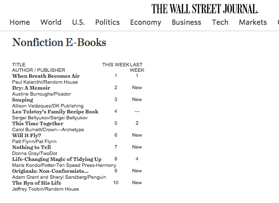
So yes, it is possible!
As of this writing, it’s been about three and a half years since Will It Fly? came out, and this chapter shares all the numbers we’ve tracked over that time, including ebook sales, paperback sales, audiobook sales, and audiobook bounty unit sales. (I’ll explain what that is in a minute.) I’ll also share details on foreign royalties, as well as income generated beyond the book based on collecting emails and driving people into a related course.
For those of you who have been around for a while, this chapter may remind you of my older income reports. In the first nine years of Smart Passive Income, I did a detailed monthly income report for all my businesses, all my products, and all their earnings. But eventually there were so many pieces involved that I couldn’t go into much detail about any single one of them. I started to feel like the income reports were becoming less helpful.
So I stopped doing them. But I think there’s still potential value in this kind of report. So I’ve decided to do occasional income reports based on specific products or campaigns. That way, I can go deeper to understand how that product or campaign has performed and establish some useful takeaways.
With all that said, let’s dig into the Will It Fly? numbers! These numbers are all accurate as of the end of May 2019.
The Bread and Butter: Will It Fly? Ebook and Paperback Sales
We’ll start with ebook sales, which came from almost 20,000 units. They were sold mostly at $6.99 each (because I offered limited-time discounts through Amazon from time to time), generating $32,893.93. But although there were more ebook units than paperback units sold (as you’ll see in a second), we made more money from the paperback because of the royalty rates. At $7 per ebook on average, we got 70 percent and Amazon took 30 percent.
Speaking of the paperback, we sold 13,556 units at a retail price of $16.95. However, Amazon likes to play around with price points, and because of that, we weren’t always earning royalties based on $16.95 for each unit sold. Amazon changes the price automatically via algorithms to optimize it for sales. So depending on how Amazon prices it, the royalty amount fluctuates.
Paperback sales came to $62,495.48. There were also cases where I spoke at conferences and the organizers bought multiple copies for their attendees; there were also awesome fans who wanted to support me with bulk orders of the book. These numbers, which weren’t counted in the main paperback sales because they were handled directly through CreateSpace, totaled about $3,500.
Paperback and ebook sales combined came to roughly $100,000. Not too shabby!
Then we have Kindle Unlimited royalties. Authors who self publish on Amazon through KDP also earn a 70 percent royalty on books priced between $2.00 and $9.99 and a 35 percent royalty on books that cost more or less than that. With Kindle Unlimited, however, you’re eligible for royalty payments from Kindle Unlimited and the lending library. That means you get a share from a global royalty fund, depending on the size of the fund each month and on how much of your book people have actually read. Since Will It Fly? was released, I’ve earned about $4,000 from these royalties.
Really Taking Off: The Will It Fly? Audiobook
With the audiobook, we sold 19,389 units. This is where things get really interesting. We definitely sold more Kindle and paperback copies, but with the audiobook, I get a bigger cut of each sale—about $5 per sale. As a result, I’ve made just about the same with audiobook sales as I have with Kindle and paperback sales: $96,945. That’s pretty amazing, and it shows you the power of offering an audiobook. I’m especially thankful that I’ve kept the rights to my audiobooks and will continue doing that moving forward, including with my newest book, Superfans.
You can make a lot more money on the audiobook than other book formats—which is why a lot of people wondered why I was giving away the audiobook version of Superfans for free with pre-orders. Yes, we gave away the audiobook during the pre-launch, which means we might end up losing money on it. But it’s more important to me to offer a ton of value and give people an incentive to pre-order the book.
Pat Flynn, Bounty Hunter
Now, let’s talk bounty units. What are bounty units, you ask? Well, when you have a book on Audible, if you can convince someone to purchase an Audible subscription and they make your book their first book, you get a $50 bounty. What’s especially nice is Audible gives a person their first credit for free when they subscribe. So if they use that free credit for your book, you’re going to get $50 if they continue their subscription.
I was able to sell 490 bounty units at $50 each, which is $24,500. That, added to $96,000, brought total audiobook sales to $121,455. Total ebook sales (if you also count the Kindle Unlimited royalties) came to $36,981.81, which is far less than the audiobook sales. So when it comes to digital audio versus digital print, there’s the possibility for almost a four-times return if you prioritize the audiobook.
Breaking the 50K Unit Barrier
That means total book earnings from the self-published book, with 52,166 units sold, came to $224,432.29. We broke 50,000 unit sales, which is really cool. Total earnings per unit was about $4.30, both audio and digital and paperback considered. A quarter million dollars is not bad, especially when you consider that sometimes royalties for traditionally published books don’t get to that level! Those royalties, on average, are in the four-, maybe five-figure range. But we definitely made a lot more money from the book alone by self-publishing, which was amazing.
That said Will It Fly? wasn’t only a self-published book. Yup, there’s more to the story . . .
Will It Fly Across the Ocean? Yes!
Then there’s total royalties from foreign rights. That’s right, Will It Fly? is international! I worked with an agent who helped me sell the book to traditional publishers across the sea in a few different countries, including Korea, Vietnam, Romania, Taiwan, and Poland, for a total of $19,600 in advances. Here are some pictures of the covers of the book as it was published in a few of those places.
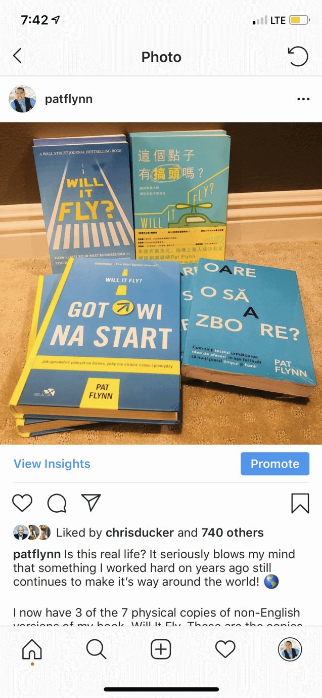

Because these versions were published by traditional publishers, I didn’t have any say in the book cover design or any of that stuff. I just sold the book to them and they made it happen. But it’s been really cool and gratifying to see the book expand beyond the US, with the various awesome cover designs.
I noticed, especially in Poland, that a lot of people have responded really well to Will It Fly?. They’ve talked about the book using hashtags and tagged me on Twitter and Instagram.
Serving and Selling Beyond the Book
All in all, the book itself has generated $244,032.29. However, book sales are just one group of transactions related to the book. There are other ways to use a book to make money and serve your audience. As any good business owner knows, a book can be treated as the first step in a process to generate more sales and ultimately help more people, which can help generate even more sales.
Beyond the book, there are a couple interesting notes to share. First, I created a free companion course that I linked to in the book. The Will It Fly? Companion Course has allowed me to collect email addresses so I can stay in regular contact with my readers. The beauty of this companion course is that although it’s free, it’s still really valuable to the reader. The course is kind of an obvious next step for someone who’s read the book and who wants to get access to more tools and more resources. The course was created using Teachable, and it took about a day and a half to put together. It’s not designed to help people on its own, but when combined with the book it definitely adds value.
At this point, 26,680 people have enrolled in the Will It Fly? Companion Course. That means more than half the people who read the book have agreed to share their email addresses with me.
This is a HUGE deal. Let me repeat that:
More than half the people who read my book gave me their email address.
(This number doesn’t include people who purchased the book in foreign countries because I’m unable to track those figures. It’s probably less than 50 percent overall, but very close to 50.)
One of the most important reasons to create a course or some other way to collect email addresses is Amazon (or any retailer, for that matter) doesn’t give you your readers’ email addresses. In particular, I’ve used that list to help solicit reviews for the book. We’re approaching 800 reviews on Amazon right now, which is amazing, and more than some other popular books by better-known authors. So thank you to everyone who has left a review. And if you’ve read Will It Fly? and haven’t left a review, I’d love to know what you thought of it.
Will It Fly? Led to One of My Most Popular Courses
Collecting email addresses has also helped generate additional sales from another course I created. That course, Smart From Scratch®, came about as a result of a request from many Will It Fly? readers who said they wanted to go deeper.
I opened Smart From Scratch initially to beta testers for $147, and it’s currently available for $249.
Overall, 1,684 students have enrolled in Smart From Scratch, which has generated $215,308.71. It’s been amazing to see how the book became the first step that led so many people to want to go deeper and get access to step-by-step tutorials, specific examples, and support and accountability through community and office hours.
The Will It Fly? Recipe for Book Success: Answer the Burning Questions
The grand total of earnings directly and indirectly from Will It Fly?, from self-publishing the book, selling it overseas, and selling the Smart From Scratch course, came to $459,341. I’m extremely happy with that, and it’s been really neat to go back in time and see how this book has performed.
I hope you find this inspiring as you build your platform, because the platform I’ve built is definitely the reason this book has been so successful. Will It Fly? wasn’t a viral hit like Hal Elrod’s Miracle Morning, which tackles some of the fears and issues people encounter when they want to start a business or change their life, and has really taken off. But Will It Fly? has still been a big success, and I’m really happy with how it’s done.
This brings me to why I believe this book has become such a success, and that’s because it answered some of the most burning questions my audience was asking. The content for the book was based on the answers to a survey I did in 2014, combined with a number of conversations and questions on social media among my audience about what they needed help with. And they told me exactly what they needed help with. They didn’t know where to get started. They didn’t know how to pick a niche. They didn’t know how to do market research. They were afraid of losing money and wasting time. Hence: Will It Fly? How to Test Your Next Business Idea So You Don’t Waste Your Time and Money.
The Numbers for Will It Fly?
Here’s a detailed rundown of all the numbers shared in this chapter:
*Published February 2016 | Figures accurate as of May 31, 2019
- Ebook Sales: 19,221 units (at $6.99 each) = $32,893.93
- Paperback Sales: 13,556 units (at $16.95 each) = $62,495.48 (~$4.61 per book royalty)
- Kindle Unlimited Royalties: $4,087.88
- Audiobook Sales: 19,389 units (profit $5 per sale) = $96,945
- Bounty Units: 490 ($50 each) = $24,500
- Total Audiobook Sales: $24,500 + $96,945 = $121,455
- Total Ebook Sales: $32,893.93 + $4,087.88 = $36,981.81
- Total Paperback Sales: $62,495.48
- Total Bulk Paperback Sales (from Conferences and others): $3,500.00
- Total Book Earnings (Self Published): $224,432.29
- Total Units Sold: 52,166
- Total Earnings Per Unit: ~$4.30
Royalties From Foreign Rights
- Korea: $10,000
- Vietnam: $1,200
- Romania: $1,000
- Taiwan: $5,600
- Poland: $1,800
- Total Foreign Royalties: $19,600
- Total: $244,032.29
Beyond the Book
- Emails Collected via Will It Fly? Companion Course: 26,680 enrolled on Teachable (51 percent conversion rate!)
- Smart from Scratch Course (Will It Fly? Leads into Smart from Scratch. Note: Not everyone in SFS has read Will It Fly?, but it teaches the same material, in way more depth, with step-by-step examples and accountability, community, and office hours): 1,684 students enrolled, $215,308.71 in earnings
- Grand Total: $459,341.00
Every Book Is an Opportunity to Serve More People
Finally, a big thank you to everyone who’s supported Will It Fly?. This book is proof that you can serve and sell at the same time. And a book is a great way to do that, because of all the ways you can connect it to other opportunities and offerings, like your email list, courses, coaching programs, and other products you can provide to better serve your audience.
This book, along with everything that’s happened in the wake of it, such as the companion course and Smart From Scratch, has been another SPI experiment that has helped me learn and grow. I’m very thankful for it, especially the fact that the audience is what has made it the success that it is. I’m hoping for similar success, if not more, with Superfans, not just in terms of sales and revenue, but how it can help people.
I know from experience that building superfans and creating amazing experiences for your fans is the best way to futureproof your business. It’s the not-so secret secret to success in business. I think every business, no matter its size, can benefit from creating superfans. Even if you’re just starting out, learning these things up front is going to help you stand out. It’s going to help you tackle or avoid a lot of the technological and competitive challenges out there right now.
So Team Flynn, you’re amazing. Thank you for your support of Will It Fly? and everything else I do. I hope this chapter is eye-opening and helps you see all the possibilities that exist for you with a self-published book. If this guide has convinced you that the time is now to write and publish your own book, then click through to the final chapter where you can learn about a resource to help you with your next steps.
Take Your Book Publishing to the Next Level
We’ve covered a lot in this comprehensive guide to writing and publishing your book. You might be wondering what more we could possibly have to tell you—and you’d be right. We’ve pretty much exhausted the collective SPI knowledge bank on book publishing.
But here’s the thing: we’re not the only ones who know a thing or two about book publishing and how to leverage your book as an asset in your business once it’s published. There’s a host of other authors and publishing experts out there with more information than you could ever know what to do with. The trick is knowing who these people are and finding out how you can learn from them.
This is where the resource we have to recommend for taking your book publishing to the next level comes into play!
Remember Coach Azul, Pat’s writing coach who helped him with Will It Fly?, his first book? Azul and his partner Steve Vannoy have created an incredible program called the Authors Who Lead Summit, a virtual conference featuring thirty-five authors and publishing experts who reveal their secrets to publishing a book and using it to grow your influence, increase your authority, and, yes, even make more money.
Why We Love the Authors Who Lead Summit
This summit is designed to give you access to a host of world-class best selling authors and experts who share powerful tips, tricks, and strategies to help you write a best selling book that people will love. Each of these speakers normally charges consulting rates anywhere from $500 to $2,000 an hour, which demonstrates the value of what they have to share.
In addition to all this goodness, because of Pat’s experience working with Azul to turn Will It Fly? into a Wall Street Journal bestseller, he can vouch for the level of quality of Azul’s services and the results they produce for his clients.
What the Summit Covers
There’s such a wide range of topics covered in this summit that any author at any stage can find something to help them regardless of where they are in their book publishing journey. It really is the only place we know of where you can learn about everything from writing effective book descriptions, staying in the top 100 of all Amazon books, and the secrets to bestselling books to getting featured in almost any media outlet, growing your email list, and paid advertising for authors.
Here’s a brief look at some of the topics covered in the Authors Who Lead Summit, where you’ll learn how to:
- Write book descriptions that sell
- Get featured in almost any media outlet you can imagine— think Huffington Post, Inc. Magazine, Fast Company, CBS, ABC News…
- Use your book to grow your side hustle and make more money
- Amplify your reach
- Get noticed by influencers like Brené Brown and Seth Godin
- Harness bestselling book launch strategies
- Improve your productivity as an author
- Land speaking gigs, including TEDx and many others
- Stay in the top 100 of all Amazon books
- Run effective Instagram and Facebook Ads
- Overcome fear and self-sabotage
- Use your book to support a movement
- Unlock the secrets behind bestselling books and bestseller lists
- Grow your email list as an author
- Get booked on podcasts to promote your book
- And much, much more
All these topics are covered by leading experts in the online business world—names you’ll recognize like Alexia Vega, Chris Ducker, Charlie Hoehn, Richie Norton, Jadah Sellner, Dana Malstaff, and others. And, yes, even Pat Flynn himself, who shares his own advice about how to create superfans for your book and business.
A Special Deal for SPI Readers
If you’re ready to get access to all of this knowledge and expertise in one place, then follow this link to sign up and get instant access to videos, audio recordings, worksheet downloads, transcripts, and an action playbook. SPI readers get access to a free virtual summit so that you can see what Authors Who Lead has to offer, so click here to join. [Disclaimer: this is an affiliate link and SPI earns a commission if you make a purchase.]
With the information you’ll learn from the Authors Who Lead Summit plus what you’ve already read in this guide, you will be more than ready for your own journey of writing and publishing your book. When your book is published and out in the world—when, not if!—we would love to know about it, and we can’t wait to hear about all of the amazing lives you will change with your book. Here’s to your success as a future author!
Part of the SPI Community

The Superfans System
A five-level roadmap that shows you exactly what to focus on, whether you’re just starting or already growing, so you always know your next step.
No more scattered tactics. No more random courses. The Superfans System organizes your entire creator journey from getting discovered to building a business people actually support.
Five clear levels. Proven frameworks. Real community.
Everything you need to go from invisible to profitable, without the guesswork, the overwhelm, and without doing it alone.
Here’s what changes when you follow the system
Stop Guessing (And Know Exactly What to Work On)
Start Seeing Real Progress (Not Just Spinning Your Wheels)
Build Superfans (Not Just Random Followers)
Know How to Monetize (Without Feeling Salesy)
Never Feel Alone In Your Creator Journey
Build a Business That Lasts (Not Just Another Failed Attempt)