 David Grabowski
If you’re of a certain age—let’s say 35 or older — you probably remember the awe and immersion you felt the first time you spun up Netscape Navigator and visited your favorite brand’s business “website.”
Now fast-forward to this age of AI, Uber, Roblox, Meta, Snapchat, and so much more… And guess what? A website is still the best way to share your brand with the world.
That’s true whether you’re a mega brand or a humble creator, solopreneur, or small business owner. Decades on, a website still provides unparalleled creative flexibility and control over your brand. It’s a place where visitors can learn more about you on your terms. A great website helps you tell your story, build trust, and even create community and fans for life.
Today we’re sharing a primer on branding and website design for online creators and entrepreneurs. We’ll walk you through how to design a website for your brand, whether you’re a creator, solopreneur, or small business owner with a team of employees.
This article won’t function as a step-by-step guide to launching a website or go into too much depth on the topic of branding itself. (For that, The SPI Beginner’s Guide to Branding can help you define your brand’s mission, vision, and more, and decide if it should be a personal brand or a company brand.)
Rather, this is a field guide to designing a website that puts your brand front and center and connects with your target audience.
Why you need a branded website
So why a branded business website? Along with your email list, a website is a must-have when you’re starting out building your brand. Like an email list, you have more creative and administrative control over a website than you do your presence on other platforms like Facebook, Instagram, or Etsy. And with the exception of rare service interruptions or security breaches, your site is much less likely to disappear the way a social media account can be banned or suspended.
Your branded website is like your home base, a focal place for shaping your brand image and narrative. At SPI, we recently revamped our website to focus on our core focus of community building and make it cleaner and easier to navigate.
Here’s what a well-crafted small business website can help you do:
- Control your brand: A website gives you full control over how you show your brand to the world, without the creative restrictions of third-party platforms. It also diversifies your online presence, reducing dependence on any single platform.
- Build trust: A well-designed website lends an air of professionalism and legitimacy to your brand, instilling trust.
- Own your content: You own and control the content on your website, reducing the risk that algorithm changes or platform shutdowns will hurt your content’s reach and visibility.
- Make money: You can use your website to promote and sell products and services or run ads.
- Build community: Websites offer a dedicated space for building a community and a following. You can capture newsletter and email-list sign-ups, and even link to your own membership community.
- Showcase your work: Use your website to share case studies, testimonials, and portfolios of your work with your audience.
- Understand your audience: Website analytics provide valuable data on user behavior, helping you better understand your audience and optimize your content to reach them.
Will my business idea work?
Enroll in our free course, Smart From Scratch®, and you’ll get:

A clear understanding of your target audience

Ideas on how to serve your audience

Your roadmap forward
Smart From Scratch® is a part of the SPI Community. Access the free course and start your entrepreneurial journey today! Learn more about Smart From Scratch®.
Your website should express your brand personality
When a lot of people hear the word brand, they think logo. And true, a logo is a key part of your creator or online entrepreneur brand — but your brand is also a lot more than just a snazzy graphic. Since your website is your home base, it’s the best place to convey the essence of your brand through the following key elements:
- Clear purpose: Define your unique value and why you exist. At SPI, we’re upfront about our why — our mission, vision, and core values.
- Color scheme: Utilize a maximum of four brand-reflective colors. Align colors with professionalism; avoid mismatch. Explore color psychology—the study of how colors affect perceptions and behaviors—for guidance.
- Tone of voice: Beyond aesthetics, your branded business website needs a distinct voice — a tone that informs all your written content. Adapt your tone to your personality, niche, and audience, keeping it approachable and jargon-free.
- Tagline or motto: A concise, memorable tagline helps convey your brand identity and value in bite-size form. It’s a little detail that can matter a lot!
- Signature font: Choose one or two readable fonts that reflect your personality, for consistency across everything you write and to bridge your brand’s visual identity with its written one.
- Unforgettable logo: Last but not least, an eye-catching logo provides instant brand recognition. Consider enlisting a graphic designer for this one.

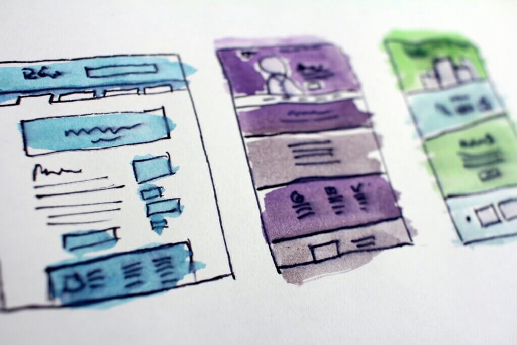
Optimizing the visual experience of your online business website
For the most part, visitors will experience your website visually, so there are a few more important considerations when it comes to your site’s visual assets. Make sure the images, background designs, and other visuals you use on your site are:
- Relevant to your brand and content: This may seem obvious, but your website visuals should make sense in the context of your brand and the surrounding content. Each visual asset should complement and enhance the content it accompanies and align with your brand’s identity, reflecting its values, personality, and messaging.
- Strategically placed: Place visuals purposefully to guide the user’s journey and emphasize key messages. Consider the flow of the website and how visuals can enhance storytelling.

- Consistent in style: Maintaining a consistent visual style across all images creates a cohesive and harmonious look and helps with brand recognition. Use those brand colors!
- High quality: Use high-resolution, professional images; grainy or pixelated ones can detract from your brand’s credibility.
- Accessible: Not all of your visitors will be experiencing your branded business website visually, so ensure that any visual assets are accessible by adding descriptive alt text to all of your images.
- Optimized and responsive: Visual assets should adapt well to various screen sizes, particularly on mobile devices. They should also be compressed to improve loading times (and search engine rankings).
- Legal: All images should be either original, properly licensed, or fall under fair use. Respect copyright laws, and get permission if you need to!
- Timeless: As much as possible, choose visuals that can evolve with your brand rather than trends that might become outdated.
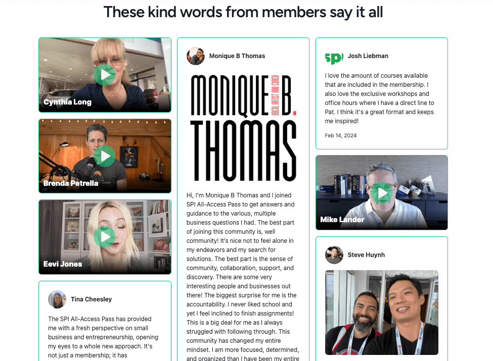
- Human: Human faces and expressions can create a stronger emotional connection with the audience, so incorporate images that feature people.
![Screenshot from the SPI community: "Ready to find [crossed out] join your people and level up?" Smiling faces decorate the page.](https://www.smartpassiveincome.com/wp-content/uploads/2024/03/humans-1024x509.png)
By making sure the visual and written experience of your website is consistent, professional, and aligned with your brand identity and voice, you’ll foster a sense of familiarity and trust with your audience.
A great creator website needs a great user experience: Layout and navigation
Your website isn’t just a static display; it’s an interactive experience for your audience. Once you’ve established the key brand elements your website needs, from your brand’s purpose to its voice, tone, and visual identity, it’s time to start designing the actual site layout.
As you’re choosing a layout, think about what will best convey your brand identity and message while making things as seamless and intuitive as possible for your visitors to navigate and find what they’re looking for. Here are some popular layout options to consider:
- Single-Column: Clean and straightforward, with a single column for easy navigation.
- Grid: Organizes content into a visually appealing grid structure, suitable for showcasing multiple items efficiently, like portfolios or product displays.
- Magazine or Blog Layout: Mimics a magazine or blog with multiple columns — well-suited for content-heavy websites.
- Hero Image or Video: Features a striking image or video at the top, capturing immediate attention and often used for product showcases or setting the brand tone.
- Split Screen: Divides the webpage into two distinct sections, providing a modern and visually appealing design with room for creative elements.
- Parallax Scrolling: Creates a dynamic scrolling experience with background elements moving at different speeds, adding depth and interactivity.
- Card: Presents content in modular and flexible cards, promoting visual hierarchy and easy organization, suitable for various types of information.
- Full-Screen Background: Incorporates a full-screen image or video background for a visually immersive experience.
A quick note on navigation: Whatever layout you choose, your users’ ease in navigating your site will determine how long they stick around and whether they’ll find what they need—or if they’ll get frustrated and give up. You can also help people navigate your branded website through careful placement and organization of menus and footers.
The strategic content your website needs
You’ve figured out your brand’s visual identity and voice and chosen a layout for the site. Now you need to fill it with useful content that tells your visitors who you are, what you do, and how you can help them!
These are some of the key pages to consider for your branded business website—some are must-haves, while others will depend on your business and offerings:
- Home Page: The home page should offer a snapshot of your brand, enticing visitors to explore further, communicating your unique value proposition, and guiding users to key sections of your website.
- Blog: Beyond promoting your products or services, blogs are still a popular way to share valuable content that positions you as an authority in your niche.
- Podcast Page: If you have a podcast, you should definitely have a dedicated page for it on your site. Although your podcast can technically exist without a website, a podcast page can promote your show and help listeners learn more about your brand and offerings.
- Credibility Section: Testimonials, case studies, and press coverage showcase the positive experiences of others, establishing your brand’s credibility and reliability and building trust. This content can live on its own page or be placed strategically at different places on your site.
- Product/Service Pages: Each product or service page should provide detailed information, benefits, and a compelling call to action (CTA).
- Brand Story/About Page: Your audience connects with the people and the story behind your online business. Use this page to communicate your mission, values, and the journey that led to the creation of your brand.
- Shop Page: If you want to use your site to sell things, you’ll need a shop page with easy navigation, clear product categorization, and a streamlined checkout process.

Get superfans secrets in just 5 minutes, for free
Our weekly newsletter helps online entrepreneurs break through mental blocks, blind spots, and skill gaps. It’s the best 5-minute read you’ll find in your inbox.
Free newsletter. Unsubscribe anytime.
Join 100k+
Subscribers
Examples of online creator and entrepreneur branded websites
For a little inspiration, here’s a selection of great branded business websites created by online creators and entrepreneurs just like you! These folks all happen to be members of our SPI Pro community, which you can learn more about at SmartPassiveIncome.com/community.
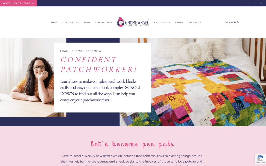
Gnome Angel
Ange Wilson’s quilting-based creator business website has a strong, vibrant visual identity based around a palette of pinks and blues and a playful header font. The Gnome Angel value proposition greets you as soon as you open the home page, and as you scroll you learn about Gnome Angel’s resources and products via a “patchwork” design style that evokes a quilt. The “sticky” navigation menu persists as you descend the home page, providing easy access to the rest of the site.
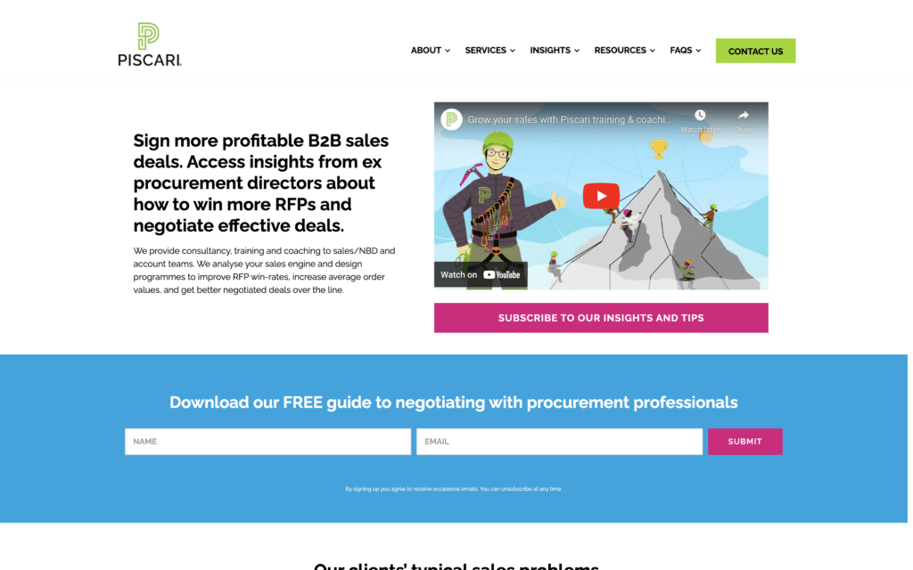
Piscari
The Piscari site is a company brand website with a simple, clean, functional home page that serves as an About page for the company and its founder, Mike Lander, with a link to join the Piscari email list at the bottom. A top nav menu that displays on every page makes it easy to learn more about the company, its services, and other resources. The “Contact Us” button, framed in bold green, highlights the main call to action visitors are encouraged to take.
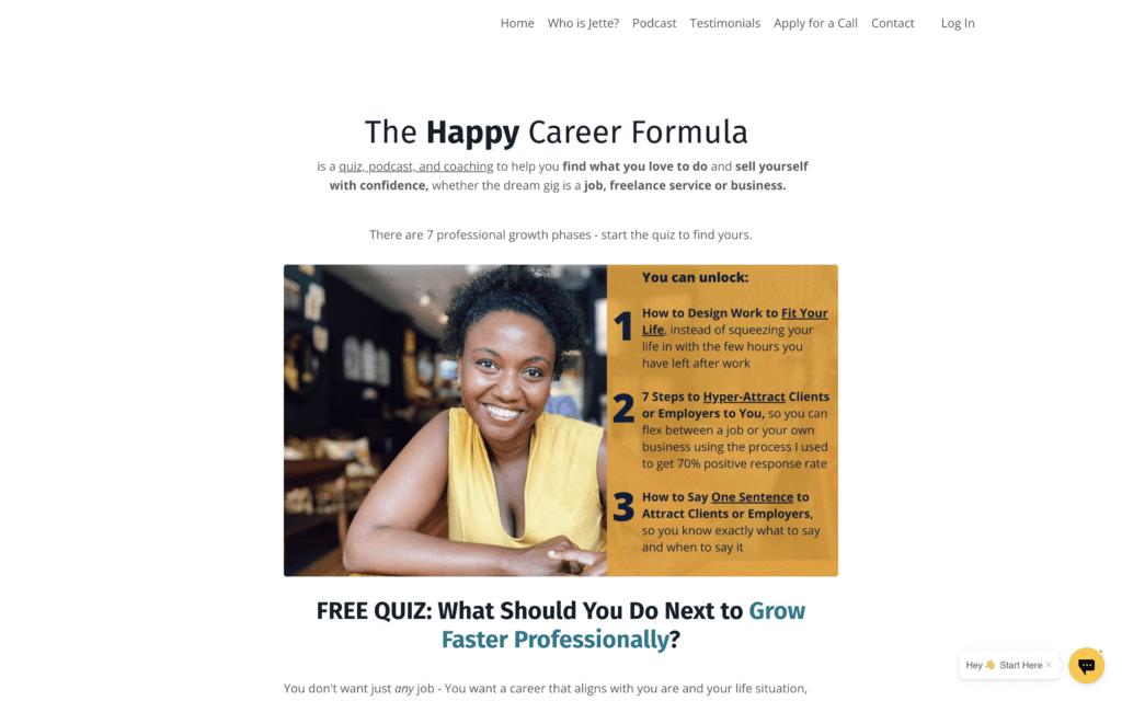
Jette Stubbs
Career and business coach Jette Stubbs’ site introduces her offerings right off the bat, followed by a friendly photo of Jette that humanizes the brand. The simple single-column layout reduces distraction and guides you down the page as you encounter a happy client’s testimonial and learn more about Jette’s services. Graphic elements and images are interspersed throughout, along with subtle font color changes to spark attention. The parallax scroll effect with Jette’s face in the background adds more human dimension and a bit of novelty. A simple top navigation menu is duplicated at the bottom, with links to an About page, Jette’s podcast, and testimonials.
Still on the fence about building a website for your small business?
We’ll end with a few reminders — and by debunking a few common misconceptions about creating a branded business website:
- Yes, you do need a website. Websites aren’t just for big companies, and social media isn’t enough.
- Your website doesn’t have to be complex or aesthetically stunning. Simple, user-friendly designs often perform better, so focus on clarity and functionality above all.
- A website needs attention. Your website isn’t just going to attract traffic on its own. You need to promote it and regularly populate it with fresh, SEO-rich content.
- You don’t have to go it alone. There are plenty of great designers out there who can help you craft a logo and build a professional-looking branded website. (We worked with the good people at Rockbase for our redesign.)
If you’re feeling daunted, don’t! We’ve got all the support you need to start building your brand and designing a killer website to show it off to the world. Check out our site’s Free Resources tab, where you’ll find content for entrepreneurs at any level. If you’re ready to take the next big step in your online business journey, head to SmartPassiveIncome.com/community to learn about our communities for online entrepreneurs. You can learn from others like you who have built their own branded websites, gain access to our full library of courses, participate in live events, and more.
 Ray Sylvester
 Matt Gartland
 Pat Flynn