 Sarah Peterson
There’s a lot of noise out there, but luckily for us, there’s a lot of data as well to help us all cut through that noise and get noticed. Today’s guest post is an amazing one from Sarah Peterson, head of content marketing over at Sumo.com, where she helps bloggers and online entrepreneurs collect more emails and get more traffic. Through her team’s experience serving tens of thousands of websites with their plugin, you’ll learn five super effective tweaks that you can make to your website to convert a lot more traffic into leads and subscribers. Take it away, Sarah!
Want to hear something shocking?
1,045,855,000.
That’s how many websites there are as I write this. There are 102,000+ US-based ecommerce stores alone that are reaching a relative level of success, millions of blogs, and every single day over two million articles are published into the voids of the Internet.
And they’re all competing for your audience’s attention.
I’m not telling you this to scare you.
I’m telling you this to demonstrate that since there are over a billion websites online right now, chances are there are at least a couple hundred (or thousand) in your niche alone.
And with numbers like that, you need to make sure that your website is effective, and helping you reach your goals and capture the attention of your target audience.
In this article, I’ll give you five specific and actionable strategies to make your website more effective, so you can increase your conversion rate, collect more emails, and rise above the competition.
Because every single email subscriber you have is money in your pocket, you can (and should) boost your business big time by making a few small tweaks to your page.
And the best part is, all of these strategies are completely free.
Strategy #1: Stop Giving Your Visitors Decision Fatigue
Have you ever been to one of those ice cream shops that has like 120 flavors?
They’ve got curry cayenne, pear goat cheese, and peanut butter pickle flavors. This is my mecca.
And yet, despite all of these choices, you can’t make up your mind.
The funny thing about having a lot of choices is that even though we like the idea of it, in practice it tends to paralyze us—to the extent that we will choose to just not act. Studies prove it.
This phenomenon is called decision fatigue, and I’m telling you this because, chances are, you’re triggering decision fatigue for many of your visitors without even knowing it.
Let’s say you have six things in your website’s menu. You might have links to your:
- About page
- Store
- Contact page
- Blog
- Resources page
- “Seen In” page
Plus you have a search function so your visitors can find what they’re looking for.
And that’s just your menu! Maybe you even spent a ton of time and money to set your homepage up just right.
But I have bad news for you . . .
Every single link, image, piece of content, and element on your page is a call to action.
And unless each and every call to action you have above the fold on your website is contributing to your main goal—hopefully to build your email list—they’re distracting your visitors from that goal, and therefore detracting from that goal.
I’ll repeat that: distractions detract from your goal.
When I land on your webpage, I should know exactly what you want to achieve. What do you think we want you to do when you land on Sumo.com?
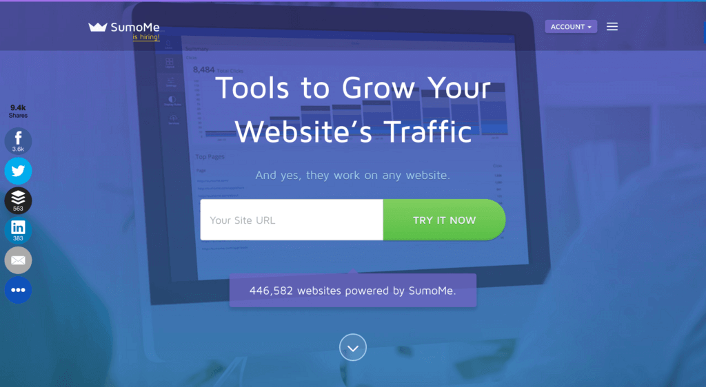
There’s no question. We want you to type your site URL into that box and press the “Try it Now” button.
What’s Pat trying to get you to do when you land on Smart Passive Income?

He wants you to press that shiny green “Get Started Here” button. Both Sumo and Pat have removed every link and call to action that doesn’t contribute to that goal.
Even if you don’t have a squeeze page, you can optimize your website to help you reach your goal. Take a look at the homepage of my personal blog:
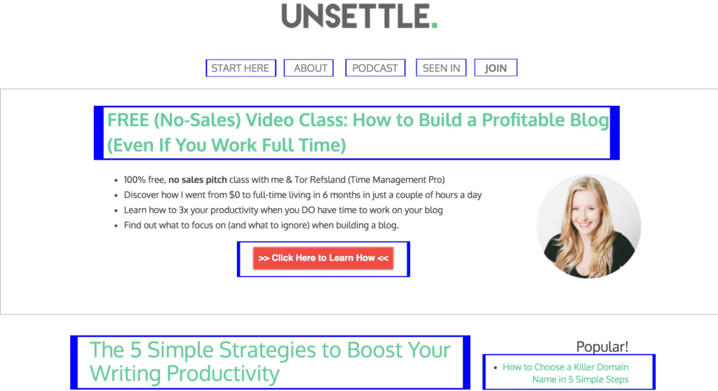
There are eight calls to action (shown in blue).
Every single one of those calls to action helps me work toward my number one goal (to build my email list). The “Join,” “Podcast,” “About,” and “Start Here” pages all have plenty of opt-in opportunities. The feature box has my opt-in offer and the “Join” button is a click trigger that brings up a two-step opt-in popup.
It didn’t always look like this. In fact, it used to be cluttered with stuff nobody was clicking on.
But I went through and removed everything that wasn’t pulling its weight from my website.
So how do you know what to eliminate on your own website? Well, don’t just guess. I figured it out by starting with looking at my visitors behavior.
What was my audience taking action on, and what was taking up space? I used heat maps (Sumo has a free heat map app) to see how I was cluttering my users’ trajectory.
See how bright all the elements are? There’s a reason for that:
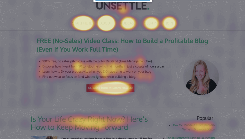
I went through and removed everything my visitors weren’t clicking on, so the valuable above-the-fold real estate began to pay dividends.
To make your website more effective, remove any call to action that isn’t helping you achieve your main goal.
You’ll inevitably reach your goal much faster (and your audience will appreciate fewer decisions and distractions, too).
Strategy #2: Capture Your Target Audience’s Attention
59 seconds.
That’s how long you have to capture the attention of your target audience and communicate why your business exists.
Since most people don’t even take a minute to assess whether your website is for them, you need to make sure your visitor knows EXACTLY what your website is about and who it’s for right when they land on your homepage.
Not sure if you’re doing this? Here are a few things you can do to find out.
- Do the five-second test. Have somebody who doesn’t know what you do navigate to your homepage, and ask them to describe what your website is about after spending just five seconds on your page. If they can’t do so accurately, you need to be more clear.
- Use a free user testing service. If you want an objective third party to review your website for free, you can make it happen! There are services like Peek’s User Testing where somebody will go through your website and record their impressions of your site.
If it turns out that your website is ambiguous, there are a few things you can do to communicate with the right people:
- Use a tagline. Unless (or even if) your domain name is crystal clear, a tagline can clear up a lot of ambiguity. The few words to describe in your tagline don’t have to be innovative. Choose a short tagline that is clear rather than clever.
- Replace generic language with specifics. It’s easy to be vague when we assume that people know what we’re talking about on our websites, but be as specific as possible. For example, if you have a landing page that offers a “30% discount on all new products,” replace that language to describe exactly what those new products are. If you sell leather handbags, say so.
- Replace your images. Every single element of your website—especially your homepage—needs to have a purpose, and that includes the images you use. If you’re using generic stock photography just to pretty up your page, consider replacing those images with images that will communicate your core message.
If your website doesn’t immediately hook your target audience, you’re losing out on a ton of emails and leads, which means that you’re also losing out on a ton of money in your business.
Strategy #3: Prove You’re Worth Paying Attention To
I went to school with a guy named Dustin.
This guy was solidly average. He wasn’t exceptionally smart, he didn’t look like Zac Efron, and he wasn’t funny.
But overnight Dustin became super popular with the girls.
He didn’t go through a She’s All That transformation, or pull a Freaky Friday swap with Seth Rogen.
Nope, the only thing he did to whip up this new claim to fame as a ladies man was to start dating a popular girl. And as soon as he started to date that girl, other girls seemed to take notice.
Weird, right?
Well, actually it’s not. The ladies noticed Dustin because they saw that other girls liked him. The popular girl Dustin started dating acted as his social proof.
Wondering what this has to do with your website?
Well, you need to be like Dustin. But instead of using social proof to become desirable to the opposite sex, you’ll use it to show your target audience that you’re worth paying attention to.
Sumo has worked with Pat to build social proof for his audience (that’s you!) around our apps:

This is a Welcome Mat on the Sumo blog.
Pat uses it, too, by posting his earnings above the fold on his homepage:

Social proof is the psychological tendency to follow the crowd; to do what others are doing. We subconsciously assume that if other people are doing it, it must be worthwhile.
One simple, free way to make your website far more effective and start converting more of your visitors is to incorporate social proof.
There are several ways to build and display it, but to get you started, here are a few of the easiest ways:
1. Display customer or reader testimonials: Testimonials are a type of social proof that can increase conversions on your sales pages by as much as thirty-four percent. Check out how The Art of Charm uses testimonials:
![Two testimonials are printed on this page, along with the customer's headshots. The first, from Steve W, reads "When I made the decision to attend an AoC program, I didn't realize I was making a choice that would change my life forever. I am so much more confident in my ability to attract and connect with both men and women. The coaches were amazing! My favorite part about the program was the tailored feedback. I grew by leaps and bounds each day because of the coach and peer feedback I received. [...]"
The second, from Ben B, reads "The Art of Charm changed my life—so much so that I (and friends I haven't seen in months) barely recognize me. I'm still the same person, to be sure, just with lots of new skills and without so many of the fears and insecurities that had been holding me back before I began listening to The Art of Charm Podcast just a few months ago. I had high expectations going in to my boot camp and can honestly say that AOC exceeded them [...]"
There is a button below that reads "Read More Success Stories."](https://www.smartpassiveincome.com/wp-content/uploads/2016/08/image_0-7-1024x566-1.jpeg)
Most of us have at least a few readers or customers we can get testimonials from. If you don’t already have testimonials or endorsements, don’t be afraid to ask for them!Include the ask in a survey, email, or even social media post. Just let your audience know that you’re looking for testimonials about how your blog or business has helped them. Request an image of them to add credibility to the testimonial.
2. Display quantities: Let’s say you don’t want to have to ask for testimonials, or want to display a different type of social proof. One great way to do this is to display the number of people who are engaging with you or your brand. Sumo does this twice on our homepage:
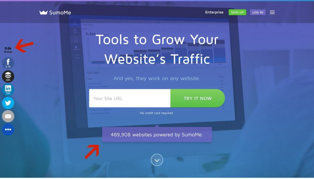
We display the number of websites that use our apps, and the amount of people who have shared our apps on social media using the Sumo Share app.
You don’t need to work with 489,000 websites or have 10,000 social shares to use quantities as social proof. Can you display how many email subscribers you have? Maybe you have worked with hundreds of clients, or you have a couple thousand Twitter or Instagram followers.
Displaying these numbers on your website provides that extra boost of social proof.
3. Show off your mentions: You’ve seen them around. Like on Paul Jarvis’s homepage:
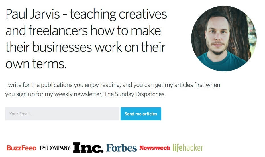
Banners of logos, “featured in” sections, and links to media mentions from other websites. There’s a reason they’re so common: it’s because they work. They offer a sense of legitimacy through social proof.
If you’ve ever written a guest post for a popular blog, been featured on a well-known website, or have appeared in a news story, don’t be afraid to wear that badge proudly.
We all have the ability to display social proof on our websites to make it more effective and prove to your target audience that you’re worth paying attention to.
Strategy #4: Do A Full Website Audit
Your website can’t be effective if it’s annoying your audience.
And if your pages are loading slowly, your links are broken or your images are too big, you’re giving your audience no reason to stick around, let alone hand over their email addresses or buy something from you.
That’s why you should do a full website audit at least once per quarter.
Audit for a few different things that, when fixed, will inevitably create a far more powerful user experience:
Site Speed
Have you ever been to a website that takes forever to load?
You know it’s not your wifi and that little blue “loading” circle just keeps spinning . . .
You probably don’t wait long before giving up, right?
Well, your audience is no different. Humans now have an attention span equivalent to that of a goldfish, meaning that your visitors aren’t going to wait for your website to load, no matter how amazing the information you’re providing.
Not only does a slow website make for a poor user experience, but it can also affect the way your page ranks in search engines.
There are many factors that can slow down your website, including the coding, images that aren’t optimized, your plugins, and your server.
But there are two low hanging fruits that speed up your site for free:
1. Optimizing your images: The images you use in the content of your website need to be optimized. Otherwise, you risk not only making your audience wait as the images load, but also slowing down the rest of your website, too. You don’t have to manually resize or compress all of your images, though. Use a free plugin like WP Smush to reduce the file size of your images without giving up image quality.
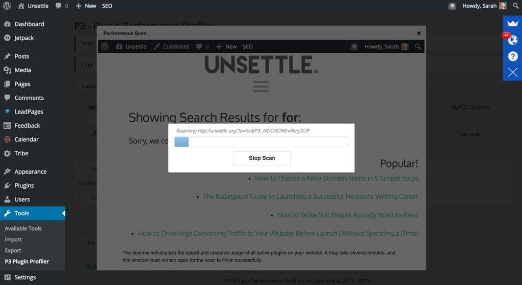
2. Removing slow plugins: Most people don’t know that plugins can drastically affect the speed of a WordPress site. But how do you know which plugins are to blame for that extra bit of lag? There’s a plugin for that. P3 Plugin Performance Profiler was mentioned again and again as one of the best WordPress plugins in 2016. It scans the plugins you have installed on your website:
Providing a report on the effect they’re having on your load speed:
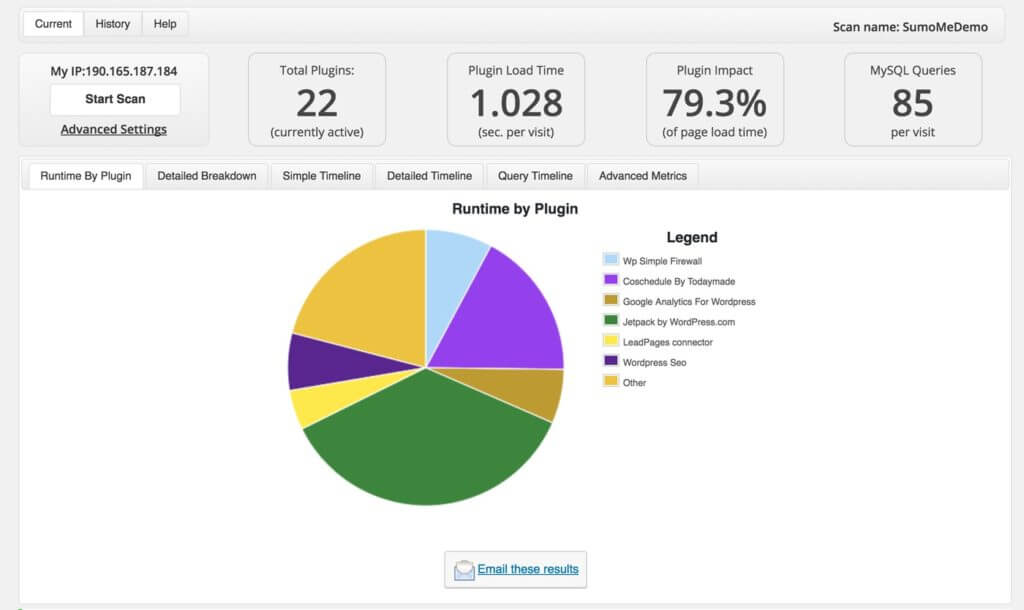
You can then deactivate the plugins that are slowing down your site the most, instantly improving your page load time (for free).
The speed at which your website loads has a huge impact on your user experience, and therefore your conversions. Don’t ignore it.
Broken Links
There’s nothing worse than going down a rabbit hole on a website that you’re really enjoying, and running into a 404 on a piece of content that piqued your interest.
It’s happened to all of us, and you don’t want it to happen on your website for your visitors.
After all, if your visitors hit a 404, chances are they’re leaving and not coming back (unless you optimize your 404 page).
They’re not going to dig for the content. They’ll just peace out.
The thing is, 404s are not always your fault. Sometimes pages change, URLs shift, or you made an error inputting the link. Often, you won’t even know about them.
Instead of letting this happen, thereby affecting your stats and conversions, perform regular broken link audits.
There are plenty of plugins that will help you find and fix broken links on your WordPress website, but WordPress Broken Link Checker is one of the most widely used plugins for this out there.
You can set it up to automatically check for broken links at intervals, saving you from having to remember to check.
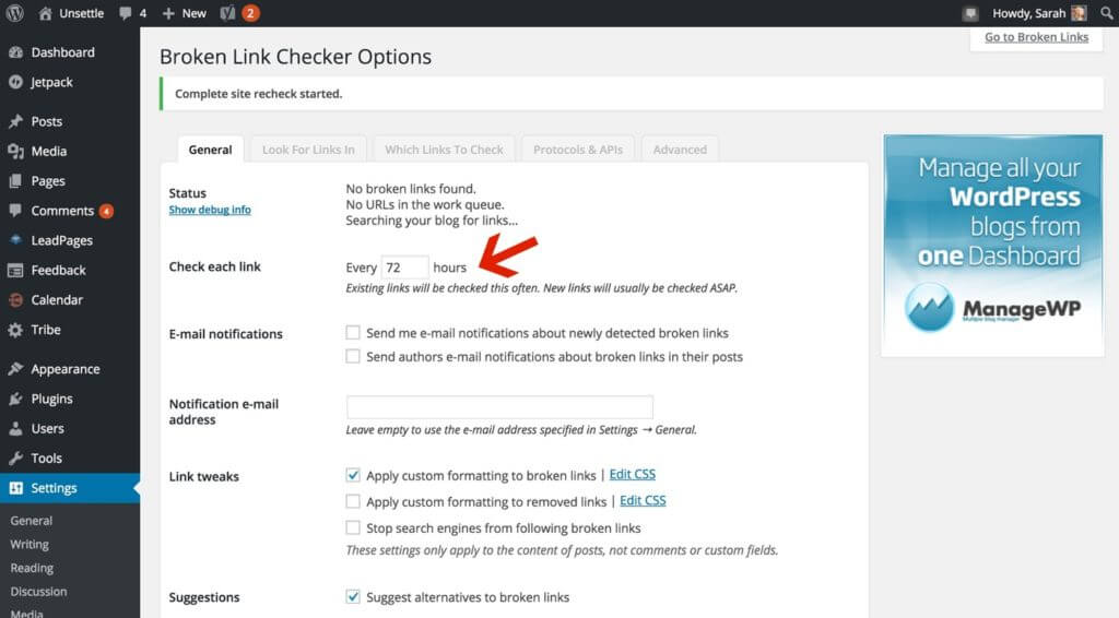
You’ll then receive an email when you have broken links. Broken Link Checker will even suggest replacement links for the broken ones.
Where Your Audience Is Losing Interest
Have you ever clicked on an article from social media and realized it was insanely inconvenient to read?
Like those really annoying “articles” that make you click through from slide to slide to see all of the content:

What if your readers felt like that on your website?
Even if you don’t put content behind annoying slideshows, you may be losing your audience to poorly designed content or even just ineffective flow.
If your readers become frustrated, chances are they’ll just leave. And once they hit that “back” button, they probably won’t return.
That’s why you should audit regularly for exactly where you’re losing people so you can make minor tweaks and adjustments that will keep your visitors on your website for longer.
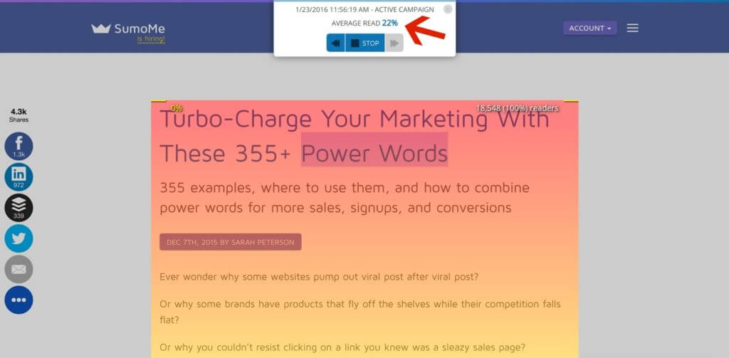
On the Sumo blog, we enabled Content Analytics to automatically record campaigns on all of our stories. Recently, when looking at the results for one of our articles, we noticed that only sixteen percent of the article was being read.
This was far below our average of around thirty-five percent, so we took a look at what was different about that article compared to others. It turns out it had a lot of images at the top of the post, which was unusual. We removed unnecessary images, and dispersed the rest throughout the article.
Just by making this small change, we saw an almost immediate boost. Within a couple of days, the average read rate of the article increased to thirty-three percent.
Where are you losing your audience?
Review your content to see where people are dropping off regularly. If you even improve by one percent during every audit, you’ll be in a much better position than you were before each time. If you don’t have time to audit every single piece of content you publish, keep an eye on your pillar content to maximize its potential and conversions.
Doing an audit of your website regularly will help you reach your goals. Don’t lose your visitors to a slow, frustrating, or ineffective website.
Strategy #5: Get Your Opt-In Opportunities In Front of More Targeted Leads
If there’s one thing that’s guaranteed to increase your conversion rates to make your website more effective, it’s getting your calls to action in front of your target audience.
And look, I know you might be thinking that you already do that. That’s why you have opt-in forms, landing pages, and opt-in offers.
But when you’re offering a content upgrade, most of your readers aren’t even seeing them.
We analyzed 650,000 website visits by pulling data from Sumo’s Content Analytics app, and it showed that the average read percentage of an article was twenty-five percent.
Not only that, but only twenty percent of your readers actually finish your articles. So if you have your content upgrade way down there at the bottom of your article . . .
. . . a huge chunk of your audience will never see what you’re offering. They’ll never have the opportunity to opt-in to your email list on that call to action.
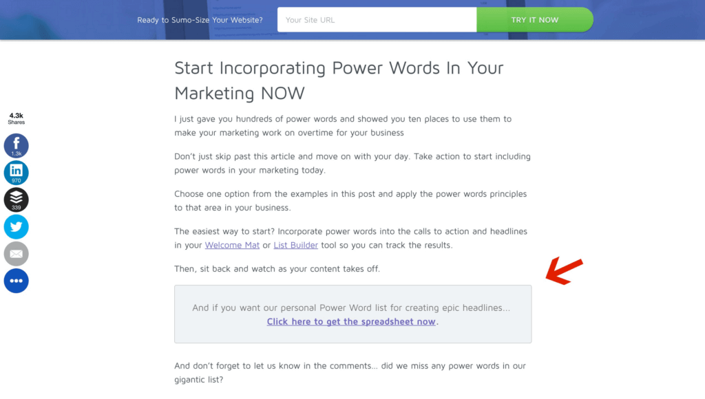
Instead of letting them slip away into the Internet abyss, capture their attention (and their email addresses) by putting a call to action above the average read rate of your articles:
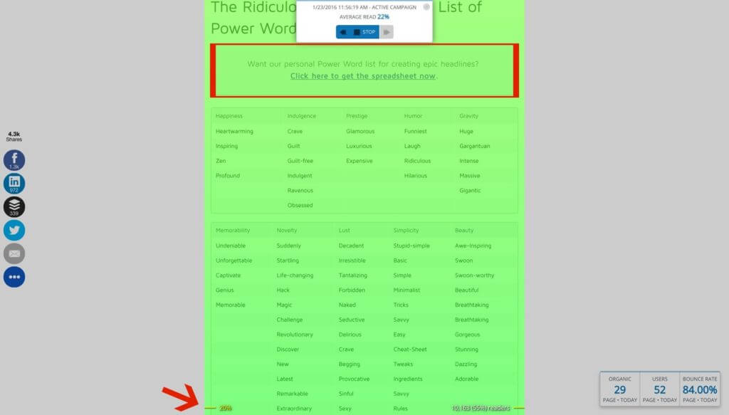
Getting that opt-in opportunity in front of far more targeted leads.
Plug Those Traffic Leaks with These 6 Simple Strategies
A lot of bloggers and online business owners feel as if they need an expensive website design or a custom-developed homepage with all the bells and whistles to make their websites effective.
But that’s not true.
With a few simple and free tweaks, you can make your website work even harder for you.
And you can start converting that traffic into email subscribers, and those email subscribers into customers.
Thanks again Sarah for sharing your insight with the SPI community! The Sumo team has put together a checklist that their content marketing team uses to help customers increase their conversions by 200 percent, and you can get it for FREE by clicking here.
 Daniel Scocco
 Gregory Ciotti
 John Corcoran