Pat Flynn
Editor’s Note: Another new SPI website design update was made in April 2016! Scroll down to check out those latest changes. The change from 2019 is not yet reflected in this post.
A month ago, the new design of The Smart Passive Income Blog was finally unveiled! This is the 7th major redesign the site has gone through, and I’d love to take you through the old themes, tour the new design, and show you why things are the way the are on the new site.
Before the (very detailed) tour, which will be published in a couple of days, I thought it would be interesting to show you some of the previous design iterations the site has gone through since its launch in October of 2008. The design has come a very long way, and I hope this history shows you that you don’t have to start out with the perfect website.
You just have to start and you can work your way there.
Keep in mind, however, that there is no such thing as a perfect website because you can always do things to improve it. Even in this latest design, adjustments have been made since it first came out. I’ll share what those adjustments were and the comments, data and reasoning behind them in my next post.
In the meantime, let’s see what the site used to look like…
1. October 23, 2008
When SPI first launched, I actually built it on the Thesis Theme framework [Full Disclosure: As an affiliate, I receive compensation if you purchase through this link.]. I was familiar with setting up a blog from my experience with GreenExamAcademy.com (which over the years has had it’s fair share of design iterations too) and I just wanted to get something up quickly so I could start writing content from Day 1.
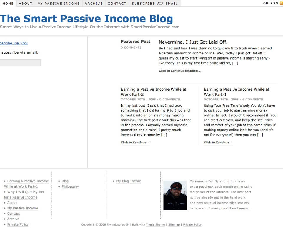
Colorful, right?
I had never used Thesis before this, but I gave it a shot because I had read so many good things about it from others. Unfortunately, I didn’t realize that those who were saying that knew a little bit about design and coding already, which I did not. It was easy to use right out of the box and I was able to get a few articles up, but as soon as I wanted to customize it a bit, it became too complicated for me at that point.
2. October 26th, 2008
That’s when I downloaded a free theme from the WordPress theme repository that made it easy for anyone to change the look of the header. After a quick dip into Photoshop (which I had experience using from my work in the architecture field), here’s what the site became…
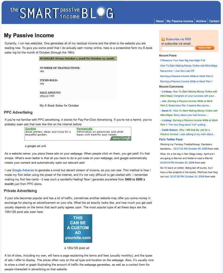
That subscriber box in the upper right hand corner—the orange box—that took me 4 hours to create, and I remember trying to make it look like one I saw on ProBlogger.net. At this point, I was still under the impression that I should figure everything out on my own. I watched a lot of videos and tried to muscle through basic CSS just to “get things right” on my own, and I was never quite happy with it.
It’s also interesting to look at my old Twitter feed in the sidebar. I had just officially been laid off at this point, but apparently I was still able to participate in Fantasy Football.
3. November 3, 2008
A day after the previous design, which I wasn’t happy with, I put a job on Elance to help me custom design a theme for SPI. I knew (after the 4 hour subscriber box fiasco, plus many other similar experiences) that it was time to hire someone to do the work for me.
Within 24 hours, I chose the winning developer (whose bid was only $175) to create a basic theme and logo for me. I went with the absolute lowest bidder (which is risky and I’ve been screwed many times before), but I got lucky that this person knew what they were doing. Here’s the theme that was created and went live less than a week later:
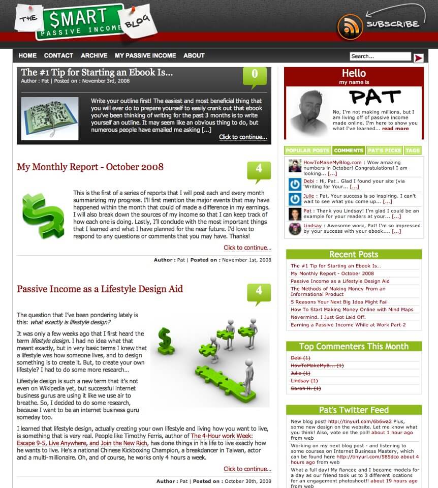
A lot of elements from this design inspired what you still see today on SPI: the logo, the color scheme and the “Hello My Name is” nametag, amongst a few other things.
Just wait until you see what happened next…
4. June 9, 2009
Seven months has passed and I figured it was time for a new design. The goals in this next update were to switch from a 2-column scheme to a 3-column scheme, update the logo a bit and add some advertisements on the site.
Take a look and see if your reaction aligned with the reaction from the SPI audience:
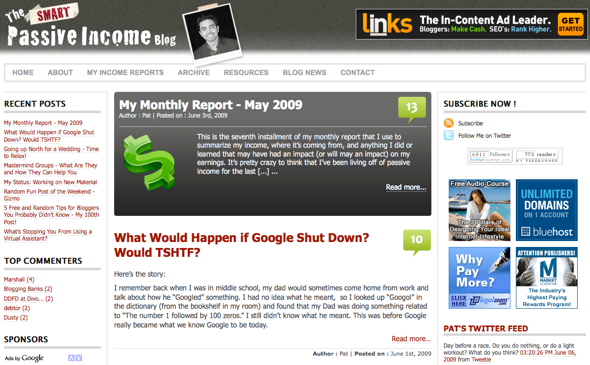
If you’re thinking I took a step backwards, then you are absolutely right.
Even through I didn’t see it at the time, I made the site a lot more confusing and I introduced ads—a lot of them—which didn’t even convert very well.
In the lower left hand side, you can even see a section for Google Adsense advertisements. The ads that were auto-generated were for “get rich quick” type schemes and just totally diluted my site. Just look at how much of my actual content is shown here above the fold—hardly any at all.
This design was inspired by what I saw a lot of other successful people were doing on their sites, but I learned that doesn’t mean it’ll work for me too.
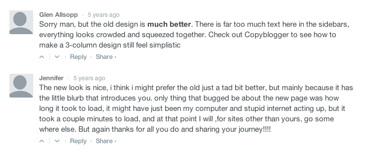
Here is the general reaction from some of the audience members, including one from one of my best friends online, Glen Allsopp from Viperchill.com:
So what happened?
I got greedy.
I started to see a few affiliate commissions come in for certain things, and then I got money hungry and polluted the site just to make a few extra dollars. I polluted my content, I polluted the design and I polluted my ability to really serve my audience, and it ended up hurting me quite a bit.
The next 6 months are what I like to call The Dark Days of SPI. Traffic plateaued, growth and engagement were minimal and nothing really interesting happened during this time. In October of 2009, I hooked up with a Texas-based, 2-person design company (BlazerSix) that made-over my site at GreenExamAcademy.com, and they agreed to help me clean up SPI for me.
It was going to take a few months to really get it right and go back in the other direction again, so all I has to do was be patient.
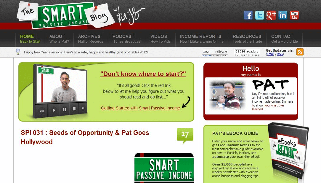
5. January 4th, 2010
After a few months, the new design was ready to go live. It would be the biggest update for SPI ever, complete with a brand new ebook (Ebooks the Smart Way), which I created as an incentive for subscribing to my new newsletter.
Yes…new.
I hadn’t started my email list yet, which was a huge mistake and something I always wish I could take back.
And here’s what went live:
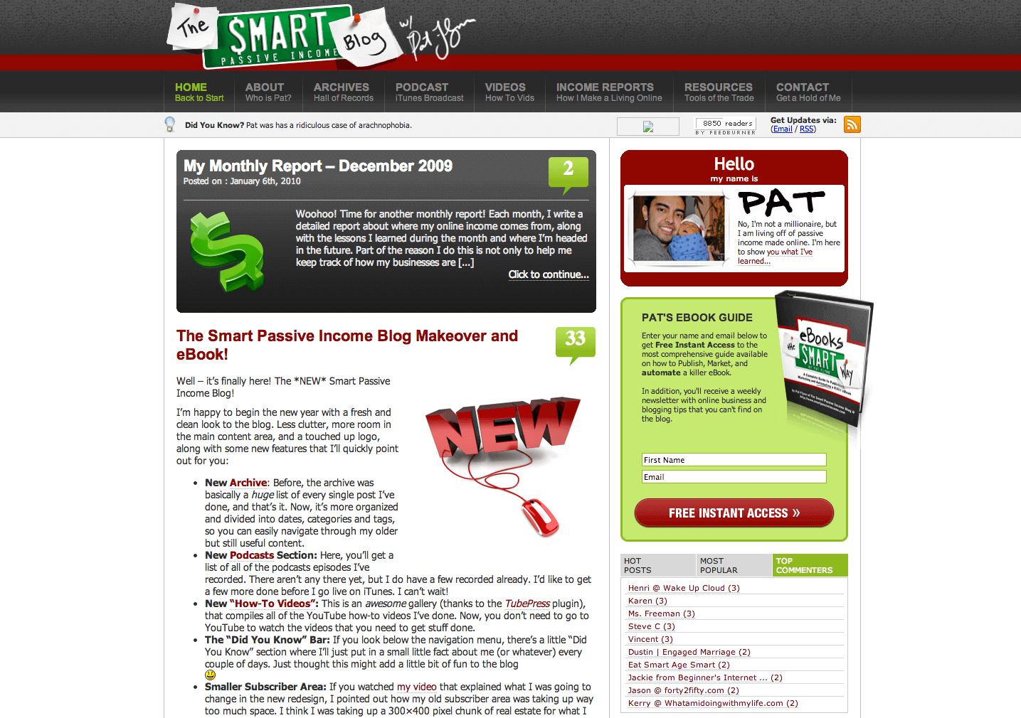
You’ll see a new version of the old logo, I reverted back to the old color scheme and the nametag came back too—this time with a picture of me and my son, instead of me looking cool (but not really at all) with my hand on my chin like before.
The navigation bar at the top was another huge addition, and you see a variation of it still on the site today. Everything was more purposeful, cleaner and more organized.
I also included a “message bar” at the top, which was inspired by the homepage of E-Junkie.com, and I minimized the subscriber area to make it look like the one on Tim Ferriss’ blog.
It was at this point that I was more conscious about sharing more about myself with my audience, hence the image of my son and that message you see in the “message bar” about me having a bad case of arachnophobia. I did this because I learned that it’s those little personal things that people connect with. Even though they have nothing to do with passive income or building an online business, they have everything to do with building a real relationship with people, and since then I’ve been continuing to do the same thing.
6. April 27, 2011
No major design changes were made to the site until a year and a half later when I discovered a hole on my blog (and many other sites) that I needed to fill.
That hole was the idea of a getting started point—something deliberate to serve brand new visitors to the site.
Out of that discovery was a getting started page, as well as a call to action on the homepage that looked like this:
The getting started page went on to become one of the most visited pages on the site, and one of the most profitable too. Actually, it was the 2nd most profitable page behind the resources page, and it’s still that way today too.
In August of 2011, the site switched over to the Thesis Theme framework to optimize page load time and search engine optimization. Unlike before (when I first launched), I had help to put my existing theme onto the Thesis framework, which I definitely wouldn’t have been able to do on my own. [Full Disclosure: As an affiliate, I receive compensation if you purchase through this link.]
Here are the results of that switch, and I’ve been on Thesis ever since.
7. April 2016
Fast forward a few years, and we made one of the biggest design changes ever on the Smart Passive Income blog. Before that, we made a few design changes in November 2013, but this is really the most significant change we’ve made since our last iteration in 2011.
In 2017, I published a post about the critical lessons we learned from the redesign, both positive and negative. We added more unique post types, created a cleaner navigation, added more consistent brand language throughout, and more.
Check out that full post here.
In the next post, I’ll go over exactly how it all happened, and in detail explain the thought process behind every little piece of the site.
From what it sounds like, most of you are enjoying the new look (thank you!), and the numbers are proving it too. I will share all of that in the next post, and you’ll be surprised to hear that even though the 2013 redesign just went live last month, work on it started exactly one year ago when Corbett Barr and Chase Reeves flew down to San Diego and we locked ourselves in a downtown conference room.
It’ll be a post you won’t want to miss. Until then…
I’m curious: what’s your biggest takeaway from all of this?
I hope you enjoyed this history lesson! 😉
Cheers!