Pat Flynn
When I started creating content in 2008, all I had to do was pick a keyword, write about that, and it would rank and generate traffic.
Nowadays, what’s most important is not the information that you publish, but how the audience engages and reacts to it. You must create something worthy of a person’s time and attention. In this article, I’m going to give you a system that I use to help ensure that your audience will stick with your content.
Whether it’s for a blog, podcast, video, book, presentation, or even a sales page, this article will change how you create content forever.
The Story
Let me start with a simple question:
Where’s the best place to keep your money so that it’s safe and still easy to access?
If you’re thinking the answer is a bank, then…
You’re right!
Another question:
Where’s the best place to keep your stories so that they’re safe and still easy to access?
The answer is…
A story bank.
Using stories is the secret to creating compelling content. The problem is that we don’t have a purposeful system for capturing and categorizing our stories so that we can summon the right story at the right time.
And by stories, I don’t just mean the life-changing stories that we use in our content (like how my life changed when I got laid off from my architecture job back in 2008), but the little stories — the seemingly irrelevant stories that, when unpacked, actually are interesting, useful, and hold an audience’s attention.
Even if they don’t seem impactful to you, your stories still work because they’re genuinely personal, unique, and also relatable when used in the right context.
Like the time my son asked me to play Minecraft in the car on my iPad when he was 8 years old. Instead of saying no, I asked him, “Why should I say yes?”
Eventually, he came around to saying, “Daddy, if you let me play Minecraft, I can learn more about building and teach you how to be a better architect because I know you used to be one.”
Capturing this moment of my life allowed me to transform this tiny story into a huge lesson for my audience about knowing who you’re speaking to and understanding the language that will resonate with them. I even shared this story on stage during my closing keynote speech at the Youpreneur conference in London a few years ago, and people still recall that story and lesson today.
Another story was about the time I used to work as a waiter at Macaroni Grill, an Italian chain restaurant. There was one person who came in at the same time every single week, a busy businessman, and I quickly learned that he ordered the same thing every time. Eventually, I became the waiter he requested because I knew what he wanted before he even asked.
This story and the lessons I was able to extract from it ended up in my book, Superfans.
All of these examples were just small moments in my life, but after capturing, analyzing, and detailing them, they became two of my favorite stories to tell on stage.
Sometimes, I’ve even used the stories from my story bank while in person at dinners and gatherings, and I gotta tell you, they always seem to leave a lasting impression.
Your Call to Action
Start your story bank and try building it out for one week. If you like it, keep going with it!
Here’s the process, step by step. I like to keep things simple because if I overcomplicate, I underuse.
Step 1: Settle on a tool or app that works for you to capture these moments that happen in your day.
You could use whatever you’re familiar with — Notion, Evernote, or even just the Notes app on your phone (which is what I use). The most important thing is that whatever you use, be sure it’s easy for you to access. It doesn’t take long for a moment to pass by and get lost forever.
Step 2: When something interesting or curious happens, capture that in its own record or page.
You don’t have to capture every second of every day. Simply, if anything interesting or curious happens, add a new record for it. Include anything else that’s on your mind about that moment too. And no editing. Just brain dump so it’s there and you can come back to it later.
Here’s an example of my recent captures on my Notes app:
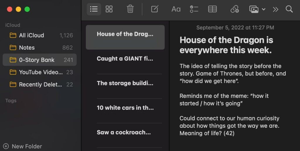
As you can see, it’s messy, it’s random, but it’s there, and that’s what’s important.
In many cases, I’m out and about and capture a moment in my notes app using the voice keyboard. I prefer this over the voice memo app because it captures the thoughts in text (although not perfectly), which is much easier to scan through than audio.
Step 3: At the end of the week, go back through your captures with this question in mind: “How might this story be useful or interesting to my audience?”
Filter each capture with the above question in mind, and if you can’t quickly find any sort of connection that matters, archive it.
Step 4: After filtering, pick one story to go deeper into and finesse into one with a beginning, middle, and end.
This is where the fun begins. Choose one single capture, and expand on it. Create a setup or introduction (a hook) for the story, share the story, and tie it into the larger picture.
For example, there’s a random moment from the other day I captured where I just noticed an entire row of white cars in a parking lot at Target. It was just weird, but thinking about it more deeply, it does have a connection to both the fact that we as humans love to see things in order, and also the purple cow effect (i.e. something you don’t see every day).
Some stories you’ll try to develop, and it just seems forced and goes nowhere. Don’t force or fight it. If it’s just not coming to you, move on to a different capture. Other stories, however, just seem to flow so well, you know this is a story you’re going to structure and continually tell time and time again (and improve each time you do).
Step 5: After drafting a more detailed narrative, tag the story with as many relevant tags as possible.
I have tags for audience growth, branding, podcasting, videos, and a lot more. You can have as many tags as you’d like.If your software doesn’t allow for tagging individual articles, add your tags at the top of each of your stories so you can use the Find feature to locate the stories that have certain keywords attached to them.
The tags should help you recall what you need when you need it. For example, if I’m going to a podcasting conference to speak, or writing an article about podcasting, I hit my podcasting tag, and boom — all the stories that involve a podcast in some way, shape, or form pop up, and then it’s just a menu I can choose from for my content.
Storytelling is a key skill to learn, but it’s hard to tell stories when you’re not actively capturing them. Start your story bank, and give it a shot!
Also, a big shout out to Ramit Sethi who was the first person to introduce me to the power of story banks.
I hope you enjoyed this 5-minute read! To get more like it every week (again, totally free), sign up below!
 Jillian B