Become the entrepreneur you want to be
Our community of 1,200+ entrepreneurs offers a path to success on your terms. Reduce overwhelm. Refocus your work. Accelerate your skill development. And make better decisions at every step thanks to peer support and expert advice.
Join 1,200+
Active Members
15+
Years of Experience
50k+
Lifetime Students
18
Premium Courses
1.2k
Active Members
100+
Private Events


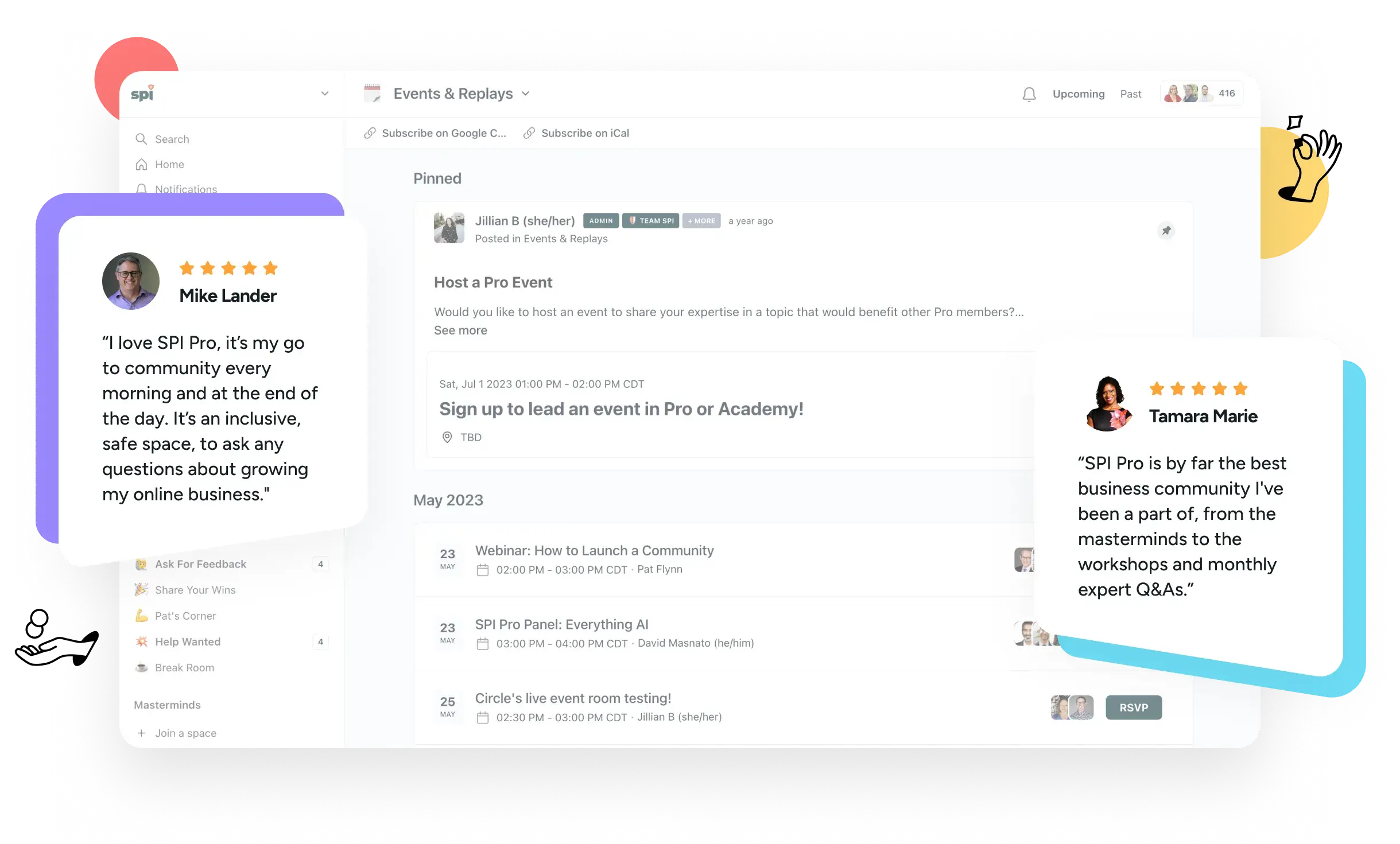
Our community includes everything you need to create your own path to success.

Private Network
Peers in the trenches with you. Legit experts who have your back. Our team by your side at every step. That’s our private network.

Exclusive Experiences
We facilitate a range of interactive experiences, helping you solve problems and forge valuable connections.

Courses and Accelerators
Our catalog of 18+ premium courses is at your fingertips anytime. We also run regular learning cohorts to accelerate your skill development.

Get Unstuck in just 5 minutes, for free
Our weekly Unstuck newsletter helps online entrepreneurs break through mental blocks, blind spots, and skill gaps. It’s the best 5-minute read you’ll find in your inbox.
Free newsletter. Unsubscribe anytime.
Join 135k+
Subscribers

Level up your skills with our live webinars, workshops, and special events


May 8th, 2024
|

11 AM PT / 2 PM ET
May All-Access Pass Workshop: How to Quickly Make YouTube Videos that will Get You More Views & Subscribers
Do you have a YouTube channel but want to up your game?
Join this masterclass led by SPI Pro EIR, Caleb Wojcik, on how to quickly make your videos and gain even more views and subscribers. We’ll dive deeply into how to get more people to watch your videos and subscribe. Caleb will also cover how to streamline the actual creation of your videos, titles, and thumbnails to work smarter, not harder.
Get access to a treasure trove of advice, events, learning, and more!
Gain a brain trust of peers
Our 1,200+ members are actively building their online businesses — not just talking about it — which ensures that everyone has meaningful and relatable questions, ideas, tactics, and experiences to share.

Our members gain elevated focus, confidence, decision-making, and results that matter to them. The same could be true for you. Join us!
Tap into industry experts
Our in-house industry experts provide members fast access to deep experience across a diverse range of business needs. They walk among us in the community, always ready to pitch in and help you.
Sharpen your skills
Advance your skills with our self-paced and cohort-based courses. Our entire catalog is available to our members. And our community-based experiences help you apply what you’ve learned.
Grow with peace of mind
Never feel alone, out of place, or unsafe again. Our community is built and managed to be the safe place for online entrepreneurs to share, connect, learn, and grow in an inclusive environment.
Join interactive events and experiences
Band together with like-minded peers, our team, and our in-house resident experts in a variety of exclusive events and experiences that fuel togetherness, deliberate action, focused work, and much more.
Receive exclusive news and offers
Our members get priority access to our very best stuff. Our best deals. The best offers from partners. Breaking news. First look opportunities. Beta programs. Exclusive tools and resources. And more!
According to our members, our community is their happy place
“By immersing myself in SPI Pro and now the Academy, I have gained the support and knowledge necessary to navigate the challenges and complexities of entrepreneurship. The decision to become a part of this community has undoubtedly played a pivotal role in my personal and professional growth, empowering me to strive toward my goals with confidence.”

Julie DeLucca-Collins
GoConfidentlyCoaching.com
“The SPI All-Access Pass has provided me with a fresh perspective on small business and entrepreneurship, opening my eyes to a whole new approach. It’s not just a membership; it has revolutionized my mindset, approach, and strategic thinking. With exclusive courses, live events, and a supportive community of like-minded entrepreneurs, it goes beyond a typical membership.”

Tina Cheesley
Flow Online
“As an entrepreneur, it can get lonely and you might feel stuck. Being part of SPI gives you a community that offers support, accountability, learning and networking.”

Kerry Finsand
KerryFinsand.com
“All this wealth of knowledge and sharing, plus great networking, leads to an amazing community space chock-full of learning and support that helps grow my business better, faster, and smarter.”

Sandee Rodriguez
SandeeRodriguez.com
“I have struggled for years with being overwhelmed about where to start my online business. The SPI Academy provides an A to Z roadmap using Pat’s courses. What makes the experience priceless is the great community, accelerators, and the opportunity to frequently get help from Pros who are a little further down the road. For the first time I feel like building my business isn’t just a possibility, but I am excited each day to wake up and make it a certainty.”

Rachael Stout
RachaelEStout.com
Supercharge your skills with our popular courses
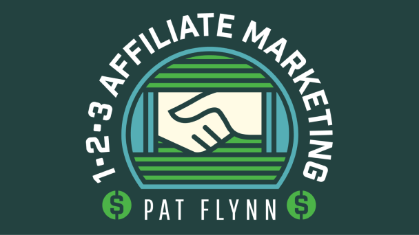
1•2•3 Affiliate Marketing
Learn to authentically generate more income for your business through affiliate marketing with our three-step system. Ideal for those who already have at least a small online presence.
A to Z Webinars
A step-by-step roadmap to help you create and deliver webinars that work. Grow your list. Increase trust. Make more money. Ideal for business owners looking for growth.
Amp’d Up Podcasting
Learn the AMP system for growing your podcast: Automate, Market, and Profit. Ideal for podcasters who want to get time back, grow their listenership, and earn more from their show.

Community Business Blueprint
Draft your ultimate community success strategy to best suit your business goals. Co-created with the team at Circle.
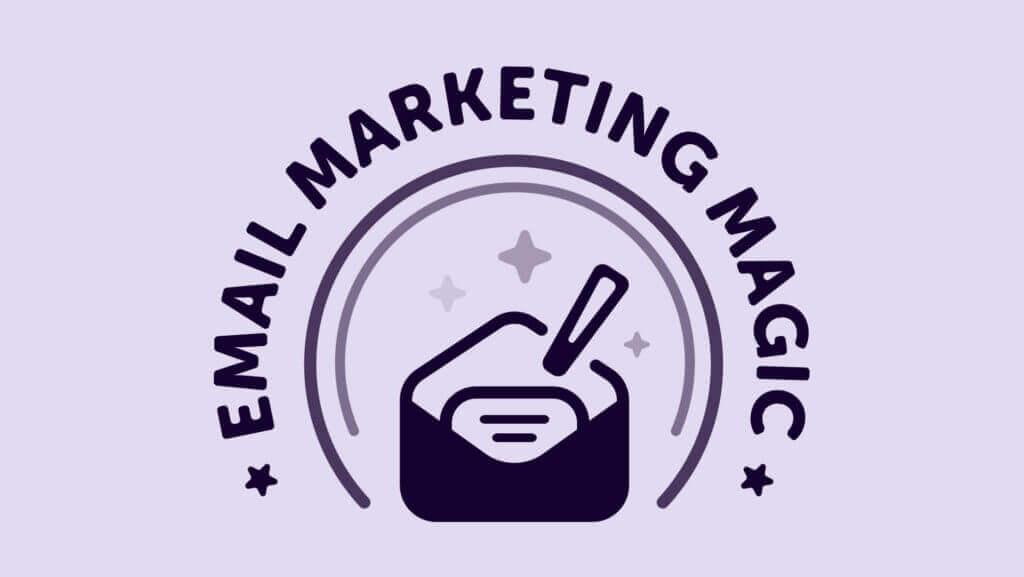
Email Marketing Magic
Grow your list, make more money, and automate like magic with this course on establishing an email marketing program. Ideal for anyone new to or frustrated with email marketing.
Heroic Online Courses
Learn to create powerful courses where you transform your audience into heroes. This course covers everything you need to know, including refining your course niche, creating a production plan, and crafting a powerful sales page.
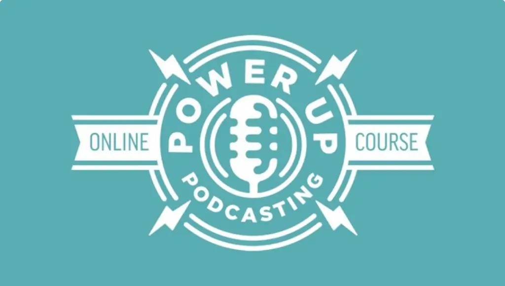
Power-Up Podcasting®
Create, launch, and market a podcast that grows your income and impact online. Covers step-by-step setup, how to get found (even on launch day), and more. Thousands of students have enjoyed this course. Now it’s your turn!
Smart From Scratch®
Learn how to find a winning business idea and land your first customer. Ideal for those who do not have a business yet or who are exploring starting a new business.
YouTube From Scratch
Learn how to start a YouTube channel and get your first 1000 subscribers so that you can qualify for YouTube’s monetization program. This is a course for beginners who do not yet have a YouTube channel.


Ready to find join your people and level up?
Like you, we’re online entrepreneurs who crave connection, direction, and support from people like us.


Enjoy content that is actually worth your time
Smart Passive Income Podcast with Pat Flynn
Weekly interviews and advice for building your online business the smart way.
Articles and Essays
Enjoy in-depth guides, useful how-tos, revealing success stories, special announcements, and more published exclusively on our blog.

Definitive Guides
Our in-depth guides on essential online business skills are your fast track to learning the ropes of how to succeed as an online entrepreneur.
Get Unstuck in just 5 minutes, for free
Our weekly Unstuck newsletter helps online entrepreneurs break through mental blocks, blind spots, and skill gaps. It’s the best 5-minute read you’ll find in your inbox.
Free newsletter. Unsubscribe anytime.
Join 135k+
Subscribers